1. Improvisation 31 (Sea Battle) by Kandinsky
2. Color Study — Squares and Concentric Circles by Kandinsky
4. Massive Structure by Kandinsky


Sample Project:

These two Abstract Artists have very different styles. Compare Kandinsky’s Sea Battle to Pollock’s Moon Woman. How are they similar/different? These are the only two paintings with any vague similarity. Both have FREEFORM SHAPE, as well as LINE, which could be compared, discussed, and dissected
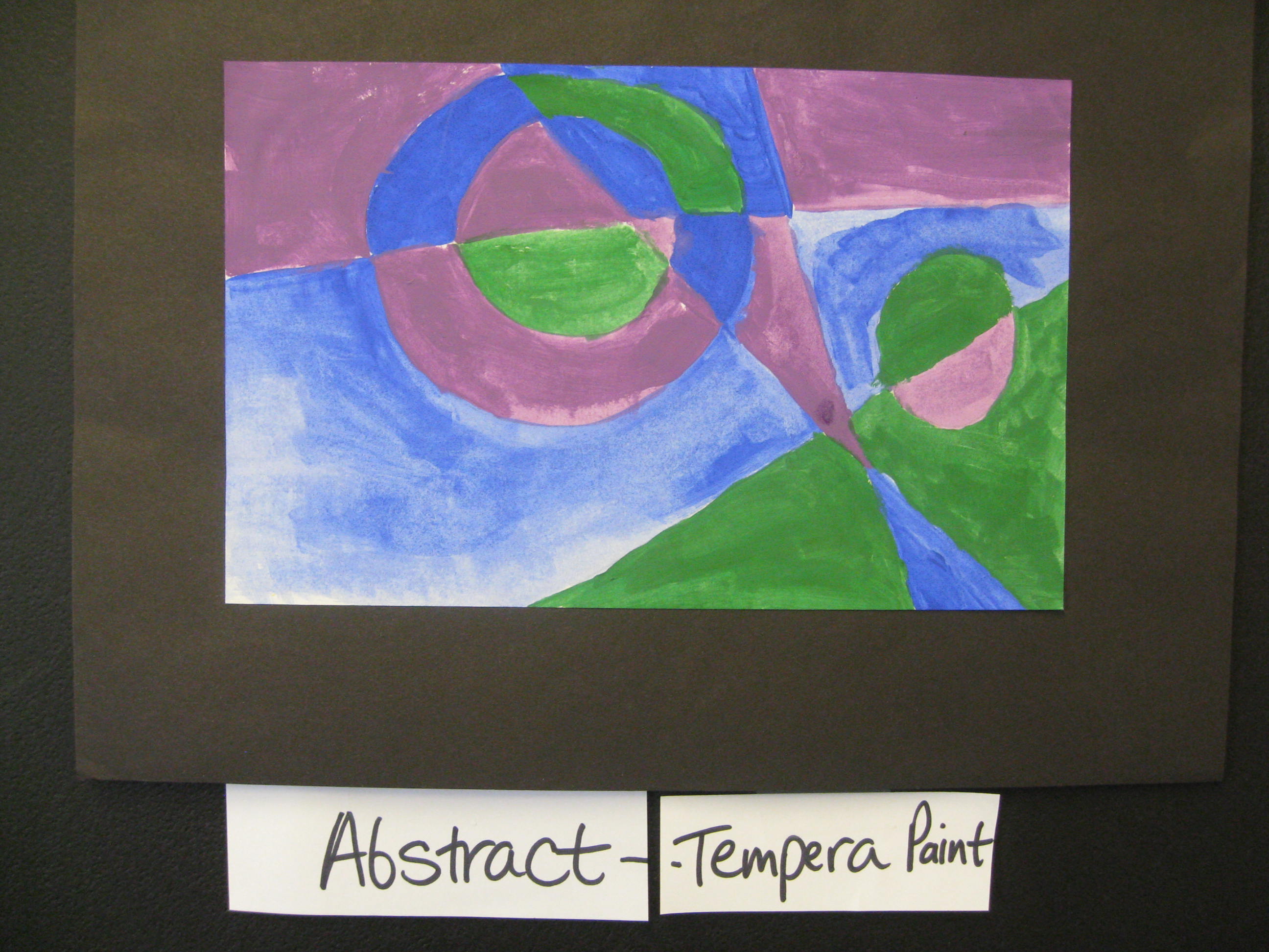
COLOR is a major emphasis in the works of both artists so painting color wheels would be a good project. Autumn Rhythm invites dialogue or projects on NEUTRAL COLOR.
Pollock’s “drip paintings” or “action paintings” are created purely with LINE. These paintings also have no FOCAL POINT, or CENTER OF INTEREST, which is unusual for a work of art. Another very unusual aspect of drip paintings is that there is a complete absence of BALANCE. There is nowhere to divide the picture into either type of “symmetry” and nothing “radiates” from the center.
If you try the marble project or attempt to follow Pollock’s actual drip technique, the most important thing is to rotate kids quickly. Set a minute timer and when it goes off, they need to step to the back of the line for a second chance to roll the marbles or drip the paint. This way everyone will get the chance without waiting forever. Make sure you are firm on the time limit and let them know they can repeat as many times as necessary as long as time allows. It will cut down on horseplay. Two volunteers working together are highly recommended for this type project. Be sure you have a place to set pictures to dry before beginning.
Define or review the definitions of suggested art vocabulary (Some Words to Know) listed for the packet. Remember that you are not limited to only the suggested projects.
(Special Thanks to Kelley Robins and Ann Powers for their help with this packet!)
Make sure ALL 8 pictures are returned to the Packet Carrier after your Presentation is finished!
Some words to know
Abstract Art: Not the way something really looks. An abstract work of art is often based on a real object. But the artist leaves out details or changes the object in the picture to look different than the real object. Can also be non-objective and resemble nothing concrete. A style of art in which LINES, SHAPES, COLORS, PATTERNS, and TEXTURES are simplified to exaggerated. GEOMETRIC SHAPES and a lack of detail are often features of abstract art.
Abstract Expressionism: A more recent term used by critics in reference to a varied body of abstract that appeared in America during and after World War II. The name given to the work of several artists painting in different but related ways in New York City in the 1940’s and 1950’s. Their work is abstract, its subject being the actual process of painting. A style of painting, in which paint is applied in an apparently random manner, producing images that may or may not resemble concrete reality.
Action Painting: A term coined by the critic Harold Rosenberg to describe a very “active” painting style, for example, as used by Pollock in his drip paintings.
Avant-garde: The advance group in any field, especially in the visual arts and music, whose works are characterized chiefly by unorthodox and experimental methods.
Impressionism: A style of painting developed in the last third of the 19th century characterized by short brushstrokes of various bright colors in close combination for the natural eye to blend and to represent the authentic optical effect of sunlight on objects.
Expressionism: General painting styles in which the artist exaggerates or changes basic artistic elements (LINE, SHAPE, COLOR, etc.) to create a work of art that is more concerned with creating MOOD or feeling than in creating photographic reality.
Great Depression: The economic crisis and period of low business activity in the U. S. and other countries, roughly beginning with the stock-market crash in October, 1929, and continuing through the 1930’s.
New Deal: President Franklin D. Roosevelt’s attempt to reduce the effects of the Great Depression by investing money in new public works projects, such as the Federal Art Program.
Non-Objective: Image that does not resemble concrete reality.
Project Ideas
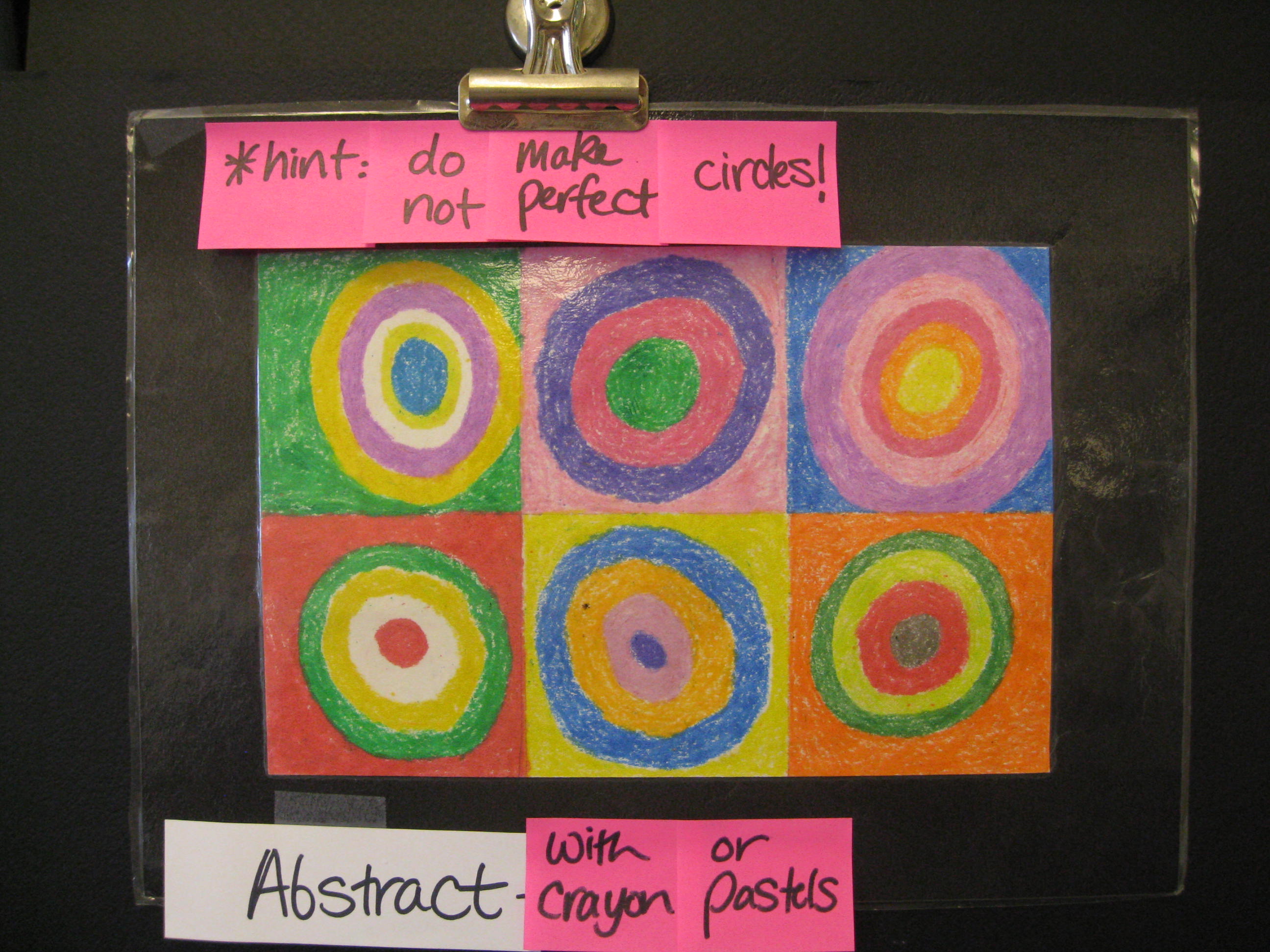
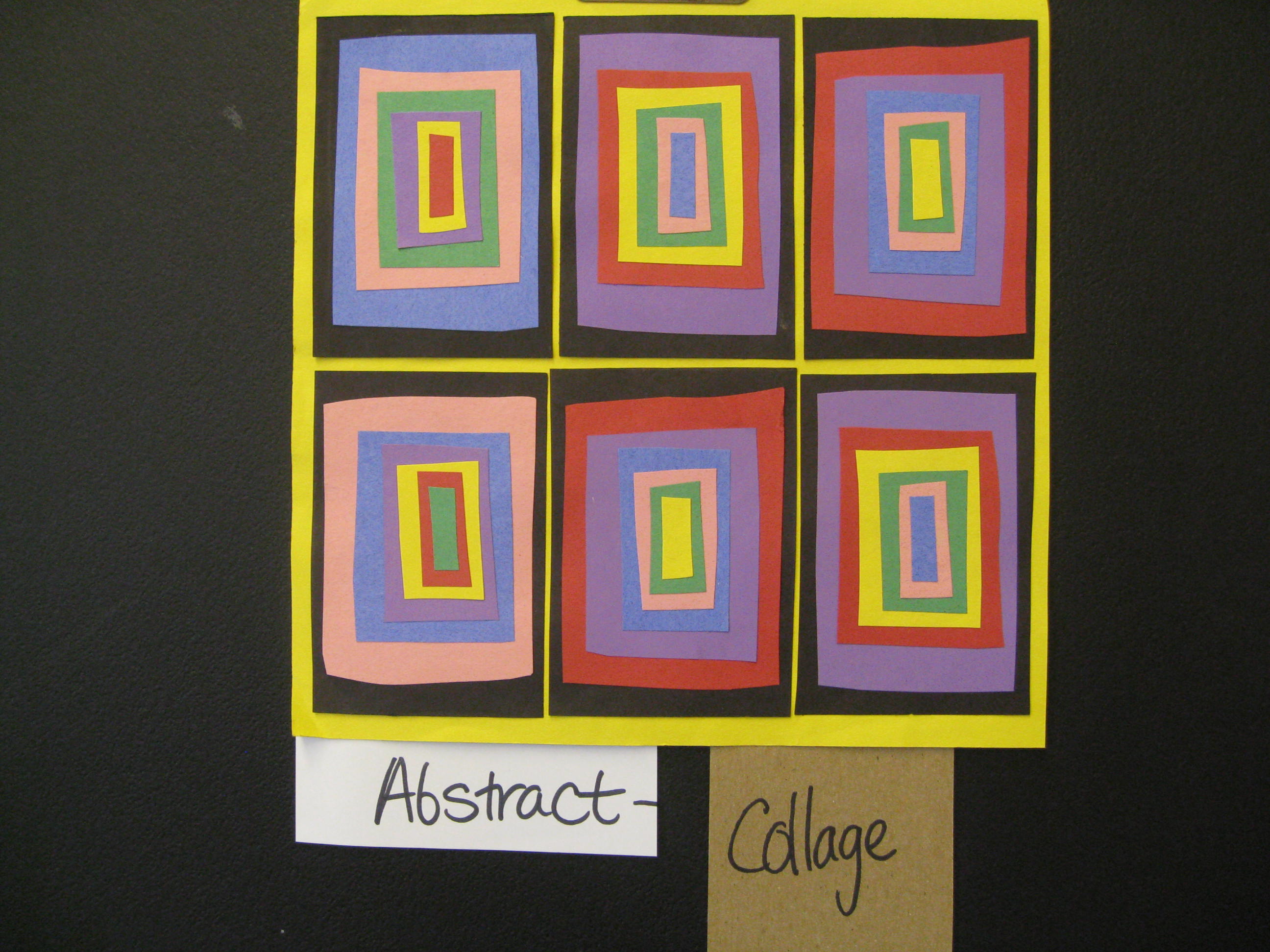
· (K-2) Use construction paper for younger kids and let them paint a large concentric circle with their fingers, using three colors of finger or tempera paint. The ring of circles does not need to be perfect but encourage them not to leave large gaps between the rings of color. Kids paint rings using the following groups of three colors in either primary, secondary, warm, or cool combinations. Using a colored paper to paint on will make possible gaps between the rings less noticeable and add a fourth color to the geometric design.
· Kindergartners can cover their entire paper with a solid color of finger-paint. Place the paint in the center of the paper for them and explain that they need to spread the paint out to cover most of the paper. After the paper is covered with paint, instruct kids to use their finger to draw geometric shapes in the paint. Draw the shapes that they should draw on the board at the front of the room. Include at least a circle, square, rectangle and triangle. Kindergartners are not as familiar with geometric shapes and this painting activity will help them remember.
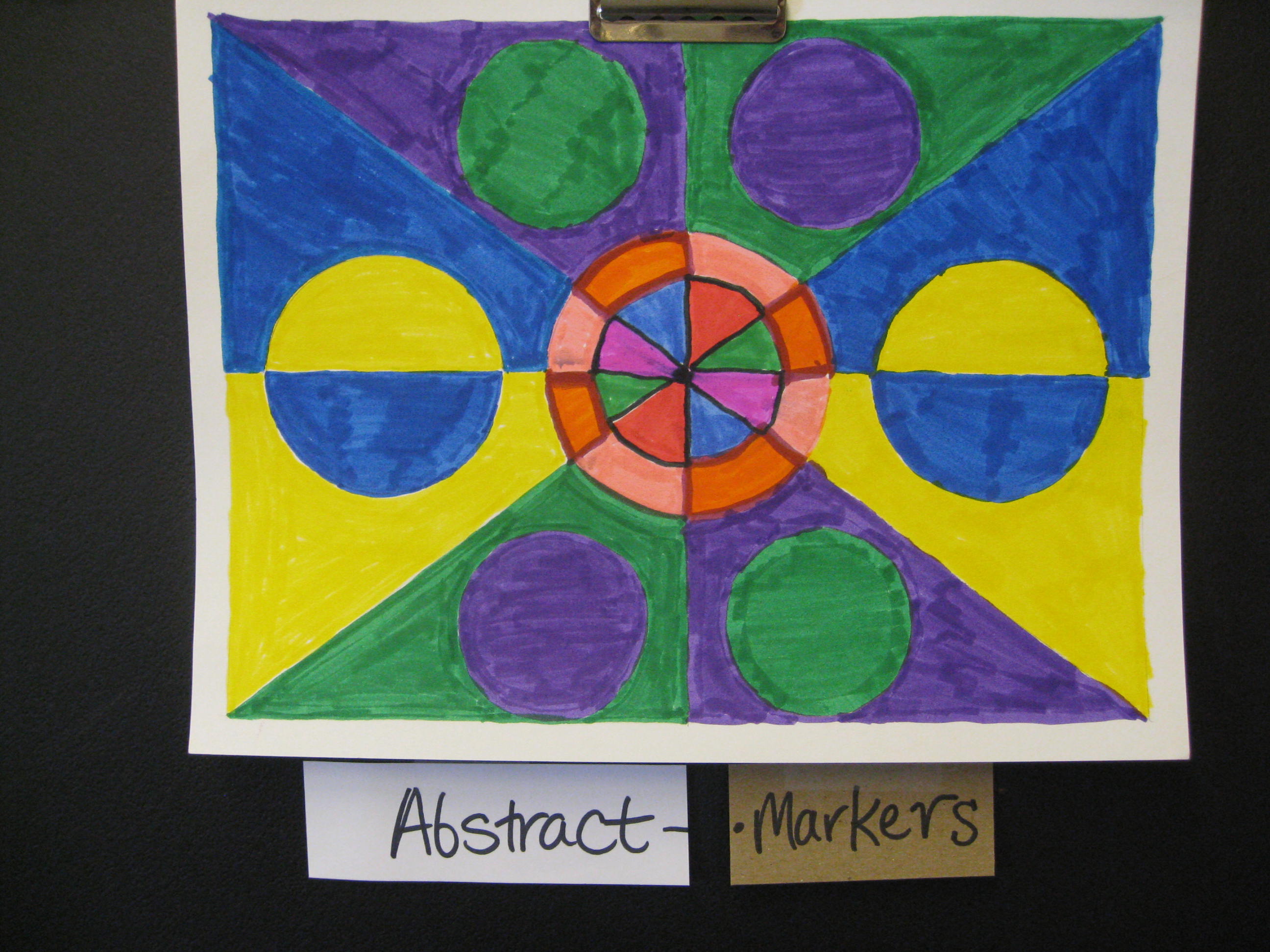
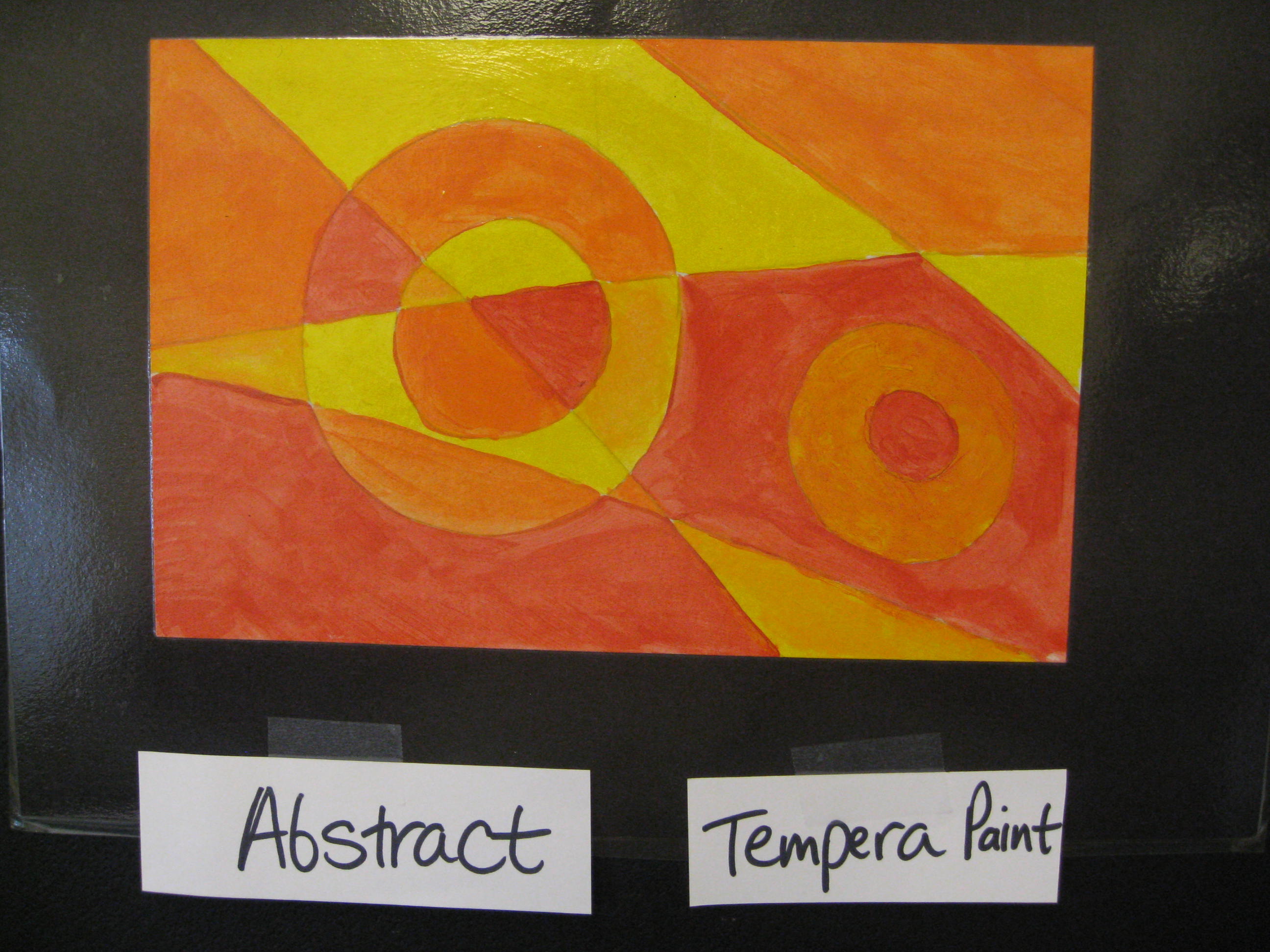
· Use a ruler and a compass to draw a geometric abstract design. Fill the entire page with geometric shapes. Paint the design with bright tempera colors.
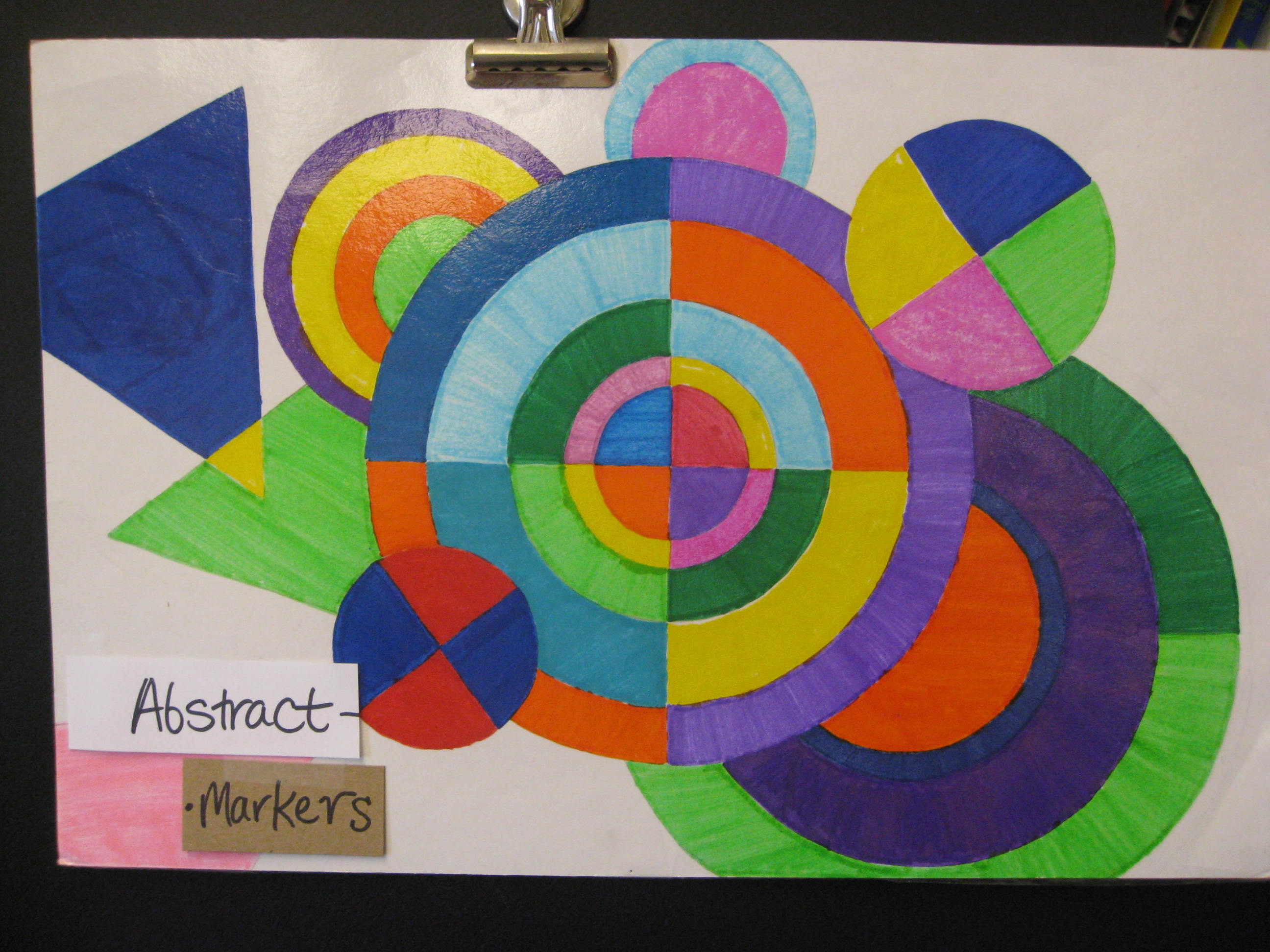
· Use colored paper and various types of bright colored patterned papers to cut out geometric shapes and various quality lines. Glue these to a background to resemble one of Kandinsky’s geometric paintings.
· Create a freehand concentric circle design using graduated sizes of construction paper circles, in a variety of colors. Glue layers together on a PATTERNED wrapping paper, scrap paper, or wallpaper background. Have graduated circles already drawn on various colors of paper for Kindergarten kids to follow the line. This is a great activity for these kids to practice their cutting skills and most kids this age will create somewhat “freehand” circles when they cut.
· Cut a half sheet of white construction paper for everyone. Lead kids in folding this rectangle into 6 even spaces. Review complimentary color combinations. Discuss how these sets of colors sharply contrast when placed next to each other. Discuss the way LIGHT VALUE colors contrast next to DARK VALUE colors. Use heavy pressure to color concentric rings with crayon colors in each square. Challenge kids to use at least 3 examples of two complimentary colors placed together somewhere in their picture. Do the same thing for at least 3 examples of a light value next to a dark value color. When the circles are all colored in, paint over the paper with a single color watercolor wash to color in the white background. Crayons will “resist” the paint and the page will be filled with color. Use only a half sheet or kids will not have time to finish since it takes longer to cover crayon thickly.
· Create designs using concentric TRIANGLES, SQUARES, or DIAMONDS. Explain to kids that CONCENTRIC can be ANY SHAPE repeated within the same shape, which gradually gets smaller.
· Create a marble painting that resembles a nonobjective Jackson Pollock “action painting”. Bring in 4-6 small boxes that are just larger than 9“ x 12”. Fill the bottom inch of at least three small disposable cups with three different colors of tempera paint for each box. You will need one marble and one spoon for each cup. Kids must write their name on the back of their papers before project begins. Lay paper face up on bottom of box. Use the spoon to scoop up a marble in the paint cup and drop it on the paper. Don’t worry about drips or spatters—they make the painting more “Jackson Pollock” looking. Pick up the box and roll the marble across the paper until most of the paint is gone. Drop marble back into the correct color cup. Scoop up marble from the second color cup and repeat the process as before, returning the marble to the cup each time. Lift paper from box after using all three colors to cover your paper with wandering LINES, similar to Jackson’s. Use yellow as a background color. Different colored backgrounds create different effects. What about black? What colors will work best for each different colored background? Just be careful the colors you “drip” are not too similar to the background.
· Create your own abstract version of a “Sea Battle”. How will yours compare to Kandinsky’s?
· Create your own abstract version of “The Moon Woman”. How will yours compare to Jackson Pollock’s?
Wassily Kandinsky
(Vas ah lee Kan din skee)
Born in Moscow in 1866, Kandinsky spent his early childhood in Odessa, which is a city right on the Black Sea. His parents played the piano and the zither (examples of zither are included in sleeve protector to display on classroom screen) and Kandinsky himself learned the piano and cello at an early age. His love for music influenced him a great deal in his art work. He embraced the concept that color and musical harmony are linked. He said, “Color is the keyboard, the eyes are the harmonies, and the soul is the piano with many strings. The artist is the hand that plays, touching one key or another, to cause vibrations in the soul.”
The concept that color and musical harmony are linked has a long history, intriguing scientists since Sir Isaac Newton. Kandinsky claimed that when he saw color he heard music. It cannot be overstated how much music influenced Kandinsky’s paintings, even down to the names of his paintings: Improvisations, Impressions and Compositions.
But Kandinsky didn’t start as an artist. In 1886, when he was 20 years old, he enrolled at the University of Moscow where he studied law and economics. After he graduated, he became a lawyer and got a job at the Moscow Faculty of Law. He was a success as a teacher and wrote extensively on spirituality, a subject that was of great interest to him and influenced his work.
In 1895, when he was 29 years old, Kandinsky went to a French Impressionist Art Exhibition where he saw Monet’s Haystacks at Giverny. He stated, “It was from the catalog I learned this was a haystack. I was upset I had not recognized it. I also thought the painter had no right to paint in such an imprecise fashion…”
This made a big impact on Kandinsky and he decided at the age of thirty, to study at the Academy of Fine Arts in Munich, Germany. From 1896 to 1900, he studied life drawing, sketching and anatomy. His early paintings were created in a realistic, naturalistic style.
Ironically, Kandinsky didn’t understand impressionism and it upset him but eventually his work moved in a direction that was much more abstract than that which was pioneered by the Impressionists. It was not long before his talent surpassed the art school he attended and he began exploring his own ideas of painting – “I applied streaks and blobs of colors onto the canvas with a palette knife and I made them sing with all the intensity I could…”
Kandinsky is considered the founder and inventor of abstract art. His work was exhibited throughout Europe from 1903 onwards, and often caused controversy among the public, the art critics, and even his contemporaries. He had a great influence on other artists of the controversial abstract art movements of the 20th century. Kandinsky and Franz Marc founded “The Blue Rider”, a group of artists located in and around Munich Germany who represented German Expressionism in 1911. Other well known artists were influenced by Kandinsky and joined The Blue Rider, including Paul Klee (See 11. Art of Fantasy, Dreams and Make Believe)
In 1914, at the outbreak of WWI, he returned to Russia. After World War I (1914-1918), Kandinsky’s abstractions became increasingly geometric in form, as he abandoned his earlier fluid style in favor of sharply etched outlines and clear patterns. Composition VIII No. 260, for instance, is composed solely of lines, circles, arcs, and other simple geometric forms. In very late works such as Circle and Square, he refines this style into a more elegant, complex mode that resulted in beautifully balanced, jewel-like pictures.
Kandinsky taught at the Moscow Academy of Fine Arts from 1918 to 1921. In 1922 he came back to Germany and took a post at the Bauhaus in Dessau, a famous art school. In the 1920’s and 1930’s his fame grew and he had exhibitions in Tokyo and New York. With his frequent exhibitions and trips to the USA, Kandinsky helped bring abstract art to this country.
Solomon Guggenheim became one of his most enthusiastic supporters. Guggenheim started a museum in New York, in 1937. It was originally called “The Museum of Non-Objective Painting”. The Guggenheim was founded to showcase avant-garde art by early modernists such as Wassily Kandinsky.
In 1933, Kandinsky left Germany and settled near Paris. The paintings from these later years were again the subject of controversy. Though his art was not appreciated by many of Paris’s artistic community, younger artists admired his work. His studio was visited regularly by Miro (Packet 11. Art of Fantasy, Dreams and Make Believe), Arp, Magnelli and Sophie Tauber.
Kandinsky continued painting almost until his death in a suburb of Paris on December 13, 1944.
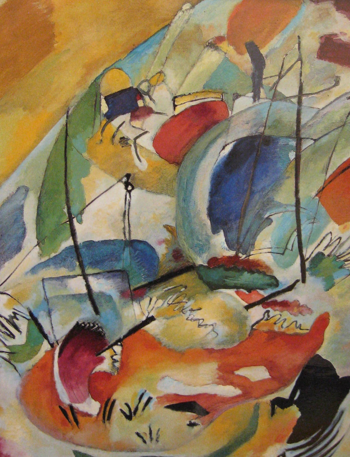
1. “Improvisation 31 (Sea Battle)” by Wassily Kandinsky (Vas ah lee Kan din skee). 57” x 47” Oil on canvas, 1913.
[Before your presentation, visit <www.nga.gov/kids/kandinsky/kandinsky1.htm>. The following dialogue, and additional dialogue on this painting, are discussed and covered there using visual examples. For instance, when the kids are asked to find the ships, you can click on the word and it shows you a version of the painting minus color, except for where the ships are. This site can be displayed on the classroom screen (with the teacher’s permission and help) and the entire discussion for this painting can be done through clicking on specific highlighted words with the mouse. A lot of fun, but you need to be respectful and remember you will be using the teacher’s computer, so discuss this a few days in advance. Be sure to study this presentation well ahead so you are clear on the way you will present this portion. DO NOT ATTEMPT THIS VISUAL PRESENTATION WITHOUT ENOUGH ADVANCE PRACTICE!]
Once we find out from the title that this is a sea battle, it gives us a hint of what to look for in the picture. This abstract painting is based on something real, a sea battle, so the COLORS, SHAPES, and LINES depict an actual, though distorted, scene. Before we look for the scene itself, let’s dissect its parts, or artistic elements first:
SHAPE—In this picture, there are 4 types of shapes that remind us of geometric shapes, but you probably won’t find any that are geometrically perfect. Can you find an oval? A circular shape? A triangular shape? A squarish shape?
Do you think the artist didn’t know how to draw perfect GEOMETRIC SHAPES? No, he painted the picture with loose abstract shapes on purpose. Kandinsky could draw and paint these geometric shapes very well, as we will see in some of his other work today. The artist was more interested in creating a MOOD, or a feeling, with his shapes than he was in making his scene look realistic.
Which of these 4 shapes is the hardest to find?
Which seems to be the artist’s favorite?
LINE—We should be able to find several LINE TYPES. Can you find curvy line? Diagonal line? Vertical line? Can you see zig zag line? To the left, by blue oval shape, and to the far right—zig zag lines represent splashing waves
The term LINE QUALITY means the way a line looks. Can you find a thin line? To the left, running diagonally
Can you find any squiggly line? In the very center area
Kandinsky actually chose his colors very carefully. He believed strongly that every color was like an emotion or a feeling; colors could be happy, angry, or sad. Do certain colors make you happy? What are they? What colors make you feel sad?
Refer to the diagram on the back of the picture so that you can point out the two ships shooting cannonballs at each other. The zig zag lines represent the large splashes created by the cannonballs hitting the water. There are even buildings in the distance.
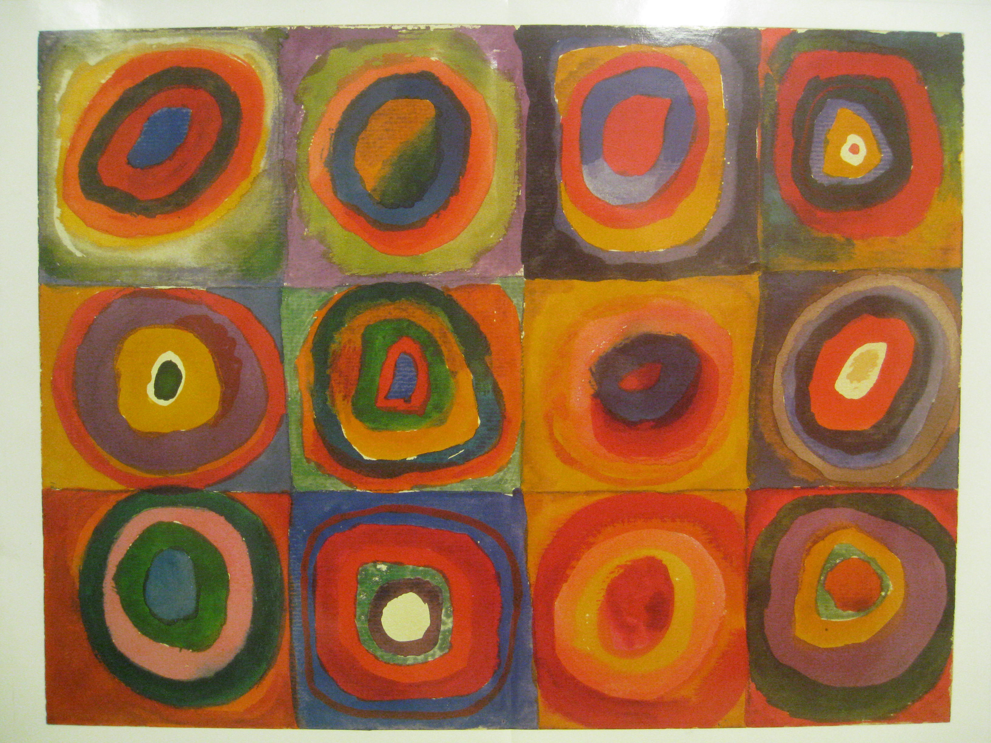
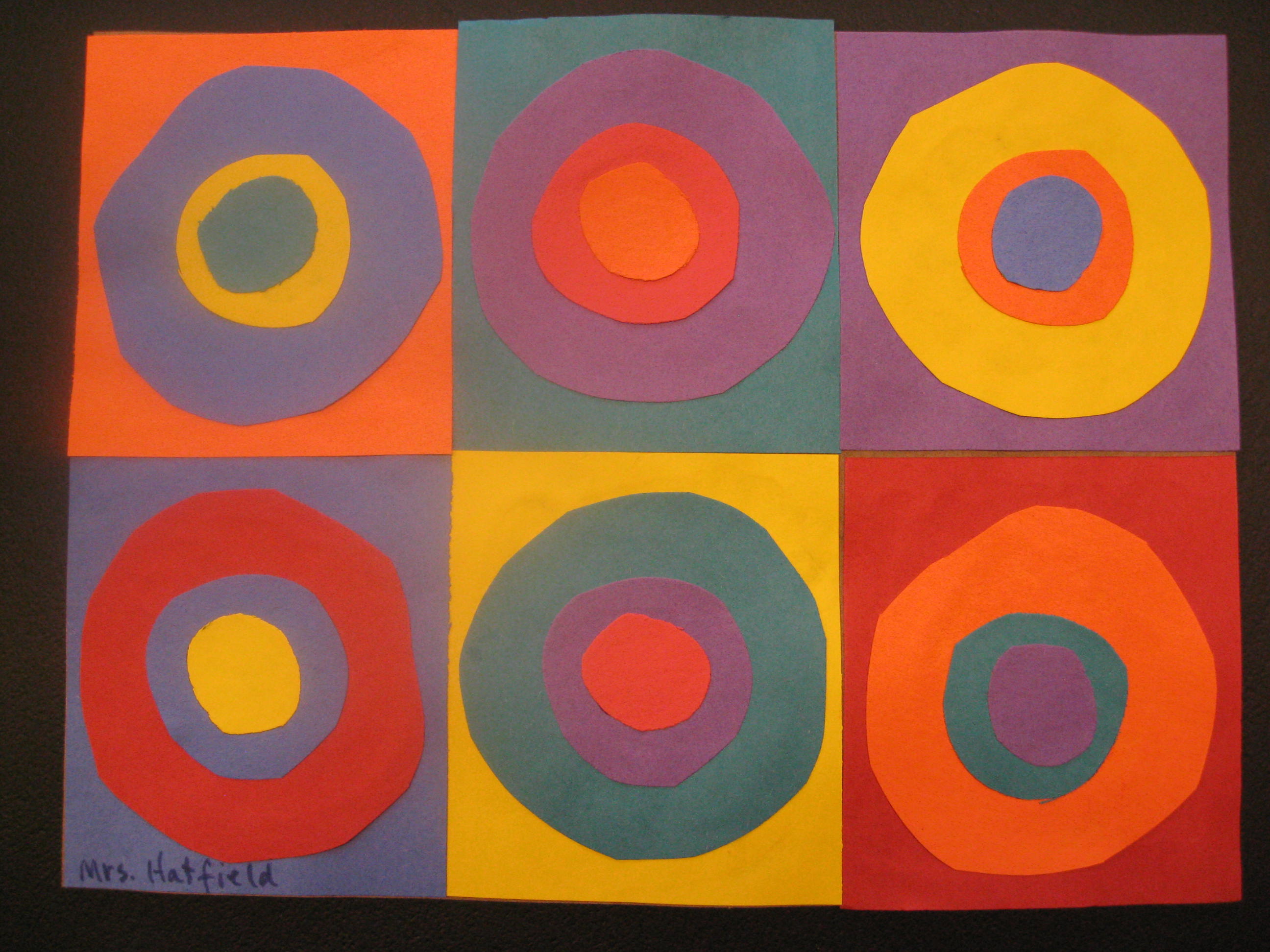
2. “Color Study—Squares and Concentric Circles” by Wassily Kandinsky (Vas ah lee Kan din skee), 1925.
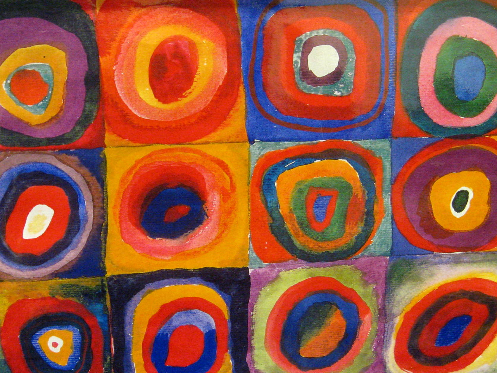
Music became a part of Kandinsky’s visual language. He made his canvases “sing” with an intensity that others could see and hear.
How do different types of music make you feel? Does slow, quiet music make you want to jump and run around? Does marching music make you want to sleep?
Kandinsky’s parents were both musicians. Wassily grew up loving music and became a musician himself. He always felt there was a strong connection between colors and music in the way they could change how people felt. People are usually aware of how different types of music make them feel, but many people often do not stop to think how different colors make them feel. Artists create different MOODS with the colors they choose for their paintings.
Suggested Activity
Consider bringing in at least two different types of music—marching and a lullaby. Give everyone two pieces of paper (or fold one piece in half) and let kids get out crayons, marking pens, or colored pencils. Explain that you are going to play (part of) two different songs. While the music is playing, they are to draw only SHAPES, LINES, PATTERNS and COLORS. The shapes can be FREEFORM or GEOMETRIC, but not organic. (The shapes should not look like anything real.) They are to create an ABSTRACT design, according to the way that the music makes them feel.
Kids will all close their eyes as you begin the music. They are to quietly sit and think about the shapes and colors they feel as they are listening without talking. Instruct them that you will say when they can open their eyes, choose their colors, and begin creating their shapes and patterns. They are to color and draw shapes that express feelings inspired by the music. Does a sudden loud beat of a drum make you think of a zig zag line? Does quiet music make you think of curvy line? Does quick music make you think of an alternating pattern of squares?
This activity should not be used for the art project. Lets kids experiment with the way colors and shapes relate to feelings or MOODS, just like music does. Take no longer than 5-10 minutes.
What type of SHAPES do you see in this picture, GEOMETRIC, ORGANIC, or FREEFORM? What COLORS do you see? What type of MOOD does the painting create? How do the colors make you feel?
A CONCENTRIC CIRCLE is a ring of circles within a larger circle, like a target. Discuss the differences in individual LINE QUALITY of the rings. Where else can you find concentric rings or circles? Logo for Target department store, ripples in a pond
3. “Swinging” by Wassily Kandinsky (Vas ah lee Kan din skee), 1925.
All 5 basic LINE TYPES can be found in this picture—vertical, horizontal, diagonal, curved and zig zag. Ask kids to look for them, one at a time, and point out at least one example of each.
What types of SHAPES do you see here—ORGANIC or GEOMETRIC? Organic shapes are natural shapes like seashells or twigs. There are many GEOMETRIC SHAPES to be found here. How many circles can you find? 7—count them together
Can you see 6 half-circles? Count them together
Can you find more than one triangle shape? More than one rectangle? Square?
This picture is a totally abstract non-objective work of art. In other words, the shapes do not represent anything concrete, or realistic. The work does create a sense of MOVEMENT though.
What did the artist do to create MOVEMENT in this painting? I will give you some hints. Did you know that curved and diagonal LINES and SHAPES help create the illusion of movement?
Do you see any examples of DIAGONAL LINE/SHAPE or CURVED LINE/SHAPE?
Move the tip of a pencil eraser through these areas so they can see the many fluid MOVEMENTS in the organized shapes and lines. (Take time to examine the picture well before you discuss this MOVEMENT with the class. Take time beforehand to find the many combinations of movement here yourself.)
Kandinsky arranged the shapes and lines to move much like the notes on a line of music move. Bring in a sheet of music and project a line of the musical notes on the classroom screen. Move the tip of a pencil eraser along the moving line created by the pattern of notes. Can you see how Kandinsky arranged the shapes and lines in his picture in a similar way?
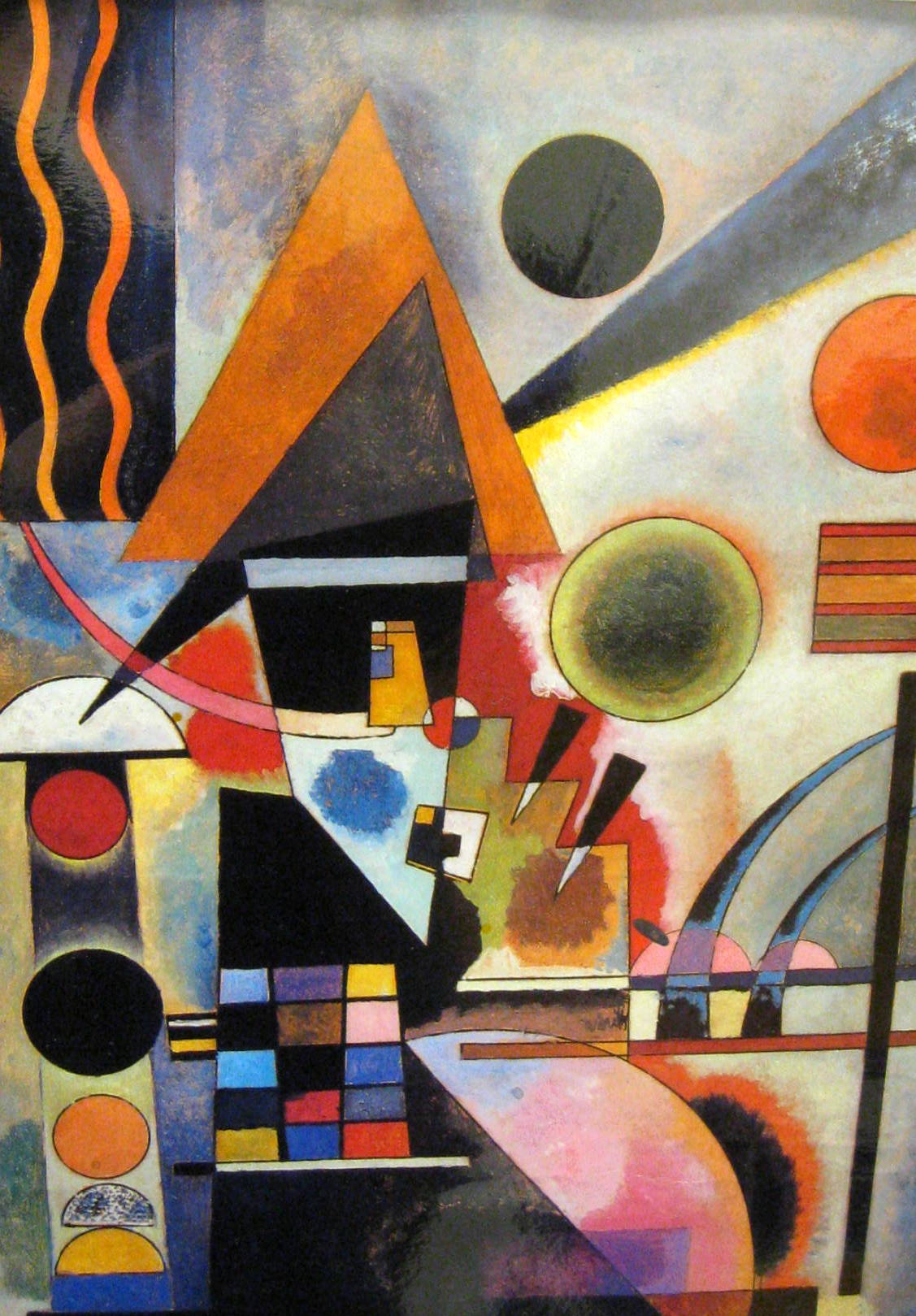
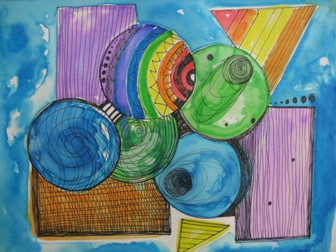
4. “Massive Structure” by Kandinsky.
All 5 basic LINE TYPES can be found in this picture. (zig zag line is created with two diagonal triangle shapes in the lower part of the picture and four very small triangles in the center left) The shapes are GEOMETRIC. Many of the circles have CONTOUR LINE, another word for outline.
(Point out at least one or two of these MOVEMENT examples.) The artist has created MOVEMENT in a different way here than in Swinging. The curving lines in the left corner cause our eyes to move back and forth across them. What is different is the arrangement or placement of the different circles. We can follow the different sized circles like bubbles floating upwards. The placement of the circles might also be similar in look to musical notes moving up and down and across the picture. Can you see any other type of MOVEMENT in the picture? Diagonal lines and shapes also move our eyes. The zig zag steps create movement as out eyes follow up or down. We can move our eyes from the top of the diagonal purple shape on the left, down to the area of zig zags and over the triangles. The blue horizontal triangle shape in the bottom right corner also moves our eyes across it, just as the long, vertical triangle shape on the far right, moving our eyes up to the diagonal line at its widest part.
The title of this painting suggests that it is NOT an example of non-objective art. The title implies that the shapes on the left are purposely stacked together to create the feeling of a “massive structure,” which might (we don’t know for sure) be a tall or large building. Can you see anything in the shapes to the left that might support this idea?
Which area of this picture is POSITIVE? Compare the POSITIVE/NEGATIVE SPACE in the two pictures listed here. Which painting has the most NEGATIVE SPACE? Massive Structure
JACKSON POLLOCK
ABOUT THE ARTIST
Born: January 28, 1912
Birthplace: Cody, Wyoming
Died: August 11, 1956 (automobile crash)
Best known as: “The abstract painter who splattered his canvasses
American painter Jackson Pollock was the leading figure in abstract expressionism, a style that evolved after WWII and changed the history of American painting and modern art.
Jackson Pollock spent most of his childhood in Arizona and northern California, where his father worked as a surveyor. When Pollock was 13, they settled in southern California and largely due to the influence of his oldest brother, Pollock became interested in art. He attended Manual Arts High School in Los Angeles. In 1929 Pollock moved to New York to study at the Art Students League, where he stayed for 2 years. He decided to settle in New York and by 1940 had his first New York exhibition. In 1943, Pollock had his first “one-man” art exhibit at the Art of the Century Gallery in New York. At that gallery he met his wife, artist Lee Krasner. They married in 1944.
During these years, Pollock struggled to find his own style. About 1947 Pollock gave up conventional easel painting and began his famous “drip” paintings. He dripped paint onto canvases using sticks, brushes, and syringes – anything spontaneous. This creative type of painting is often called “action” painting. Pollock would lay his canvas on the floor of his studio. This way he could work from all sides, sometimes even walking through or across the painting. Of his style he’s quoted as saying:
“When I am in my painting, I’m not aware of what I’m doing…the painting has a life of its own. I try to let it come through. It is only when I lose contact with the painting that the result is a mess. Otherwise there is pure harmony, an easy give and take, and the painting comes out well.”
Pollock’s “drip” paintings constitute his masterpieces. These works are generated exclusively by LINE, but the quality of his lines is unique. The ways the lines twist, change color, create an optical web, and even create momentum are amazing.
Another artist, Frank O’Hara, said of Pollock: “There has never been enough said about Pollock’s draftsmanship, that amazing ability to quicken a line by thinning it, to slow it up by flooding, to elaborate that simplest of elements, the line – to change, reinvigorate, to extend, to build…”
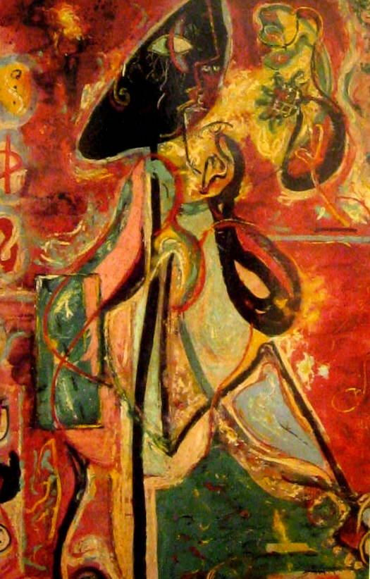
5. “The Moon Woman” by Jackson Pollock (1942)
From 1935 to 1942, Pollock worked for the Federal Art Project (FAP), set up as part of the New Deal during the Great Depression. President Franklin Roosevelt created many types of federal “public works projects” to help unemployed workers earn money to buy food for their families during the hard economic times of the Depression. Some federal project workers were employed improving national park trails or campgrounds. Others workers improved and paved roads. The Federal Art Project supported artists by buying their art. Unfortunately, much of the art that the government bought during this time was put into storage and later discarded.
At its peak, the FAP employed about 5,000 American artists. Pollock was paid $23.50 a week for creating one painting a month—although he was not always able to manage this. Some of the art that he painted for the FAP was rejected. After missing too many deadlines, the FAP fired Pollock.
Suggested Dialogue
Do you think that Jackson Pollock was always a responsible grown up? No
Point out that being an artist is usually a paid job. If an artist is irresponsible about what the paying customer wants or needs, such as a deadline, they might lose their job like anybody would.
This style of painting is ABSTRACT. Because of the title, we can guess that the painting actually represents something. Can your imagination find what represents the subject of the painting (The Moon Woman)? Have the teacher display the picture on the overhead screen so that it is larger for the kids to examine. Do not allow any answers to your question until everyone has been quiet and studying the picture for at least 2-3 minutes. It is surprising how much more you can see when you take extra time to actually LOOK! There are no wrong answers here. Compare interpretations.
What LINE TYPES can you see in the picture? All 5—Horizontal, vertical, diagonal, curved and zig zag
Have kids point out where each was found.
Describe the various kinds of LINE QUALITY you can find. Thick, thin, black, green, red, yellow, heavy, and short are a few descriptive terms that apply
Are there mostly WARM/COOL COLORS in the picture? Warm
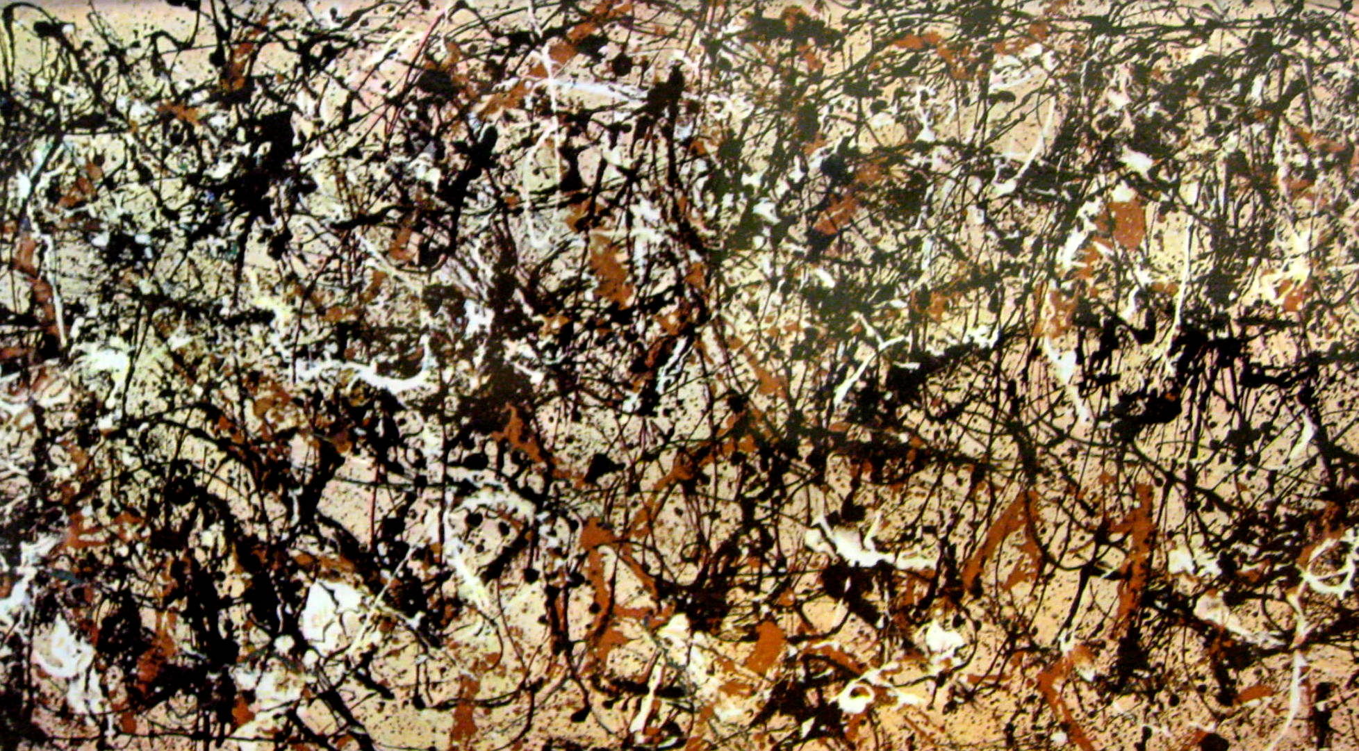
6. “Autumn Rhythm” by Jackson Pollock
Jackson Pollock was the last of five sons born into his family. As a very young boy, he did not seem to be interested in art. His oldest brother, Charles, was very interested in art and seemed to be the talented one. In 1922, when Jackson was 10, Charles enrolled at the Otis Art Institute in Los Angeles. Charles began to send home arts magazines, which introduced Jackson and his brother Sande (the fourth son) to modern European Art and inspired artistic ambitions in both boys. In 1928, Jackson enrolled at Manual Arts High School in Los Angeles. He knew he wanted to become an artist but wasn’t sure what kind of an artist. In a letter to his older brother, Charles, Jackson once wrote, “As to what I would like to be. An artist of some kind.” He also wrote, “…my drawing, I will tell you frankly, is rotten, it seems to lack freedom and rhythm, it is cold and lifeless…” At this time in his art studies, it seemed that Jackson might have been more likely to turn into a sculptor than a painter.
What is a sculptor? An artist who creates three-dimensional art, or sculpture. Sculpture has height, width, and thickness (depth), or FORM.
What kind of art is two-dimensional? Drawings or paintings, which can be measured by height and width, but have no depth or thickness.
The comments that Jackson wrote to his brother seem to indicate that the artist did not like the feeling or MOOD his drawings had. Have you ever drawn something that you didn’t like but you couldn’t quite put your finger on why? Maybe the shapes were okay but possibly the arrangement or the color created a different LOOK than you were trying for. Most artists experience this throughout their careers.
What COLORS do you see in this picture? White, gray, tan (light brown), dark brown
These are all neutral colors.
Black, White, Brown, and Grey are neutral colors. They are not found on the color wheel and they are not found in the rainbow. Black is made by mixing equal amounts of red, yellow, and blue. White is the absence of color. Brown and grey can be made by mixing complementary colors together. They are harmonious with almost any color.
Project Idea
Fold a piece of paper, horizontally, into fourths. Mix three types of neutral color using each of the complementary color combinations (red and green, blue and orange, violet and yellow). Paint each mixed color side by side on the same piece of paper and label the colors used to create them beneath. In the last section of the paper, mix equal parts of the three primary colors to create black.
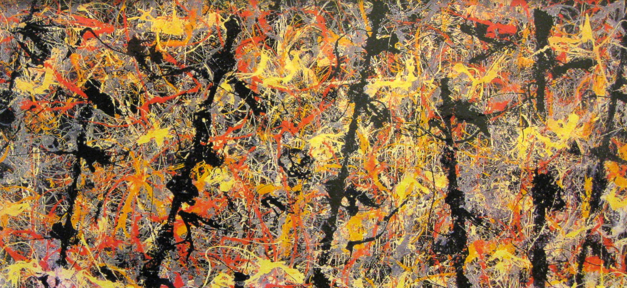
7. “Number 20” by Jackson Pollock, 1949.
Critic Harold Rosenberg coined the term “action painting” to describe Pollock’s way of painting. Jackson also earned the name “Jack the Dripper”. He only felt alive when he was painting and creating. A fellow modern Abstract artist, Helen Frankenthaler, once said this about Jackson Pollock, “I guess he was his truly real self when painting. That’s where he lived.”
During the summer of 1950, Photographer Hans Namuth documented Pollock’s painting technique with his camera. He observed Jackson walking around the edge of his large canvases, laid across his studio floor, pouring, flicking, and flinging paint. He used sticks, trowels, hardened brushes, and sometimes his own hands, to apply his paint. Namuth said of his observations, “It was a great drama—the flame of explosion when the paint hits the canvas; the dance-like movement…energy and motion made visible—memories arrested in space.”
From 1948 onward, Pollock quit naming his paintings. Instead, he referred to them by number and year. Even so, many of the paintings came to be known by popular names. For example, the painting officially called Number 1, 1950, is much better known as Lavender Mist.
Jackson’s “drip” painting canvases were unusually large, averaging from 7-12 feet. Pollock never actually “touched” the canvas with his paintbrush for these paintings.
Since the canvas was so large, how do you think he reached the center of the canvas without stepping on it? Sometimes he stretched or bent over to fling the paint onto the center. His whole body became involved in the act of painting the canvas.
How do you think he reached every corner of the picture? He continued to move around and around the canvas painting until he was satisfied with the painting.
What COLORS did the artist use for this painting?
Pollock did not just “throw” his paint across the painting. The designs were carefully planned so that the twisting, turning lines wove under and over each other. The build up of paint on his canvas was usually thick. This drop painting is a bit unique. The lines are not as thickly layered and you can see a background color under the many lines. What is the main COLOR that you see here? yellow
8. “Blue Poles II” by Jackson Pollock
In 1929, Pollock enrolled at the Art Students League, in New York, where he really began to learn about art from a favorite teacher, the famous American painter, Thomas Hart Benton (1889-1975). Pollock became a favorite student of this teacher. Outside of class he ate dinner at the Benton’s home at least once a week and often stayed at their vacation home on Martha’s Vineyard. “Pollock was a born artist,” Benton once said.
(Check the internet and find a painting of Thomas Hart Benton to display on the overhead screen.) This art teacher paid Jackson quite a compliment with his statement. Compare the STYLE differences of Pollock and Benton.
Is there anything similar in the two artist’s Styles?
Does it seem strange to you that Thomas Hart Benton would be so complimenting about Jackson Pollock’s work?
The LINES of Pollock’s action paintings seem to twist and turn across the canvas. This painting, however, has a little something “extra”. Can you find the DIAGONAL LINES in this picture? They are spaced apart across the picture. Their spacing has RHYTHM. Each line moves up and down DIAGONALLY in a horizontal row across the picture, very much like the musical notes in a line of music. Each line is slightly different from the others.
Do the lines of “poles” look Blue? The blue is so dark they appear black
Describe the LINE QUALITY. What do the lines look like? How do you think the artist created lines that look this way?
What COLORS do you see? Are they mostly WARM/COOL?