2. Gorillas and Crowned Cranes
4. Wilderness Full of Creatures
Packet Extras:

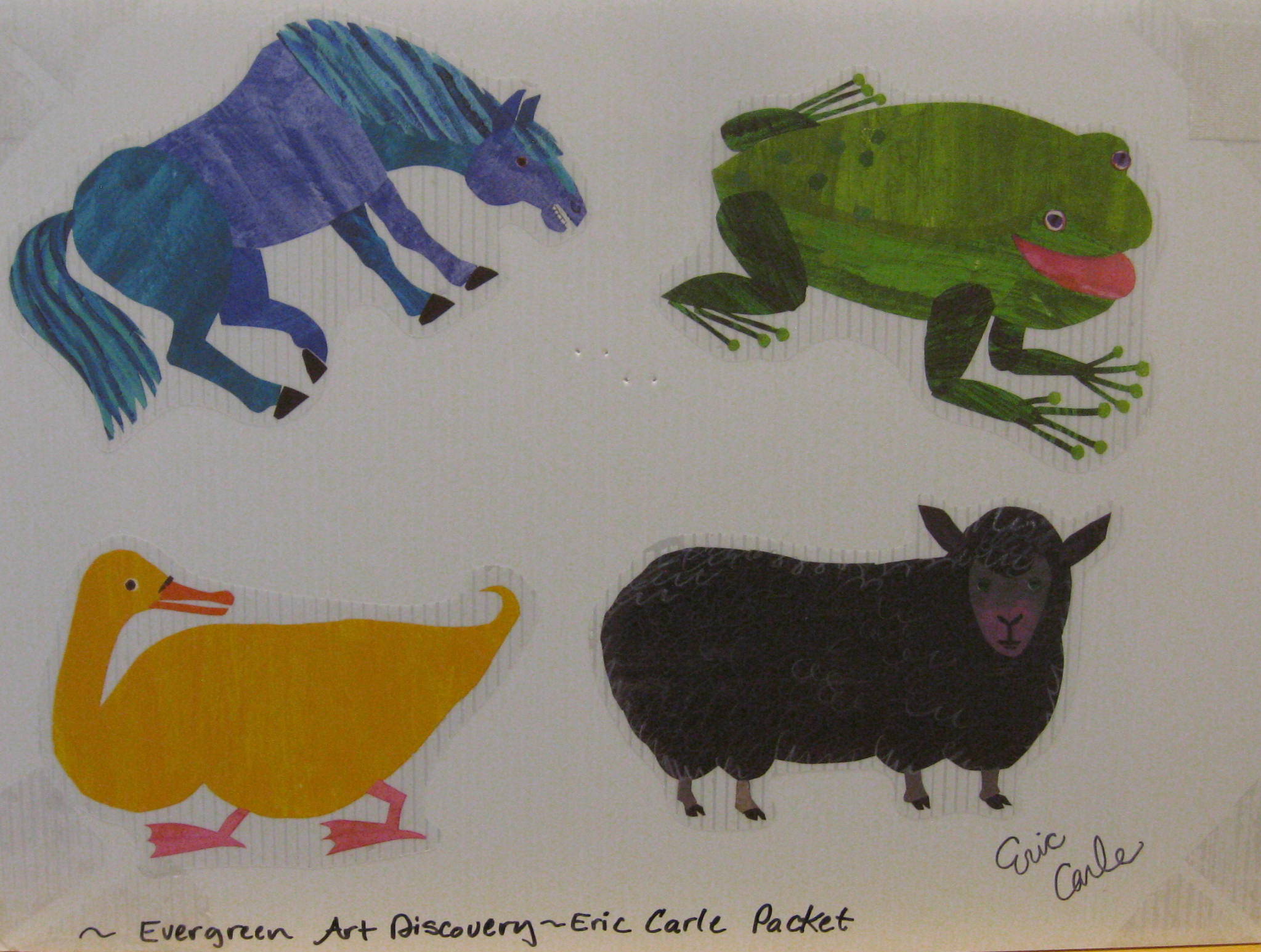
Sample Packets:

A Link to the Eric Carle Museum Website:
http://www.carlemuseum.org/visit/virtual_tour
This packet was created because of a chance find in a trashcan several years ago, at one of the elementary schools in the district. TEXTURE is what makes Eric Carle’s artistic style unique. His medium was at first unpainted, bright tissue paper COLORS. By adding “dabs,” strokes and stripes of paint, the artist intensified a “special something” in his art that caused it to stand out and make his name a household word around the world. The result is unique TEXTURE, PATTERN, simple SHAPES, and bright COLORS to attract both kids and adults.
Colleges now offer classes creatively fostering interest in reading and natural science in elementary grades using Carle’s books. Some teachers within Evergreen Public Schools already use Eric Carle books in a yearly study unit. It is suggested everyone share information with their teacher on the month this packet will travel to your school as early in the school year as possible. Art Discovery Volunteers and classroom teachers (who do an Eric Carle study unit) should work together to enhance the learning opportunity and gain an extra set of hands. The Packet information has a SLIGHTLY DIFFERENT EMPHASIS AND FOCUS than generally used by classroom teachers. A two-part project for this month is highly recommended, if it can be arranged with the teacher.
Art featuring animals is always an interesting subject for kids. The suggested comments are designed to teach and review basic VISUAL ARTS EALRs (Essential Academic Learning Requirements) for Washington State. Information about the animals illustrated is also included but EALRs dialogue is priority. Beginning in the 2008/09 school year, Washington State will assess the Visual Arts in 5th grade classrooms, based on State Visual Arts EALRs. Art Discovery EALR focus enhances success for this assessment.
YOU ARE NOT EXPECTED TO REPLACE REGULAR ART TEACHERS! It will take time before school districts in the state will all phase in elementary art teachers. Even then, focus may be just for 5th grade—who knows? Many school districts in the state that have elementary art teachers already (Vancouver district), ALSO have volunteer Visual Arts programs, giving kids additional exposure to art. ART MAKES YOU SMART; it is a fact! Dissecting and discussing the different parts (elements and principles) of a picture exercises the brain. Opinion questions and comparisons also stimulate higher level thinking skills. Researchers now understand that overall grades in every area of the curriculum are improved with the right exposure to visual arts and music. Many schools across the nation are beginning to figure out the value of visual arts in the school curriculum.
Art Discovery allows elementary kids the chance to enjoy art, while they are exposed to EALRs knowledge (which exercises higher level thinking skills), from volunteers who share this information to the greatest extent they are capable of. (School Art Discovery Coordinators have various informative materials to aid in this goal—please check with yours if you need more help.) By teaching and reviewing a few of these artistic elements each month, you make an important difference in each classroom’s ability to learn. Our kids have had fun and a chance to learn more with Art for years, thanks to the caring parents and community members who have taken the time and challenge of sharing Art Discovery knowledge in Evergreen’s classrooms!
(I am especially grateful for recently graduated Tenay Robins’ valuable contribution in writing information for this new Art Discovery Packet!)
Be sure ALL 6 pictures are returned to the Packet carrier after your Presentation is finished.
Eric Carle
Eric Carle was born in Syracuse, New York, in 1929, to German immigrant parents. At the request of his grandmother, Eric’s family moved back to Germany when he was six years old. As he grew up in Germany, he especially hated the strict schools. As a child, he wanted to build a bridge from Germany to America, so he and his family could return to New York. While in Germany, World War II began and his father was drafted into the army. For the next six years, their family endured many hardships. The Allies bombed Eric’s neighborhood and his father did not return home for many years. Yet amidst the chaos of the war, Eric pursued his love for art with the support of his mother and a high school art teacher. He eventually graduated from the prestigious art school, the Akademie der bildenden Künste, in Stuttgart, Germany.
Seventeen years after he left America, Eric Carle finally returned home to America. When he returned he had an impressive portfolio and just $40 in his pocket. Eric found a job as a graphic designer for The New York Times and later worked as the art director for an advertising agency. When one of Eric’s bright collages caught the eye of children’s book author Bill Martin Jr., Martin hired Eric to illustrate Brown Bear, Brown Bear, What Do You See? In 1969, Carle published his own book called The Very Hungry Caterpillar, a small book that endeared him to generations of children and adults around the world. This book has now been translated into 33 languages and over 18 million copies have been sold worldwide. Eric Carle has illustrated more than seventy books. Many of his books were best sellers and Eric Carle wrote most of them.
Eric believed that writing and pictures need each other. For Eric it is usually the idea that comes first. When starting a book he starts with a “dummy book”. This rough book is eight sheets of paper folded into 4th’s and stapled, to make a 32-page blank book, into which he sketches his ideas. Sometimes it takes many dummy books before the pictures and the story are just right. Eric Carle’s art is distinctive and instantly recognizable. His artwork is created in collage technique, using hand-painted tissue papers, which he cuts and layers to form bright and cheerful images. Sometimes additional colored crayon lines are added to the picture shapes.
The themes of his stories are usually drawn from his extensive knowledge and love of nature. Besides being beautiful and entertaining, his books always offer children the opportunity to learn something about the world around them. It is his concern for children and his beautiful artwork that makes the reading of his books so enjoyable.
How Eric Carle Creates His Art
Eric Carle’s artwork is created using a technique called COLLAGE. Eric first began his collage artwork while he was creating advertising illustrations, which was years before he became a famous children’s storybook illustrator. At that time, Carle used store-bought tissue papers which came in about four dozen shades of color. From these colored tissue papers, he cut or tore out shapes and pasted them down with rubber cement on illustration boards. These creative collages eventually led to Eric Carle’s career as a famous children’s storybook illustrator.
Later, Eric Carle began to paint on these store-bought tissue papers to make them more interesting and add more texture. Unfortunately, over time he discovered that rubber cement eventually discolored the tissue papers and did not permanently glue the paper to the illustration boards. He also found out that the commercially colored tissue was not colorfast and would fade over time.
Since the 1980’s, Eric Carle has used archival quality materials. He creates batches of a variety of painted tissue papers, which he creates on original white sheets of tissue. Eric does not carefully plan the colors he will use or the way he is going to paint the tissue ahead of time. His ideas “sort of happen” as he lays out the sheets of tissue and begins dipping his assortment of large paintbrushes and other painting tools into watercolor, acrylic or poster paints.
Eric Carle first places a single sheet of white tissue paper on a clean surface. He then paints bold strokes of a paint color onto the tissue with one of his large brushes. Eric says that one secret for painting on such lightweight paper is to lift up the tissue paper occasionally for a brief moment so that it will not stick to the surface beneath (the paint easily soaks through the tissue.) When the entire sheet of tissue is completely covered with the first paint color, from top to bottom and side to side, Eric lets it dry on newspapers and moves on to paint other tissues.
After the first color is dry, the artist applies a second color. He may paint wavy brush strokes, polka dots, even messy splatters of paint, whatever the color inspires. After the entire paper is covered with the texture or pattern of the second color, Eric Carle again lifts the tissue paper and moves it to newspapers for drying.
Often, a third color is applied, using a different line, pattern or texture. After this dries a fourth color is sometimes applied. Occasionally the artist uses things to paint with that are not artist brushes, such as a piece of carpet. The piece of painted carpet is used to print a layer of textured or patterned color.
When the painted tissues are finished and dried, they are then stored in flat files, sorted out by colors. These colored tissues are used as a palette for Eric Carle’s bright and brilliant cut paper collages.
Where do Ideas come from?
For the 1990 celebration of International Children’s Book Day, Eric Carle was invited to give a speech at a gathering of librarians and educators at the Children’s Literature Center, in the Library of Congress. This event was established by Ezra Jack Keats, (another children’s book illustrator who also used collage) to encourage creativity in the arts. The following is an excerpt from Eric Carle’s speech:
…”Where do ideas come from?’ is the most often asked question. Indeed, only recently a child asked, ‘Where do ideas come from?’ Unlike the others, however, this letter writer provided me with the answer. Here it is: ‘Some ideas come from the outside, and other ideas come from your inside’.
“What is this outside and inside?”
Can you answer Eric Carle’s question? Can you explain what the girl meant about where ideas come from? Eric Carle understood the girl’s answer, and he wondered if others could also understand—Do you? There are many answers to this question. Carle went on to explain that the experiences of his life affected the way he saw things in the world. He explained that ideas are patched together from feelings and experiences that are unique to every person. Although the artist and author had several sad things that happened throughout his life, he looked for good things, happy feeling things, to create in his art. He explained that painters, musicians, and writers create mainly for themselves and that, first and foremost, his books and ideas were created to please himself.
In a portion of his speech, Eric went on to explain about his inspiration for his famous book The Very Hungry Caterpillar:
”One day I was punching holes into a stack of papers, looking at the holes I thought of a bookworm; however, the bookworm would not yield to be shaped into an idea. So I turned the bookworm into a green worm. When I presented the hungry green worm to Ann Beneduce (Carle’s editor), she liked the concept but not the worm. ‘How about a this?’ ‘How about a that?’ we went back and forth. ‘How about a caterpillar?’ asked Ann. “How about a butterfly?” I shot back. And the book was finished!
One more interesting quote from the speech encourages us to look a little closer at Eric Carle’s pictures. …”Most of my books are done in collage. Collage is nothing new. I did not invent the collage; they have been done by Picasso and by nursery school children and many others in between”.
Can you think of any ideas or subjects that you could use to create a collage like Eric Carle? Maybe some of these pictures have helped inspire ideas from your “inside”, as well as your “outside”.
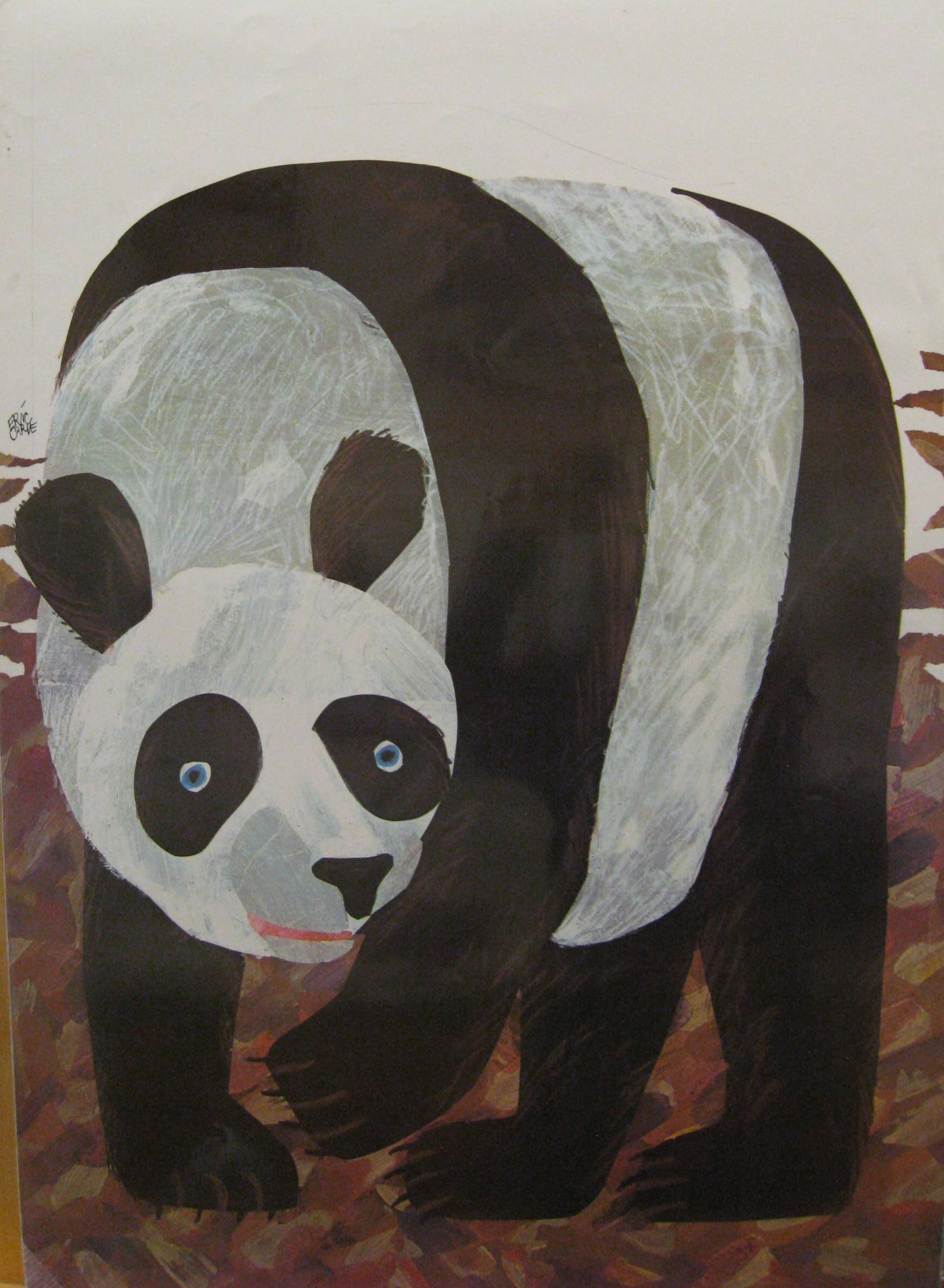
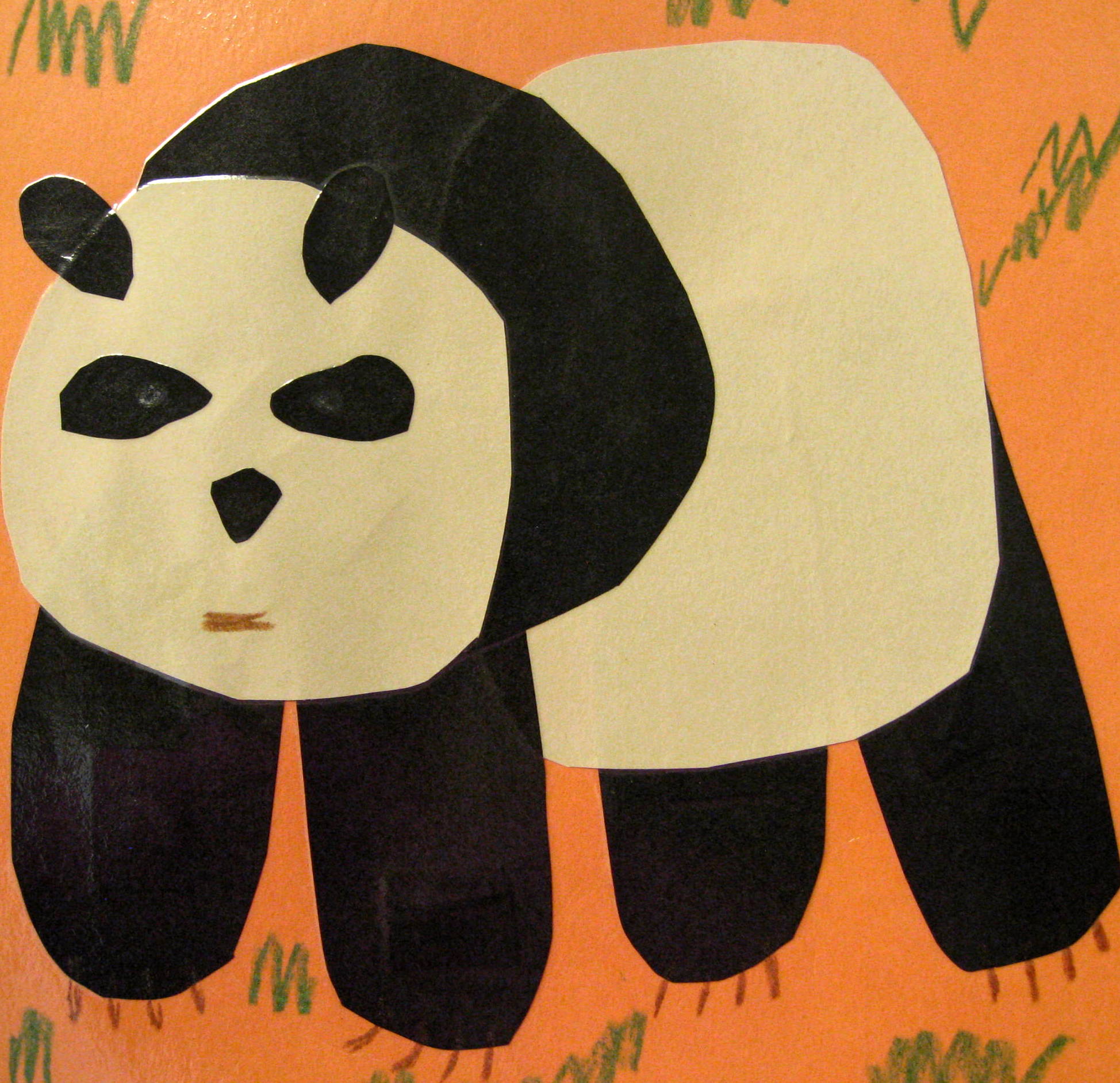
1. A Giant Panda
The panda is found primarily in the bamboo forest between western China and eastern Tibet. There are very few pandas left and little is known about how they live in their wild state. The panda’s main food is bamboo and it has been estimated that he must chew the stalks and leaves for at least ten hours a day in order to obtain sufficient nourishment to survive. Giant Panda’s weigh up to 250 pounds.
What types of SHAPES do you see mostly in this picture? Round shapes, the legs and the mouth are the few things that have straight edges
What COLORS do you see? Mostly NEUTRAL COLORS—black, white, gray, brown (dark, medium, reddish), and tan, the eyes are blue, the mouth is pink
What type of LINE do you see? Curved-claws, Horizontal-mouth, Diagonal-fur on legs
Describe the LINE QUALITY. Thick, white, brown, black, pink
Where do you see TEXTURE? Ground, fur
How did the artist create this TEXTURE? GROUND-dabs of various COLORS, FUR-LINES created with brush strokes and crayon
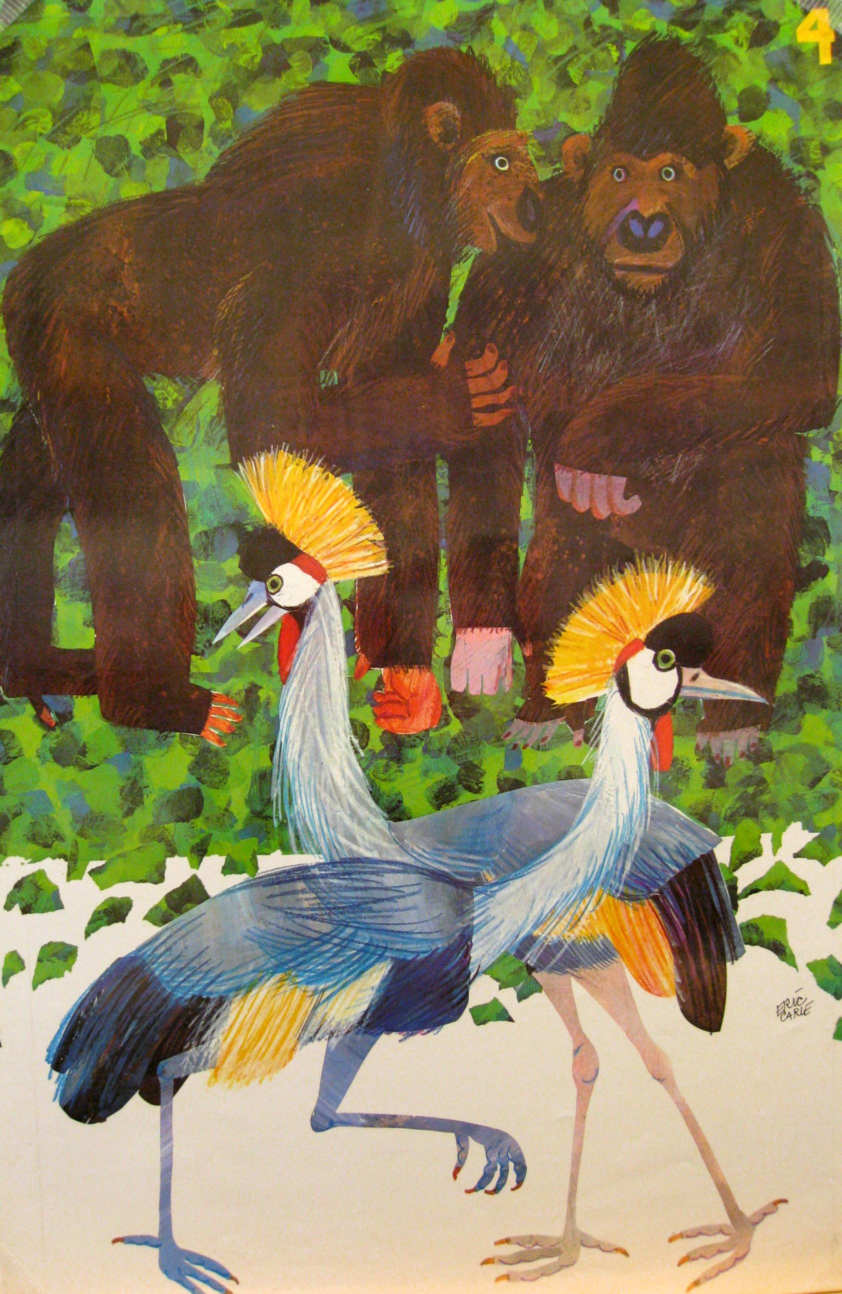
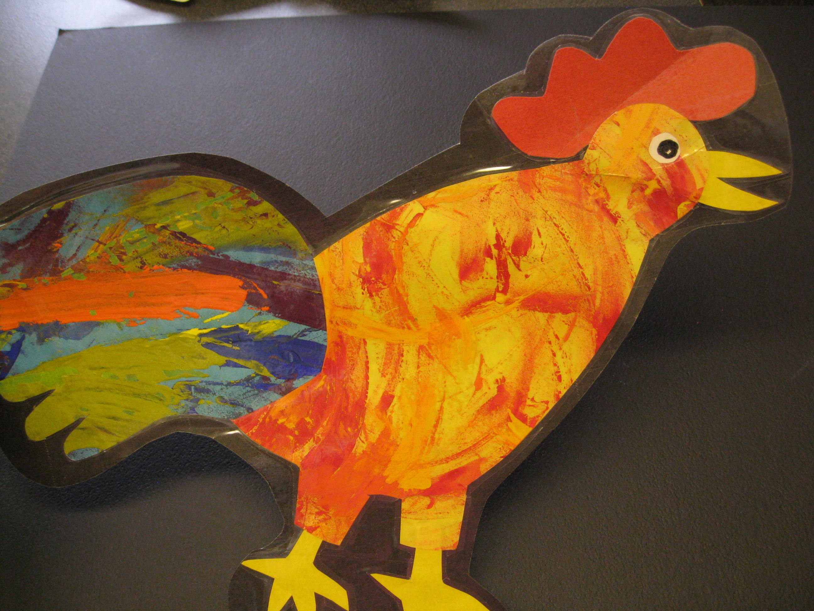
2. Gorillas and Crowned Cranes
The gorilla, the largest surviving ape, lives in the dense equatorial forests of western and west-central Africa. Specimens range up to 6 ½ feet and weigh as much as 600 pounds. They require great amounts of food to sustain their large bodies. Primarily vegetarian, it is believed that gorillas in their natural state spend much of the day eating at a leisurely pace.
Also known as the corn bird, the remaining specimens of crowned crane are found in scattered areas of Africa, from Senegal to Ethiopia, and Uganda. Its American cousin, the whooping crane, was once considered totally extinct. The whooping crane species was as low as fourteen specimens, but due to strenuous efforts by naturalists, it is now rebuilding and it is believed that there are more than fifty specimens today in existence. The sandhill crane is commonly seen in our area.
What type of LINE can you find in this picture? Four of the basic five—zig zag is the only exception. Be sure kids point out where they see each LINE TYPE
What colors do you see AROUND the animals in the poster? Various shades of green, also blue in MIDDLE GROUND and BACKGROUND, white in the foreground
Who can describe the TEXTURE of the green area behind the gorillas? Leafy? Not only are there dabs of various greens and blue, but there are also short, curved lines layered over this painted texture
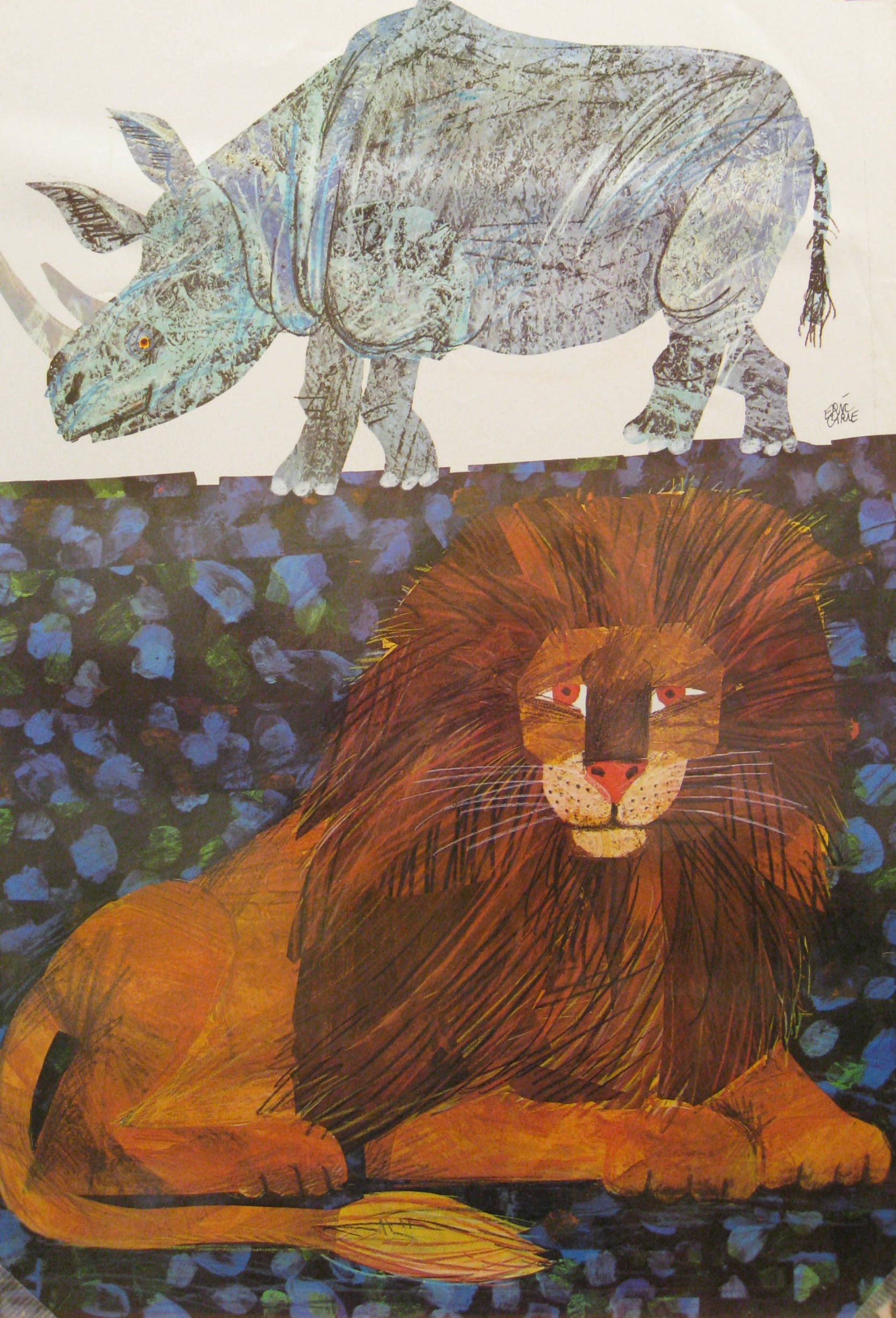
3. Black Rhinoceros and Lion
The black Rhinoceros is actually gray. It lives in the woods of central and southern African. Its horn is erroneous believed to have medical powers and its flesh is edible. Therefore, the animal has been hunted extensively. A black rhino lives on foliage and will often weight as much as two tons.
The lion once lived in southern Europe and the Middle East, as well as in India and Africa. Today there are only about 200 lions left in Asia, all in the Gir Forest in India. The remaining specimens now survive only line east-central Africa. Lions live on the flesh of other animals, killing only what they need to eat. A single meal for a lion may be as much as 50 pounds of meat, but it may not have to eat again for a week. A male lion can measure up to 9 feet in length and weigh up to 400 pounds.
When we first look at this black rhino he appears gray. Gray is a NEUTRAL COLOR that is not found on the COLOR WHEEL. If you look closer at the paper the rhino was cut from, you might see that the artist used a COLOR that is found on the COLOR WHEEL to help create the gray look.
What additional COLOR did he use? Different types of Blue—turquoise and baby blue
The artist used LINE to create some of the blue. The painted paper the artist used for the SHAPE of the animal was drawn on the top, with crayon after the glue dried, to create the details of the wrinkles and folds of his skin. The artist also used white and black crayon for this.
Do you see any other COLORS used for the rhino? His eye is red and yellow
Do you think rhino’s really have eyes this color? No
Why would the artist give the rhino an unrealistic eye COLOR? So that the eye would stand out against (CONTRAST) all of the colored TEXTURE of his body. If he painted the eye a natural color it would not show up to help give his face a little personality.
How would you describe the TEXTURE of the rhino’s skin? Rough, dry, leathery, bumpy
Can you find any SHAPES that look like triangles? Two horns on his nose
Do you see any CIRCLES? His eye and his toes
How did Eric Carle use LINE for the lion? Again using crayon, the shaggy TEXTURE of the lion’s main is created with dark brown and light brown lines drawn over the painted paper. The tip of the lion’s tail has horizontal line. The artist used white horizontal line for the lion’s whiskers. He also drew the lion’s mouth and whiskers with horizontal and vertical lines. There is also a horizon line created with the dark edge of the background.
Where in the picture do you see HORIZONTAL LINE? VERTICAL LINE? CURVED?
Where else can you find TEXTURE in this picture? How did the artist create it? With the artist’s trademark “dabs of color” (as he calls them), seen in the dark background.
Which animal is farther away/closer? How do you know? The rhino stands on a HORIZON LINE (where the sky meets the earth) and is created proportionately smaller. Real lions are much smaller than rhinos in real life.
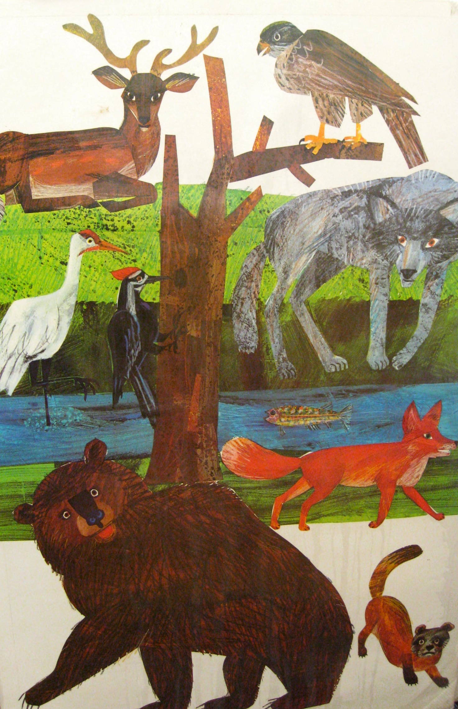
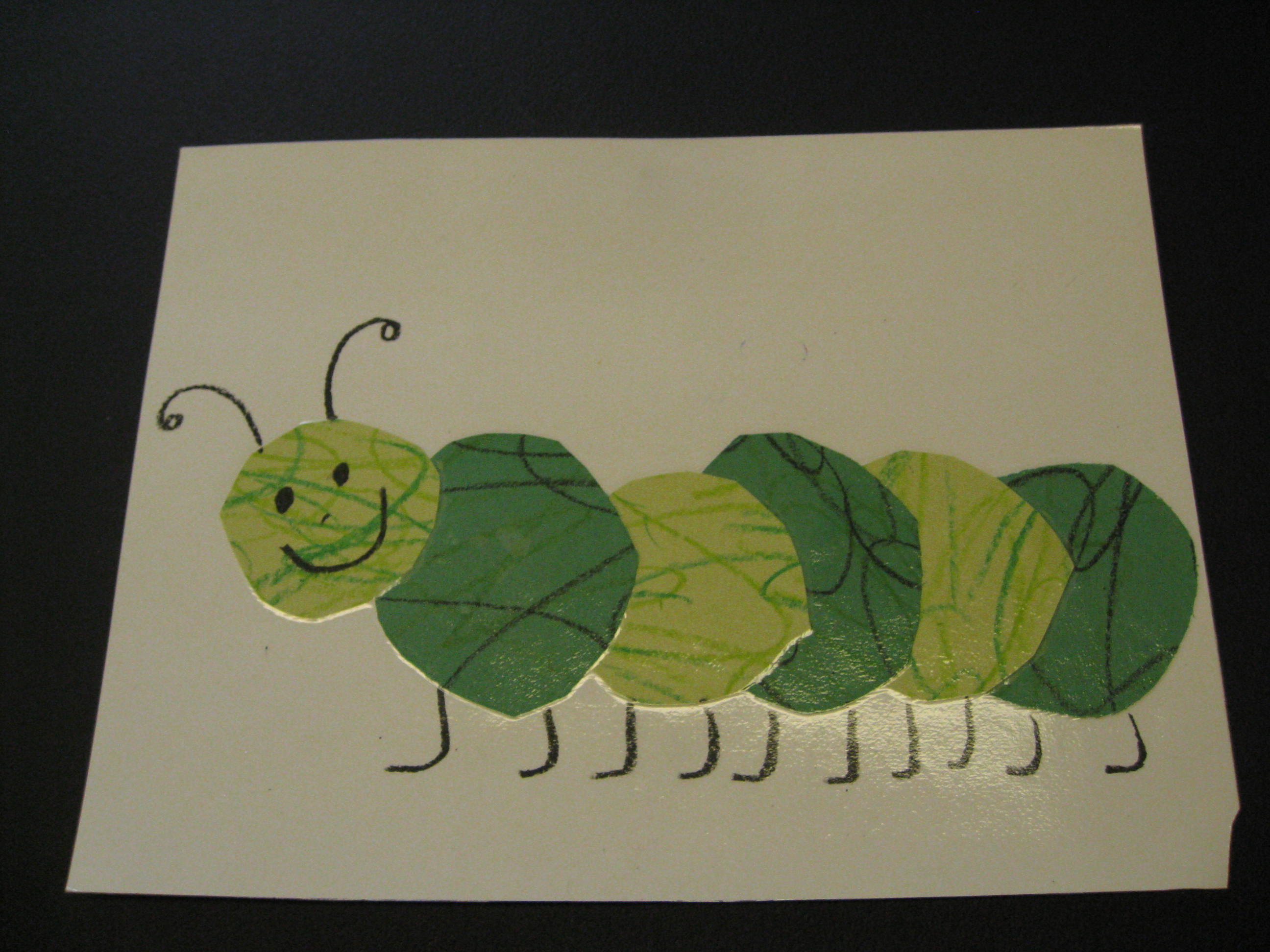
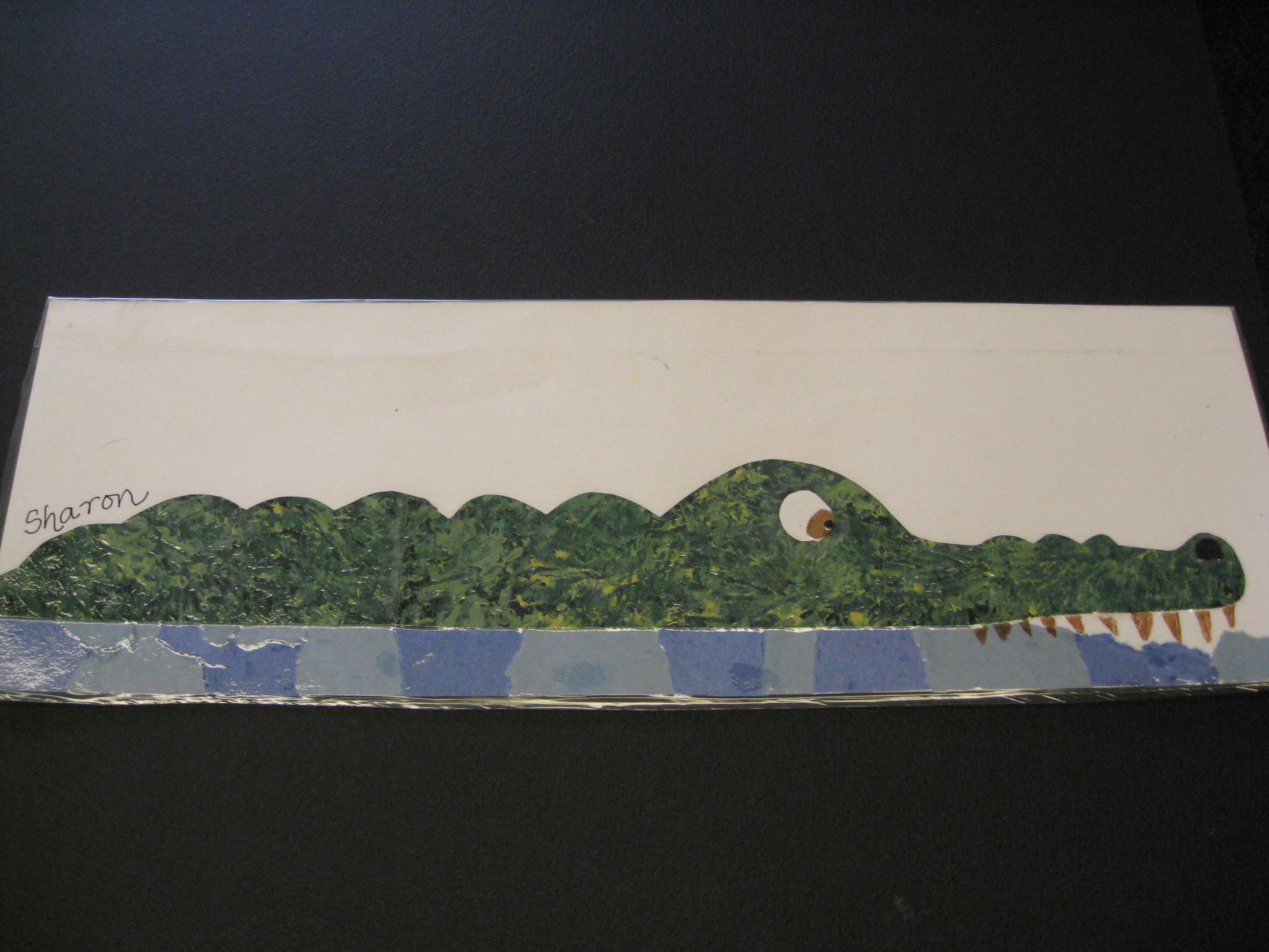
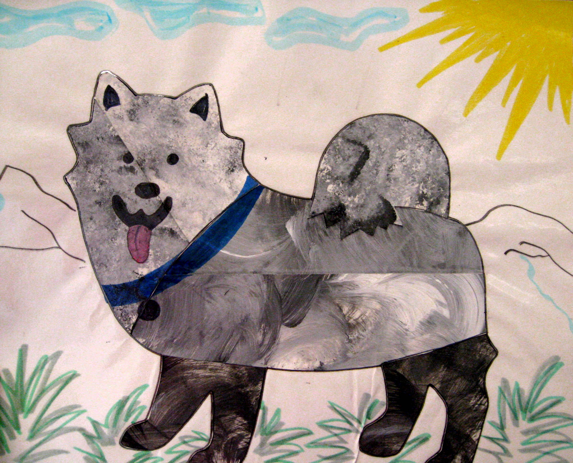
4. Wilderness Full of Creatures
White-tailed deer are found mostly in the United States, although they do roam into Canada and Mexico. The pile of their coats is so full of air that it floats and can be used in life preservers. The species has been overly popular with hunters.
Of all the many species of falcon, the peregrine is the fastest and most versatile and has been trained by man for hunting prey. Nesting as far north as the Arctic tundra, these falcons migrate south in search of food in the fall. Because of the effects of DDT, it is estimated that no more than two dozen peregrines successfully mated and laid eggs that hatched in the United States in 1970.
The whooping crane is a native American bird. Its survival as a species was once considered a lost cause in that there were only fourteen counted in the United States. Due to rigorous protective measures, it is now believed that there are over fifty specimens in existence.
Various species of woodpeckers are found all over the world. Western Hemisphere species are often decorated with crests that are usually a different color from the rest of the plumage. DDT has had a deleterious effect on the woodpecker population in many areas of the United States.
The gray, or timber, wolf once ranged over much of North America, Europe, and Asia, but today it has almost disappeared from these areas. Armed with lethal weapons, man is killing wolves wherever he can. Contrary to popular belief, the wolf does little damage in most parts of the world, but due to its erroneously bad reputation, the species is in danger of being wiped out altogether.
There are many species of trout in existence in many parts of the world. Although most are freshwater fish, some do live in salt water. The pollution of rivers and streams in the United States is contributing to the demise of certain species.
The red fox shown here is named for the glowing color of its coat. Foxes have been heavily hunted due to the belief that their favorite diet is chickens or other domestic animals—which is not true. An occasional fox will attack domestic animals, but most confine their menu to mice, rats, and rabbits.
What techniques did the artist use to create the illusion of three-dimensional SPACE (DEPTH) in this two-dimensional picture? In the center section of the picture, he used HORIZONTAL LINES (stripes) of COLOR to create FOREGROUND, MIDDLE GROUND and BACKGROUND. The PLACEMENT of the top line tells us it is farthest away. The PLACEMENT of the lowest line of green tells us it is closest. The two middle lines represent the MIDDLE GROUND, where most of the action happens in a picture.
Can anyone describe the different LINE QUALITIES of the foreground, middle ground and background?
(Ask a few questions about the animals similar to suggestions included for other pictures.)
Project Ideas
The BEST way to learn about TEXTURE and PATTERN from the project is to divide the preparation of the paper and the creation of the picture into two parts. Discuss this suggestion with the teacher as soon as possible in the school year!
Collect a number of printing tools that can also be used with paint for printing on the tissue paper. Narrow sponge brushes are recommended, not thin brushes. Painting the tissue must be done fast in order to have enough project color variety for the entire class to cut their shapes.
Tissue colors to watch out for (several bleed) are dark and medium value green, and black. Most other colors, if you get them from the district, will not bleed when wet with paint or glue.) Painted pieces of construction paper are easier for younger classes to paint, as well as to cut and glue to a background.
Cut either type of colored paper into manageable 4” x 6” pieces.
Group students to paint different colored pieces at a station with different tools. Example: GROUP ONE creates pattern and texture using 2 different colors of paper and 3 paint colors. Tools for this group may include pieces of sponge, small paintbrushes, and corrugated cardboard squares. Sponge is used to lightly layer two colors over entire paper. Cardboard edges are painted with third color and used to print curvy line patterns on top of previously sponged paint. GROUP TWO uses 2 different colors that are both either warm or cool. Tools for this group could be jar lids, paper towels and small paintbrushes. This group uses one paint color, plus black and white, to create tints and shades of the color (grades 3-5 only). Color is painted on lid edges to print overlapping rings across paper. Paint color is wiped off with paper towel before moving to the next tint or shade to print in the next layer. Each group is creating colors for the entire class to use on the collage project. Build a variety of colors for more choices in collage production. You need a few pieces of neutral color. Use paint brushes or sponges on white tissue, in tints of blue combined with light gray to create dark and light gray fur textures. Use tints of yellow and orange with small amounts of black paint on brown paper to create texture resembling commonly used in collages for background.
- Collect a box with a large variety of printing tools—to help create textures like tree bark or animal fur. Create more pieces of blue and green, as these are the most used colors.
- nylon dish scrubbers
- small blocks of wood with stapled various grade sandpaper
- small carpet squares
- various sized jar lids and/or plastic cups (creates colored rings)
- crumpled bubble wrap
- large foam stamps
- painted corrugated cardboard edges
- large tooth combs
- opened cell sponges
- pencil eraser tips
… And any other items that can be painted and printed on paper to create texture or pattern. Check dollar stores. Kids can share so you only need a few of each item. If each volunteer contributes 3-6 items, the collection will benefit everyone.
Included are two lists that I experimented with last year in several classes. I did not find the perfect solution to make the project flow freely, but each experience helped me collect these few suggestions, giving volunteers a better place to start. Refine suggestions with your own ideas, to hopefully smooth the process for others and include these improvements in the packet idea folder! (Everyone does not need to reinvent the wheel each time.)
The first suggestion was handed out to everyone in a 5th grade class. Each person was to complete every step listed, using in a “round robin” sequence. This was not successful. My theory was that everyone would create “his or her own” unique small pieces. I laid out cardboard drying stations labeled with every student’s name. Unfortunately, space was so limited it slowed the progress. There was not enough time to finish the list, which was included only for the variety of printing techniques suggested.
It was better to have small groups do the same printing and painting techniques on several colors and share these with the group for the cutting project. As you can see, I tried to teach color lessons in the process. Unfortunately, kids did not learn much about tints or shades because of the fast pace. It is suggested that you teach color lesson(s) in projects the previous month(s) and the second type of list could be an effective review.
Keep in mind that lists will vary according to the variety of colors and printing and painting tools used. List is for organization of volunteers only. Do not pass out lists to kids, they get in the way. I handed out one small index card to each 3-5th grade small group, with instructions for the specific colors and tools that particular group would use. Each group worked together to create a stack of colored paper for everyone to use for the second part of the project, making the animals.
- Watch video before beginning collage.
- Mount tissue to white poster board background to create picture collages. 12” squares are a good size. Use dabs of liquid starch to tack pieces in place. When all pieces have been arranged and lightly tacked down, paint all tissue pieces with a topcoat of starch to permanently attach. (This is why you avoid colors that “bleed”.)
- Put small amount of liquid starch in bottom of cup and use like paint. Large, clean brushes work best.
- Encourage kids to cut large subjects that fill most of the page. It is easier to draw shapes on the back of the paper before cutting.
- Cut legs and heads separately so the texture will look slightly different than main body. Pay attention to differences in texture or value (lightness or darkness) as you cut these out.
- When paper is dry, use crayon or colored markers to draw in details such as antennae, whiskers, or claws.
- Solid color construction paper can be used for Kindergarten and 1st grade collages. DO NOT hand out full pages, kids will cut out center and scrap the rest. Cut colors into small ¼ pieces.
- If a collage project seems too overwhelming, kids always like drawing animals too. Have them use colored pencil or crayons so that animal pictures are more colorful.
- Clay animal sculpture is another option. Focus on TEXTURE using toothpick to create “sunken relief” line texture.
Tints, Shades, Lines, Shapes, Pattern & Texture Painting
- Brown: Short line texture created with comb instrument—Mix a yellow gold color to use first. Create short lines, placed close together, in the same direction, to completely cover the tissue. Use one of your browns to go back over the gold lines in the same way, with the same type of pattern.
- White: Mix three different value SHADES of dark gray. Use a thin paintbrush to paint squiggly lines with each gray. A second choice is loosely painting short, straight lines.
- Dark Green: Mix 3” puddle of yellow-green. Print by dipping wadded bubble wrap into puddle. DON’T POP BUBBLES! Set on drying board. After yellow-green dries, print a second time with bubble wrap using a TINT of green (add white).
- Red: Use a line wheel to create a diagonal line pattern with white. Set on drying board. After white is dry, use line wheel to create a vertical line pattern with blue. Set on drying board. When blue is dry, use black to create a horizontal line pattern. Be careful, this one will be tricky because you will have to stop for more paint and try to begin in the same place each time you stop.
- Lavender: Use a sponge to dab purple and create a texture. To get the most texture, dab sponge on cardboard a couple of times before sponging on tissue. After purple dries, use white to create a slightly lighter TINT of purple.
- Purple: Mix white into purple to create a lavender TINT. Sponge lightly to create texture. Use blue to create some kind of dot pattern on this. Dots can be in a random pattern, organized pattern, close together or far apart.
- Light Blue: Use white, blue, and a blue TINT you have mixed to create ring patterns using various sizes of cup edges. Paint edge of cup and print on paper. Rings may be individual, CONCENTRIC (circles surrounding smaller circles, like a target), overlapping or any combination of these.
- Yellow #1: Use a wooden block to print a line texture in at least three areas, using the WARM color orange. Leave yellow dominant.
- Yellow #2: Mix a yellow TINT (add white to yellow) and create a texture or pattern using spiral stamp.
- Light Green: Use green and a dot wheel to create pattern. Use a TINT of green (add white) and a line wheel to create a diagonal pattern over the dots.
- Medium Green: Use a cotton swab and red, yellow, blue, orange and purple to create a dot pattern of your choice. This piece will include ALL of the Primary and Secondary colors.
- Choose 4 additional colored tissues and any tools to create a pattern or texture on each piece of tissue.
Fun with Color, Shape, Line, Texture and Pattern
Cool Color Textures
TINTS: Created by adding color to white in various quantities
SHADES: Created by adding black to color in various quantities
- Lavender: Use a sponge to dab purple and create a TEXTURE on tissue. To get the most texture, dab sponge on cardboard a couple of times before sponging on tissue. Add white to create a slightly lighter TINT of purple. Sponge this over tissue leaving large spaces between.
- Purple: Mix more white into purple to create an even lighter TINT. Sponge to create a TEXTURE. Use a blue TINT to create some kind of dot PATTERN on top of this. Dots can be in a random pattern, organized pattern, close together or far apart. Use pencil eraser to create the dots.
- Blue: Begin with white. Paint the rim of one size of cup and print random circle rings of white across entire tissue. This works best if you paint the rim each time before you print a ring. Next, use a regular blue color (there are two different blues) to paint rim of another size cup and print rings. Now, mix a small drop of blue in the white to create a light TINT of blue and use a different size cup rim, to print more rings across the tissue. (Rinse brushes very well and wipe rim of cut with paper towel each time you change color. Do not to lay your hand on the tissue as you work. Begin on one side of the tissue and print across, moving from top to bottom, to avoid smearing.)
Warm Color (Yellow, red, orange) Textures
TINT: Created by adding color to white in various quantities
SHADE: Created by adding black to color in various quantities
- Yellow #1: Use wooden block and orange to print a LINE texture in at least three areas. Leave large blank spaces between orange prints. Mix a yellow TINT. Use this TINT and geometric stamp(s) to print a pattern on the blank spaces between and/or across the orange texture prints.
- Yellow #2: Use the yellow TINT to create a texture or a pattern with spiral stamp(s). Add a very small amount of orange to the yellow TINT to create a yellow-orange TINT. Use a small amount of this color in your spiral stamp texture or pattern.
- Red: Use the blue texture ball to print texture using only WARM colors. You may also use TINTS or SHADES of warm colors but you must use AT LEAST TWO DIFFERENT warm colors (yellow, orange or red) to create them.
Intermediate (Tertiary) Colors
Primary colors: The only three colors that cannot be created by mixing other colors—red, yellow, and blue
Secondary colors: Three colors created by mixing equal amounts of two primary colors—green, orange, violet (purple)
Intermediate (or Tertiary) Colors: blue-green, yellow-green, yellow-orange, red-orange, red-violet, and blue-violet
SHADE: Created by adding black to basic colors in various quantities
- Green #1: Mix a small puddle of yellow-green (INTERMEDIATE COLOR). Print this by dipping wadded bubble wrap into puddle. DO NOT POP BUBBLES! Set aside to dry. When dry, mix blue-green (INTERMEDIATE COLOR) and print over yellow-green. When dry, mix green SHADE (green + very small amount of black) and print with bubble wrap.
- Green #2: Use the PRIMARY COLORS of red and blue, and the SECONDARY COLORS of orange and purple, to paint a dot pattern with two cotton swabs (one tip for each of the four colors). Use no other tool.
- Light Green: Use the color “PARAKEET” (a very bright and premixed yellow-green) to create a line pattern or texture using your choice of line roller (straight or zig zag). Use only this color. You may use both or just one type of line roller. YOU MUST USE THREE LINE DIRECTIONS—vertical, horizontal and diagonal—across the tissue.