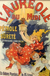
1. L’aureole du Midi by Jules Chéret
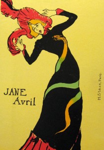
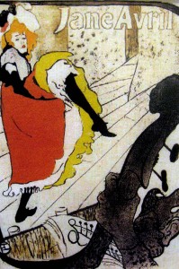
2. Jane Avril by Henri de Toulouse-Lautrec
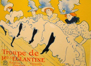
3. Troupe de Mlle Eglantine by Henri de Toulouse-Lautrec
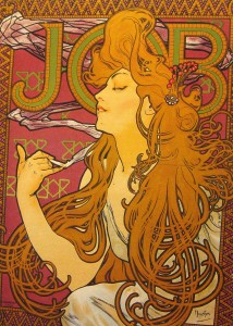
4. Job Papier a Cigarette by Alphonse Mucha
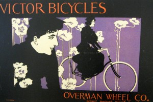
5. Victor Bicycles by Will Bradley
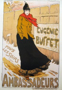
6. Eugenie Buffet by Lucien Metivet
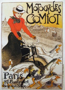
7. Motocycles Comiot by Theophile Steinlen
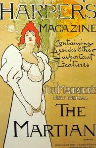
8. Harper’s Magazine by Fred Hyland
Packet Extras:
Sample Projects:
Surfacing in the mid-19th century and reaching its height in the 1890’s, POSTER ART was a new and innovative way to advertise. It literally transformed the boulevards of Paris and other major cities into the “art gallery of the street.” The objective of this art type was to attract attention and create a desire in the customer to attend a play, read a magazine, or purchase a product. All of these posters include the elements of LINE, COLOR, and FOCAL POINT. The elements of LINE and COLOR are the principle elements used by artists to create a FOCAL POINT.
Most of these posters use all 5 LINE types: vertical, diagonal, horizontal, curved and zigzag. Compare/contrast the use of LINE in each poster and discuss how lettering plays an important role in the art.
Only 2-3 COLORS are used to create these posters. Discuss how the artists make use of COLOR VALUE, HUE, TONE, and INTENSITY to draw our attention.
Compare/contrast how advertising is the same/different now. Discuss how the posters use attractive women as the FOCAL POINT to draw our attention. In JOB PAPIER A CIGARETTE, for instance, the attractive woman is the FOCAL POINT of the poster as opposed to the cigarette, the product advertised. The customer is misled to think it’s attractive to smoke.
Special Thanks to Ann Powers for her help with this Packet.
Make sure ALL 8 pictures are returned to the Packet Carrier after your Presentation is finished!
Project Ideas
Packet 19. Jane Avril poster and coloring page
A Brief History of Advertising
Advertising is calling something—a candidate, an idea, or a product—to the attention of the public. Thousands and thousands of advertising agencies help business groups and individuals get their messages across to their intended audiences. Trained artists use their skills and knowledge or the elements and principles of art to capture the public’s attention. Artists that draw or paint for advertisements are considered commercial artists. Advertising is a way to sell, inform or promote a product, an idea, or a person.
Many people believe advertising plays a very important role in supporting the world’s growing economy. Some advertising analysts claim the average person is bombarded with more than 1,800 advertised messages every single day.
Suggested Dialogue
Can anyone think of some of the places we can find advertising today? Television, radio, newspapers, magazines, internet, sports games, billboards, mailings
Tomorrow, try to keep track of all the advertisements you see and write down your total. You will probably be surprised, or completely lose track, there are so many you may not have even noticed before!
One of the very first forms of advertisement, thousands of years ago, was the Town Criers. Criers would holler out in the town market place, a list of the specific things that merchants were selling. Criers in Ancient Babylon, for instance, called attention to the slaves, animals and other wares that were available from Greek cities.
As advertising evolved, tradesman and shop owners hung signs over their doors, illustrating with a picture what goods and services they had for sale. Most signs were only pictures because the majority of people couldn’t read. As more and more of the populations learned to read and write, written advertising became more common.
Written advertising was used by the Ancient Romans, who created a wall that was divided into white-washed rectangles. On these surfaces, a Scripter, or writer, wrote advertising information with charcoal. Sales, services, and festivals were advertised in each rectangle. Whenever there was an empty space on the wall, a new advertisement would appear. Some of the things advertised were events like plays or circuses. Announcements admiring the qualities of popular Gladiators have even been found on the ancient walls of Pompeii. Early scripters eventually began adding color to their wall advertising, to make them more “eye-catching”.
The invention of the printing press, in 1450, helped advertising expand even more. In 1480, the first known printed advertisement was a flyer. A flyer is a printed advertising page that advertises a single product, person or business. This first printed advertisement was made in England and it was advertising a book that was for sale. Flyers are often sent by Advertisers through the mail, or found at stores carrying their products today. Eventually advertisements began to appear in newspapers. The first newspaper advertisement offered medicine for sale. Magazines began to sell, and continue to sell advertising space today, which helps pay the employees who do the work to put the issues together.
The spread of lithography in the earlier nineteenth century created the poster industry as we know it today. Lithograph Posters first began to emerge in the 1850’s, and this began what remains as the most decisive revolution in the history of advertising. Until then, advertising for everyday things like books or chocolate was gloomy and very proper. Most advertising consisted almost exclusively of the written article and only a small picture of the object being advertised.
Jules Chéret was an artist and printer, living in Paris, who was one of the first to realize that people were attracted to color, laughter and simple, direct images. Chéret began designing posters that people responded to and in no time, other Parisian artists and printers began to follow his ideas. Posters were designed to attract attention and to carry a message attractively and persuasively to even the most casual viewer. Posters were most importantly a means to communicate, rather than an expression of an artist’s feelings. They usually contained both pictorial and written elements; and in a successful poster, the drawn image and the written word were well balanced, to produce the best possible effect and communicate the information clearly to the viewer. Jules Chéret understood these basic advertising concepts and has come to be recognized as the “Father of the modern poster”.
The decades just before and just after 1900 not only saw radical advances in technology, industry, and mass communications, but were also a time of massive economic and political changes. This period marked the beginning of the popular age, when the strict division of social classes began to break down. The power and wealth of the common man, or the general street population, grew very great during this period and with it came a new economic market. Partly in response to this market, a new focus for art developed. Paintings showing everyday people in relaxed poses, doing everyday activities, or Genre (jon ruh) scenes, began to find more favor than the formal, elegant creations of the French and British Artistic Academies which had, for hundreds of years, been the measuring tool for good art. The new art form of the poster was almost entirely concerned with everyday subjects. These bold, colorful advertising posters had widespread appeal to every class of society when they first appeared. Today, they remain popular and are definitely considered to be rare works of “Art”.
DEFINITIONS
ART NOUVEAU
The new art that spread across Europe in the 1890’s and tried to integrate designs into all aspects of daily life. As a style it is characterized by flat patterns and natural curvilinear floral and vegetable motifs. These design motifs were carried to all areas of design: textiles, wall papers, Tiffany and Lalique glass, the architecture of Gaudi and Endell, posters, and book illustration. In Germany, this style was called JUGENSTIL, after the magazine JUGEND (Youth), which was first published in 1896. In Spain, Art Nouveau was called MODERNISSIMO. It was an international style and for all its superficial romanticism, a modern one. New materials, such as glass, iron and steel were used to create objects based on organic shapes and curving lines.
ART DECO
A style named after the Great Paris Exposition – the International Show of Art and Industry – in 1925. It was a successor of Art Nouveau and exercised the use of luxurious materials such a lacquer, bronze, ivory and ebony. In contrast to the materials used, it stressed very simple, massive forms.
IDEAL or to “IDEALIZE”
Creating an image that is so perfect in its execution that has a beauty beyond realism.
LITHOGRAPHY
A type of surface printing. It is usually executed on a stone, but today zinc is the medium commonly used. The drawing is done with a greasy crayon and then the stone is wetted. When the greasy ink is rolled on to the stone it does not stick to the wet part, only the parts of the design that area also already greasy. When lithography was invented in the nineteenth century it was taken up by Delacroix, Goya, Daumier, Manet and many other artists of the time. In America, Currier and Ives used the medium to become “engravers to the people” by producing these inexpensive prints in larger quantities, for the first time allowing second class society the luxury of Art in their homes. It was the first technique to offer almost unlimited prints in both black and white, as well as color.
GENRE (JON RUH)
Artistic scenes featuring the everyday activities of ordinary people.
1. “L’AUREOLE DU MIDI POSTER” (1900) by Jules Chéret (b.1836 – d.1932)
ABOUT THE ARTIST
Jules Chéret is considered the father of the modern poster. Born in Paris, he studied lithography, which was, at that time, a new, more economical method of reproducing colored designs. His research into this revolutionary process took him to London where he remained until 1866. He then returned to Paris and set up his own shop where he began printing theatrical posters in his remarkably innovative way. He changed the history of advertising! Chéret used these lithographic techniques to create lively, moving images. His sense of design, his freehand style, and his ability to smoothly incorporate written messages into his pictures were skills that combined to produce posters that attracted immediate attention and interest.
Like Toulouse-Lautrec after him, Chéret was influenced by the Post-Impressionists and by Japanese prints, with their prominent dark outlines and flat color (without shading or highlight). He used more detail, and depicted inviting scenes of figures caught in mid-action.
ABOUT THE ART
This poster advertising lantern oil certainly doesn’t seem as boring as we might think lantern oil might be. That is the genius of Chéret, the poster artist. He captivates us with the colorful dress of the young girl, who appears to be leaping up with joy, holding the lantern. Notice how the lantern lightens the dark space in the background. Her body language makes the lantern the FOCAL POINT of this poster, bringing our eye up to the beautiful lantern, making the customer want to immediately go out and buy the oil advertised in the poster. The COLOR and MOVEMENT of the poster make it eye-catching and fun to look at.
SUGGESTED DIALOGUE
How does Chéret draw our attention? By his use of COLOR. The bright red polka-dot dress catches our eye (FOCAL POINT, CENTER OF INTEREST). The MOVEMENT of the young girl also brings attention to the lantern she is holding.
What’s important about the background of this poster? The background is black, showing us how important it is to buy the oil so we can have light.
How many COLORS were used to make this poster? Only three: red, black, and yellow. It is a very common practice to only use 2 or 3 colors in different VALUES to create posters or advertisements, even today. More colors usually mean more expense for the advertiser.
PROJECT IDEA
Create a poster advertising something we might consider boring but necessary, like gasoline or batteries. Try to make it appear interesting and exciting, like Jules Chéret did in this poster. This could be an opportunity for kids to do a SELF-PORTRAIT, making themselves the FOCAL POINT of the poster, similar to the girl shown here.
2. “JANE AVRIL POSTER” (1899) by Henri de Toulouse-Lautrec
ABOUT THE ARTIST
Count Henri de Toulouse-Lautrec (1864-1901) was born in Albi, France in one of the castles of his ancestors, the Counts of Toulouse. He was a delicate child, but led a normal life until he was fourteen. Then, in minor accidents, he broke first one thighbone and then the other. The bones did not heal properly due to a rare bone disease and when he could finally walk again, he had a normal torso with abnormally stunted legs. Lautrec’s crippling illness forced him to become an observer rather than a participant in life. He chose to observe the life of the crowd in cabarets, music halls, theatres and circuses. Lautrec excelled in the art of lithography.
ABOUT THE ART
Large flat areas of color, an instantaneous Degas-like pose, and brilliant color are combined in this poster with Art Nouveau decoration. The Art Nouveau decoration is evident in a coiling snake that emphasizes Avril’s tiny waist and slim figure and is in itself so alive that it seems ready to strike. The objective of a poster is to attract attention. This one holds our attention completely through its simplified form, its obvious statement, and its contrast of black, bright yellow, Nile green and crimson.
In the late 1800’s, brightly colored posters were a new and exciting way to advertise. A poster that was designed well enough to attract attention could create a singer or dancer’s career. Of Henri de Toulouse-Lautrec, Jane Avril was quoted as saying: “Without a doubt I owed him the fame I enjoyed from that very first moment his poster of me appeared.”
Curving LINE and SHAPE help create a feeling of MOVEMENT and action in a painting. Diagonal LINE assists this MOOD of excitement and action. Lautrec’s bright curving feathers, at the top corner of the picture, start the viewer’s eye down the curving, and angled SHAPE of Jane Avril. The curving LINE of the snake pictured on her dress leads the eye to the entertainer’s name, then down to the bottom of the picture, in a diagonal direction. The dramatic CONTRAST of the dark dress focuses attention on the curving snake. This poster’s simple design, with its extremely minimal background detail, attracts attention well and, according to what is understood about the science and psychology of advertising today, probably was a major contribution towards Avril’s fame.
Project Idea
(K-1) Using this poster for a guide, cut out several curved lines, approximately 2 ½” x 14”, with the shape of a snake’s head at one end and a tapered tail, from large 18” x 24” white construction paper or tag board. (Make a pattern first.) Kids can color or paint this snake, maybe even add a tongue, and glue to a CONTRASTING black background. Paint snake with bright, Expressionistic COLOR and PATTERN.
3. “TROUPE DE MLLE EGLANTINE POSTER” (1896) by Henri de Toulouse-Lautrec
ABOUT THE ART
This is another Parisian Cabaret poster. In 1896, the troupe of Eglantine Demay appeared at the Palace Theater in London. Lautrec designed the poster showing the group’s four members: Eglantine Demay, Jane Avril, Cleopatre and Gazelle. Interesting names, aren’t they? Using a photograph as a starting point, Lautrec painted the dancer’s flounced petticoats like a large cloud placed diagonally across the wooden dance floor. Curving LINES and Diagonal direction both help create a sense of MOVEMENT and action, contributing to the MOOD this advertisement was trying to create for the viewer.
SUGGESTED DIALOGUE
Where do you see diagonal line? Vertical line? Curved line?
Compare these women to women in the other posters. How are they different? How are they alike?
Compare the styles of all the posters. How are they different/alike?
Which are the most appealing? Which might encourage a paying customer?
Compare some modern advertising posters to these lithographed ones. How has the style of advertisement changed in modern days? Is anything similar? What are the major differences?
PROJECT IDEA
Design a 3-dimensional newspaper hat in the 19th century style these dancers are wearing. To create the basic hat, stack several layers of newspaper (4-5) together and lay this on top of a child’s head. Use masking tape horizontally to pinch and gather paper around the curve of the child’s upper head. Tape it on top of the newspaper until it conforms to child’s head. It is surprising how little it takes to create a three-dimensional effect for the crown. To create brim, roll the outside edges toward the center until you create a circle. Tape this rolled edge so it will keep its shape. Practice making the hat a few times at home and see if you can teach a few other adults to assist in the hat making portion with you. Paint hat with tempera paint (tempera covers masking tape well). Create colored tissue paper feathers by taking two strips of tissue paper and making small cuts into the strip, leaving one side “solid”. Tape and center the two solid edges to a straw. Poke small hole in the top of the hat, to insert the feather.
4. “JOB PAPIER A CIGARETTE POSTER” (1898) by Alphonse Mucha (1860-1939)
ABOUT THE ARTIST
Alphonse Mucha, born in Czechoslovakia in 1860, was raised in a strict Roman Catholic environment, and the religious tradition of rich decoration found in Roman Catholic art was later to play an important part in his art. Mucha’s style is marked by a wealth of luxurious detail; he used muted colors, gold leaf, complicated and delicate patterns, and intricately intertwined lines. As a young man he studied at the Prague Academy of Fine Arts, and later at the Munich Academy. He came to Paris in 1887. Mucha combined the principles of theatrical design he had learned in Prague with the classical technique taught to him in Paris, and developed from them the elaborate Art Nouveau Style for which he is known. In 1889, at the Paris World Exhibition, Mucha first saw Japanese prints, which, with their flat surfaces (COLOR without shading or highlight) and graceful, curving outlines, influenced him deeply. He gradually incorporated those elements into his own art. In 1892 he executed his first lithographs. In 1894, almost by chance, he received his first commission to design a poster—for Sarah Bernhardt’s GISMONDA. This began a lifelong collaboration with the celebrated actress, who was so delighted with his initial work that she immediately contracted Mucha for six years of poster, set and costume designs for some of her plays. The posters of Mucha’s later style were the ultimate expression of Art Nouveau with their naturalistic curving lines, subtle coloring and glorification of the feminine ideal. While the influence of Japanese prints and of the poster artist Eugene Grassett (as well as the Baroque churches of his childhood) can be seen in his style, it was his association with Bernhardt that molded his artistic style.
ABOUT THE ART
In this poster advertising a brand of cigarette paper, Mucha exhibits the most characteristic elements of his art: flowing lines, subtle colors, rich patterns, and the mysterious, goddess-like central figure of a woman. Here the woman’s hair looks almost abstract, its entwined tendrils curling like some exotic underwater plant. The word “JOB”—the brand name of the company—is partially obscured by her head, and the cigarette she holds in her hand, supposedly the subject of the poster, is clearly much less important than she is. The success of this poster as an advertisement depends on its attractiveness to the viewer rather than the clarity of its message. It is interesting how Mucha takes the viewers mind away from the unhealthy aspects of cigarettes. Mucha became one of the leading artists of the Art Nouveau movement. His designs are so closely associated with the delicate Art Nouveau style that it is often referred to as LE STYLE MUCHA.
SUGGESTED DIALOGUE
What LINE TYPES did the artist use? All 5 line types – vertical, diagonal, horizontal, curved and zigzag.
How did the artist create a PATTERN with some of those lines? With color and short diagonal line he created a border pattern between the zigzag lines. He also created pattern in the same way inside the curving shapes that spell the company’s name.
How many colors did the artist use?
PROJECT IDEA
(K-2) Draw and paint a mermaid on a paper plate. Use similar type CURVED LINE to create the mermaid’s hair. Add a few exotic underwater plants using curving lines of green, brown, or purple. Sprinkle glitter across the plate after the paint dries. Then, tape clear plastic wrap over the top of the plate. Shake plate and watch static electricity cause the glitter to stick to the plastic wrap. The painting looks like it has water sparkles.
5. “VICTOR BICYCLES POSTER” (1896) by Will Bradley (1868-1962)
ABOUT THE ARTIST
Will Bradley was a cartoonist, illustrator, decorator and architect. One of the leading American poster artists at the turn of the 20th century, his skill in the graphic arts earned him the nickname “The American B”, a reference to the great English graphic artist, Aubrey Beardsley. Born in Boston in 1868, Bradley received his first formal artistic education from his father, who worked as a cartoonist for the Daily Item, a local Massachusetts newspaper. In 1880, Bradley began a long career as a journalist, working for the IRON AGITATOR. He continued his journalistic pursuits until 1887 when he decided to move to Chicago to work for the prestigious printers, Knight and Leonard. By the 1890’s he had become an independent designer, working for Harper’s and other magazines. He established his own studio and produced theater posters as well as commercial advertisements.
ABOUT THE ART
Will Bradley’s posters compare favorably with the best of the French and English poster designers of his generation. Bradley developed his own style of bold and elegant poster design relying, like Beardsley, on sharp contrasts of black and white for strong visual impact. The influence of Beardsley on Will Bradley’s work is evident in this advertisement for the Overman Wheel Company. Bradley’s own embellishments on the severe linear style of Beardsley can be seen in the softly drawn white flowers of the poster’s background. A deep purple tone surrounds the typical cold black and white of the shapes. There is an elegant and airy quality surrounding the product to be merchandised that reveals Bradley’s subtle skill as a graphic artist. The bicycle, in particular, is drawn in a graceful, somewhat stylized manner.
SUGGESTED DIALOGUE
What geometric SHAPE do you see in this poster? The circles of the bike wheels.
Is there any organic shape in the poster? Yes, the flowers in the background and girls.
(Organic shapes are natural shapes – rocks, flowers, animals, or people)
What LINE TYPES do you see? Vertical and curved.
Where do you find VERTICAL line? The flower stems.
Describe the line QUALITY of the vertical lines. (Line quality describes the “appearance”) Bumpy? Lumpy? Bent? Encourage kids to come up with their own descriptions.
Where do you see curved lines? The bike and the women.
How many colors do you see in the poster?
Bradley has used very flat POSITIVE and NEGATIVE shapes for this poster.
Which shapes are positive? Silhouette of the women’s clothing, hair and hats, frame of bike and wheels.
Which SHAPES are negative? Most of the flowers and stems in the background. The flowers in the foreground appear much the same, except they become positive as they OVERLAP the bicycle wheels and the woman’s dress on the left.
6. “EUGENIE BUFFET POSTER” (1893) by Lucien Metivet (1863 -? probably before 1930)
ABOUT THE ARTIST
Lucien Metivet was born in Paris, probably around 1863. He was one of the Belle Époque masters of caricature and humorous illustration and an innovator, as well, in lithographic technique. Belle Époque refers to a period of European history that began during the late 19th century and lasted until WWI. Belle Époque is French for “Beautiful Era” and was at the height of artistic refinement. After his debut exhibition with the “Salon des Artistes Francais”, he published a series of satirical drawings in the CRITIQUE, a popular journal. He soon abandoned that style in favor of poster art and became one of the most prominent illustrators of the nineteenth century. His popularity was so great that he won an award that was denied to the more innovative Toulouse-Lautrec in a poster competition in 1895. Metivet became one of the leading illustrators of LE RIRE, and in 1926 he illustrated the humorous tales of Balzac. Unfortunately, the last years of his life were marked by obscurity, and the date of his death is not known for sure but is thought to be before 1930.
ABOUT THE ART
This is one of the few posters from the Belle Époque to illustrate the less luxurious side of life; instead of gracious excess we see a woman buffeted by the cold winds of winter. The realism of the scene is not to be taken too literally, however, because it was a poster advertising a popular melodrama performed every evening at the Café Ambassadors.
SUGGESTED DIALOGUE
What is the first thing you notice in this poster? The woman’s red scarf.
How many colors are in this poster? Just three. The woman’s coat, the fence and the sky are all different shades of the same color.
How would you describe the MOOD of this scene? Sad, lonely, cold? (Encourage the children to come up with their own descriptions, but you might need to use at least one of these examples to get them started.)
How did the artist create MOVEMENT in this scene? The curving diagonal lines of the woman’s skirt, the diagonal line of her scarf and the diagonal line of the bottom of her jacket, which is being blown open by the wind. The diagonal lines across the top and bottom of the fence move closer together on the left. This causes our eyes to move across the picture and creates an illusion of distance.
Where else do we see diagonal LINE TYPES? Top and bottom of fence line, edge of “Eugenie Buffet” poster, path she is walking on.
Where do we see vertical LINES? The fence boards.
Can you remember what the poster is advertising? A melodramatic play.
What time of year is illustrated here? Winter.
What is the most dominant feature (FOCAL POINT) of the poster? The woman.
PROJECT IDEA
(Appropriate for 4th, 5th graders)
Draw a scene with you and/or someone else walking next to a fence. Be sure your fence creates an illusion of distance the way this one does. Notice how the ground line moves in a diagonal direction and also how the vertical boards of the fence are taller on the right (closer) and shorter on the left (in the distance). This is a good way to create distance using only a small amount of space, so that the pathetic woman can take up the majority of space.
7. “MOTOCYCLES COMIOT POSTER” (1899) by Theophile Steinlen (1859-1923)
ABOUT THE ARTIST
Steinlen was born in Switzerland in the year 1859. In 1882, at the age of 23, he arrived in Paris where he worked as an illustrator and produced over 400 lithographs. As an artist he was not only a commercial success but showed great sensitivity toward his subject matter. Besides illustrating advertisements for a variety of products, Steinlen was famous for his posters of cabaret and music hall performers. His work was often compared to the artist Toulouse-Lautrec. Although he draws with the same bold simplicity as Lautrec, Steinlen’s work is marked by an air of sweetness and a quieter mood than Lautrec. Steinlen also often drew “GENRE” (pronounce jon-ruh) scenes of the working class, capturing day-to-day life in Paris with a simple, warm style. He was very fond of animals, especially cats and often included them in his posters. Steinlen’s cats proved so popular, in fact, that they became a trademark of his work.
ABOUT THE ART
The influence of Toulouse-Lautrec is evident here in Steinlen’s use of color and his graceful, wavering lines. Like Lautrec, Steinlen loved to apply colors with a grainy, paint-spattered texture to achieve variations in tone. The medium of lithography, which gave his posters a soft, slightly hazy light, was well suited to this loose technique. The lightness of mood helps to bring the message of this poster across to the viewer. The young woman on her new machine seems to float above the peasant farmers and the flock of geese that surround her. She is colorfully dresses in the popular style of the day and contrasts brightly with the dull brown and cream shades of the background. Steinlen’s well-conceived poster ads were among the most charming of the period. Here he has drawn the startled geese and smiling woman with his usual gentle wit.
SUGGESTED DIALOGUE
When you look at this poster, where is the first place your eye goes? Why? To the woman because of her bright red blouse. It is the brightest thing in the poster.
How many other colors do you see?
What is happening in this poster? A woman is riding her “Comiot” brand bike on a country road through a group of geese, which had been standing across the road.
Was she trying to “chase” the geese? Probably not, since her face seems so calm and disinterested.
PROJECT IDEAS
- Bring in a picture of a goose, or find one on the internet, to project on the classroom screen. Draw and/or paint a goose portrait. The goose should fill up most of the space on the paper.
- Draw and/or paint a picture of your own bike. (Show a bike picture in case there are some who don’t own a bike.) Lay the paper horizontally (landscape) and fill up most of the paper space with the drawing.
- Design a “modern” advertising poster for a made-up brand of bicycle. Create an unbelievable new design for a futuristic bike. Use creative lettering to write your bicycle brand in the upper right corner of the page, the way the artist did here.
8. “HARPER’S MAGAZINE COVER” (1897) by Fred Hyland
ABOUT THE ARTIST
Not much is known about Fred Hyland. He was a poster artist and illustrator active in London during the 1890’s.
ABOUT THE ART
The elegant red-haired beauty on this magazine cover looks out dreamily in her stylish white dress which contrasts sharply with the background, making her the FOCAL POINT of this work of art. She seems completely unaware that there are 2 little green men from Mars hovering right behind her! Although this seems like a colorful cover, there are really only 3 colors at work: green, red, and brown. Illustrators would often only use a few colors in different VALUES.
SUGGESTED DIALOGUE
What is the FOCAL POINT of this magazine cover? The unassuming lady
Describe what you see in the background. Two planets, maybe Mars and Saturn, two green, fairy-like Martians
What do you think is going to happen to the lady?
What do you think the Martians are discussing? Note the worried expression on one Martian’s face. The other Martian seems to be pointing at the lady. Do you think they might be thinking about taking her for some otherworldly experience?
Does this cover entice you to want to read the magazine story and find out what happens to the lady? Is it an effective “attention getter”?
PROJECT IDEA
- Make paper mâche planets using flour and water for the paper mâche and dipping strips of newspaper. Coat a balloon or small Styrofoam ball with the strips. Allow planet to dry. Decorate with bright streaks of various colors.
- Have the children draw their own version of a Martian. The Martian should fill the paper. Color with markers or colored pencils.
- Create a Martian from cut or torn paper, using unusual color on a black background.

