1.

2.
3.
4.
5.
6.
7.
8.
9.
The packet covers the three types of artistic BALANCE—SYMMETRICAL, ASYMMETRICAL and RADIAL.
Sample Projects:


Volunteers should view the video included with the Packet, to see ways to discuss exactly what artistic BALANCE is. Teachers have video players in the classroom. Entire tape is too long for presentation time, but sections of it can be helpful, especially if you do one of the projects the video demonstrates. It might be a little too corny for older grades to watch for very long.
After giving this presentation, concentrating on the Art Principle of BALANCE, focus on reviewing the types of BALANCE found in the Packets that will follow for the remainder of the year. Next month’s Packet 8. The Art of Quilts, gives a chance to reinforce and review all three of these different types of BALANCE. Packet 9. Northwest Coast Native American Art contains examples of RADIAL and SYMMETRICAL BALANCE, for additional BALANCE review. BALANCE is found everywhere in nature and in every Packet, but Packets 8 and 9 are especially helpful for reviewing BALANCE AND SYMMETRY, since they directly follow this Packet.
Mondrian’s art, with GEOMETRIC grids, represents early ABSTRACT or NONOBJECTIVE art. The SHAPES of the work represent nothing found in nature or created by man. The art is meant to be enjoyed simply for its PRIMARY COLOR, LINE and SHAPE, and nothing else. Composition is an ASYMMETRICAL work. Each side is different yet attracts the eye equally.
The art includes painting, mosaic (Mosaic Panel from Revetment) and sculpture (Mask of Tutankhamen), with a varied assortment of cultural, ancient, Renaissance, modern and “Pop” art. Marilyn Monroe is a great chance to discuss, review or introduce the principle of REPETITION with grades 3-5.
Be sure ALL 9 pictures AND video are returned to the Packet Carrier after your Presentation is finished.
ARTISTIC BALANCE
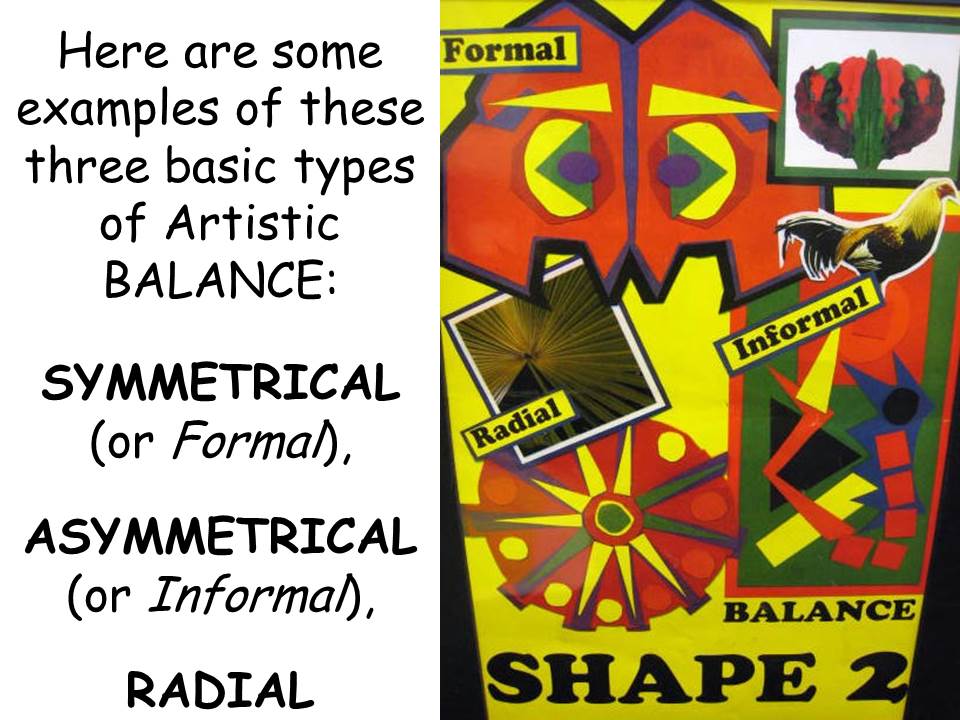
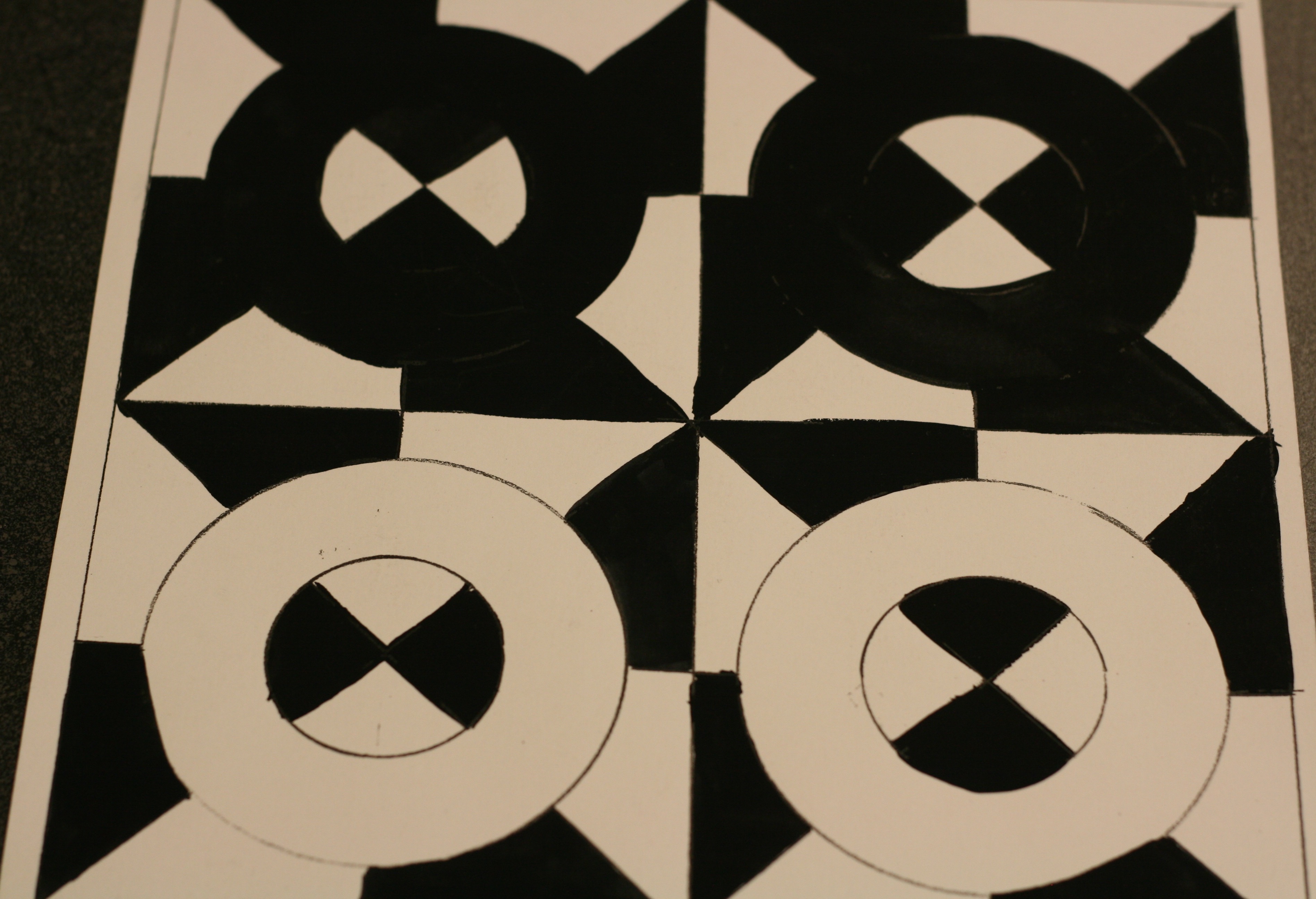
The three types of artistic BALANCE in a work of Art are Symmetrical (Formal), Asymmetrical (Informal) and Radial. This basic principle of art has to do with how different artistic elements relate to each other from a variety of positions in a work of art. The artistic elements might be either line, color, color value, size, shape, texture or space, even a combination of several. Balance refers to visual interest and “weight” to hold the viewer’s eyes equally, whether each side of a work of art is different or exactly the same.
Symmetrical Balance
(Sometimes called Formal Balance)
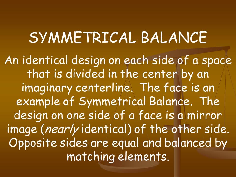
An identical design on each side of a space divided in the center by an imaginary centerline. The design on one side is a mirror image of the design on the other. Opposite sides are equal and balanced by matching elements. The face is the most common example of this type of balance.
Asymmetrical Balance
(Sometimes called Informal Balance)
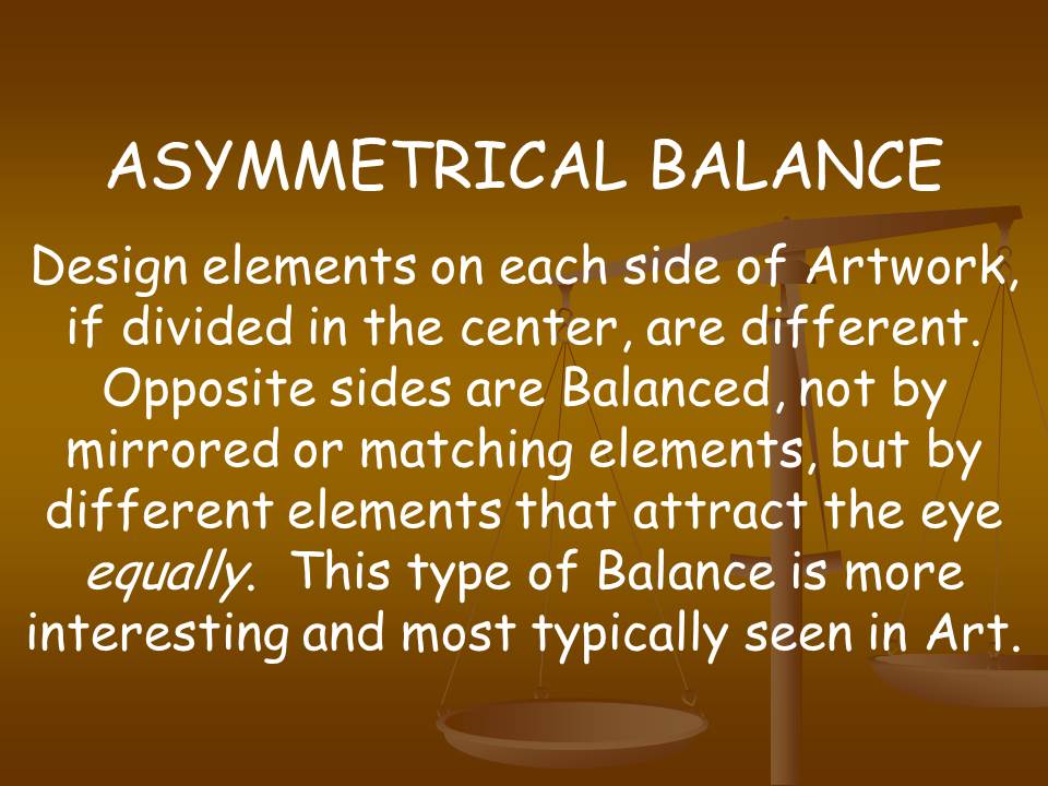
Design elements on each side of a work of art, if divided in the center by an imaginary line, are different. Opposite sides of a work (composition) are balanced, not by matching or mirrored elements, but by elements that attract the eye equally. This type of balance is more typically found in works of Art because it is the most visually interesting.
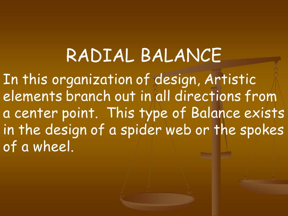
Radial Balance
This is a design of art elements radiating out from a center point. All elements of a work branch out in all directions from a common point. Repeated elements may be identical or different. This type of balance exists in the design of a spider web or the spokes of a bike wheel.
Balance and Symmetry Project Ideas
Before beginning, discuss what is meant by Symmetry to insure a common level of understanding. One way to do this might be to cut two shapes
from construction paper, such as the examples shown at right. Ask the
students to tell you which shape is SYMMETRICAL and why they
think so. If shape A is chosen, fold it in half and point out
how, when split in half, a symmetrical shape will become a
mirror image of itself on a smaller scale. If shape B is
chosen, you can point out the opposite is true. Be sure B
to define shape B as ASYMMETRICAL. A
SYMMETRICAL BALANCE Project
(K-5)
Materials needed:
13 yellow Tinker toy sticks, 14 Tinker toy wooden rounds, 1 Tinker toy green plastic base, 9×12 black construction paper, colored chalk
Beginning the Project: Black paper and have students place it on their desk horizontally. Give each two different colored pieces of chalk. *Have kids watch as you construct a toy tree. Explain that it will only remain SYMMETRICALLY BALANCED if you add equally to both sides. Ask the kids to choose one color chalk for the stick forms and one for the round forms. Tell them they must not alternate these colors once they begin to draw (base may be drawn with either color). Remind the students to keep the drawings of their sticks short and their rounds small (but not too small), or they might not fit the whole project on their paper. Show them where to put their base (in lower the center of the page) because younger grades have a tendency to start higher, in the middle of the page. Once they have reproduced the lines of the Tinker toy tree you have created, tell them to add as many more lines and circles as they wish (if there is room) to make their tree appear fuller. Remind them to always add the same lines and circles to each side, so the tree will remain SYMMETRICALLY BALANCED.
*Special Note: First, second and third graders did better when they were allowed to draw the tree as it was being constructed. Start with the base, one stick and one round. Have them draw this. When most are finished, add the next five sticks (poking out of the top round). Have kids draw this. Now add the rounds. Stop at this point for first graders. For second and third graders, continue along in the same manner, one layer at a time until the tree is complete.
*Allow Grades 4-5 to build the tree themselves, a step at a time. Call on kids who are paying attention to build each level until the tree is finished. Older kids can begin drawing once they have finished building the entire tree.
ASYMMETRICAL BALANCE Project
Materials needed:
Lego or Duplo type building blocks in assorted sizes and colors, Base to attach blocks, Color crayons or felt pens, 9×12 white construction paper
Beginning the Project: This project can be done much the same as the previous Tinker toy project. The Lego shapes are stacked in two piles on the base. (You could also use wooden building blocks in different sizes and shapes) Each pile has a different combination of sizes and colors. One pile may be taller than the other. Keep your design asymmetrical (different on each side). It might help with younger kids to have them fold
their paper in half before they begin. Kids draw the two piles using the colors and shapes they see. If you use wooden blocks, it would help to have a base wide enough for both piles to be stacked on. Let the older kids add more stacks to each side in any shape or size they choose. Remind them that this project is asymmetrical, so it WILL NOT be the same on both sides.
RADIAL BALANCE PROJECT
Glue found objects such as plastic spoons, wooden spoons, Popsicle sticks, toothpicks, buttons, beans, straws, pasta, shells etc. to a piece of cardboard in a RADIAL pattern. Begin with an object in the center (such as a button) and have the other shapes move out from this center axis. Pick simple lines and shapes.
*Special Note: (K-1) Create radial design one step at a time. Begin with just the center object and check to see if each child actually has the object in the center so they will have room to make the entire project. For kindergarten, you may want to just have one row radiating from the center object.
Additional Suggestions
• Fold graph paper in half and create a SYMMETRICAL design (formal balance) by coloring in the squares. Kids could also create ASYMMETRICAL and RADIAL BALANCE designs on graph paper.
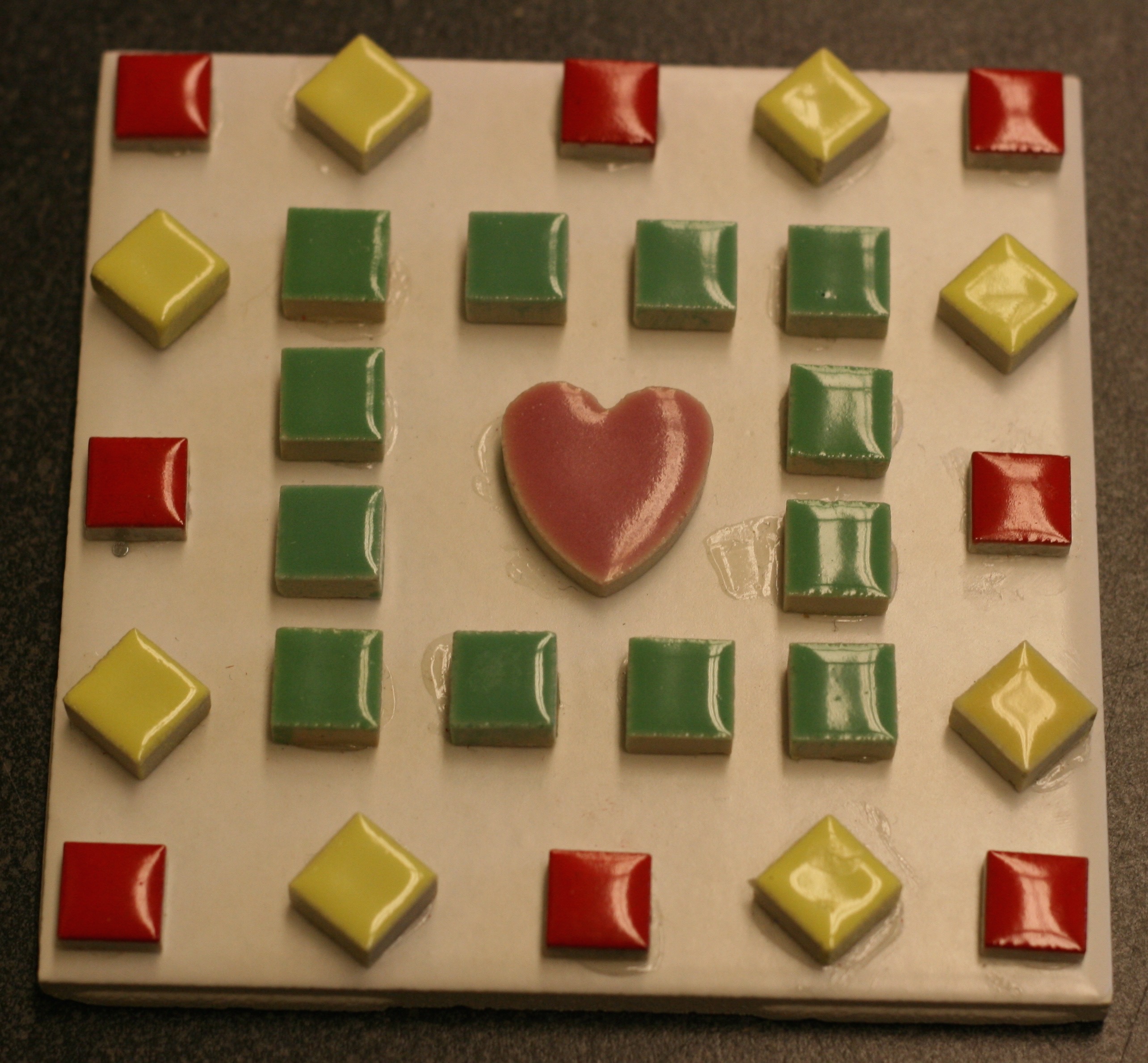
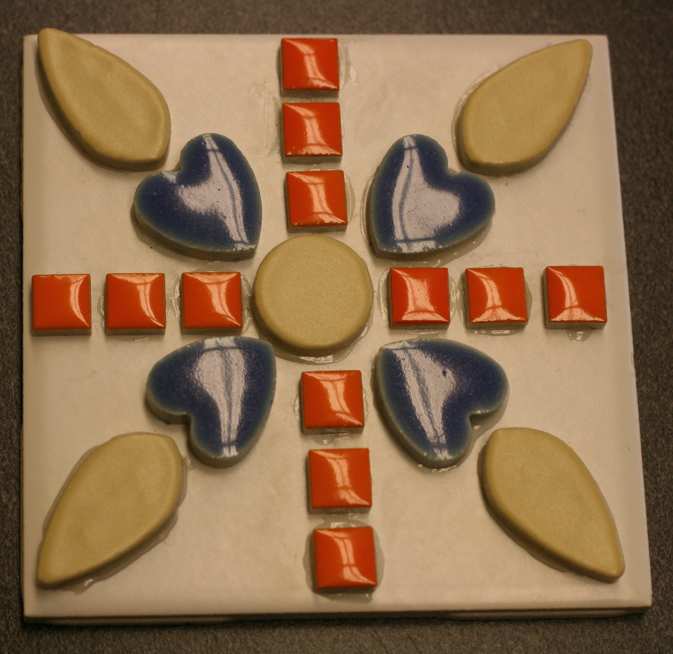
• Cut ½ inch strips of assorted colors of construction paper. Cut these strips into small squares. Use a white or black sheet of construction paper to glue and create a mosaic design. Create a mosaic example of EACH of the three types of balance—SYMMETRICAL, ASYMMETRICAL and RADIAL.
• Divide the class into three groups. Have one group create SYMMETRICAL designs; a second group creates ASYMMETRICAL art and the rest RADIAL BALANCE.
The Last Supper
(Additional information can be found in Rotation #1 Packet 22. Renaissance Art)
About the Artist
Leonardo da Vinci was born in the little town of Vinci, near Florence, Italy, in 1452. He was raised by his grandfather and lived during the fifteenth century, a period of European history called the High Renaissance. Between the ages of thirteen to fifteen, Leonardo became an apprentice to a famous painter and sculptor. He worked with Verrocchio for several years. By the age of 25, Leonardo was famous as both a painter and a man of science.
Leonardo considered painting the supreme form of art. Among his great paintings are the Mona Lisa and the Last Supper. Leonardo designed magnificent buildings that were never constructed. He invented fantastic machines for both peacetime and war. He was an engineer, musician, physicist, botanist, anatomist, geologist, geographer and aerodynamic engineer. He was not only interested in all of these fields but was considered an expert in them all. He left ten thousand pages of drawings, ideas, sketches and notes, all written backwards, that can only be read when held up to a mirror. Many of the things he began were never completed. He was too busy working on more new ideas.
In 1517, Francois I, of France, invited Leonardo to Amboise, in France. There he lived in the small Chateau of Cloux, enjoying great honor and the esteem of the king and court. He died there in 1519.
About the Art
This picture is a Fresco. It is considered Leonardo’s greatest work and was done for the wall of a dining room that was used by the monks at the Church of Santa Maria delle Grazie, in Milan. Parts of The Last Supper were hard to see because the fresco began to deteriorate only a few years after it was completed. Leonardo experimented with an oil tempera paint that didn’t attach well to the wall. Over the years, many people have tried to repair the painting but the repair work actually ended up causing more damage. A major and scientifically assisted renovation has recently restored this great work of art.
This picture is an example of Formal Balance or SYMMETRICAL BALANCE. If we were to fold this picture in half, we would see that the room is exactly the same on both sides. The walls are the same except that there is the shadow on the left side of the picture. Even the ceiling is symmetrical; it can be divided exactly in half and is the same on each side. In the center of the picture, Jesus sits in front of the middle window. The glow of the horizon behind Him creates a halo around His head. There is a smaller window on each side of the center one. Jesus is also sitting in the center of the table. The picture shows Him sitting with his closest friends, the twelve apostles. Although each of the apostles is arranged in a different pose, they are equally placed in the picture (six on each side). The special way Leonardo placed the men gives them a feeling of MOVEMENT that had never been seen before.
Project Ideas
• Draw or paint a SYMMETRICALLY BALANCED picture of your family at the dinner table. You may have to pretend that the table at your house is a long rectangle, like this picture, if you have a round one. You can set up the table the same way Leonardo made his. Closely examine the way Leonardo organized his picture. Pose each person in a different position. Some seated (maybe passing something or talking to a person behind) and some standing (maybe putting something on the table or getting ready to sit). This will help to add MOVEMENT to your picture, similar to the special way Leonardo placed the apostles. Remember to keep them EQUAL—similar on both sides.
• Create a RADIAL BALANCE picture of your family at the dinner table. Seating them around a round table as seen from above. Arrange the food, the plates, napkins, glasses and silverware in a design that is equally balanced as it moves out from the center of the circle. Place the members of your family an equal distance apart. People at the very top of the circle should have full frontal faces, and full frontal trunk of body. People on the side of the table will have a profile facial view and their bodies will also turn sideways. For the people at the bottom area of the table, you may only be able to see the back of their head, the back of the chair and their body.
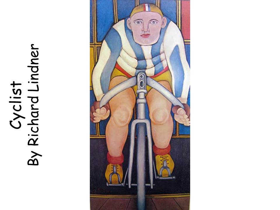
Cyclist
By Richard Lindner
Born in 1901, in Hamburg, Germany, Richard Lindner became a fine-art painter of hard-edge ABSTRACT figures, a fashion illustrator and art educator.
In 1933, Lindner was forced to flee from Germany because the German leader, Adolf Hitler, negatively targeted abstract artists as enemies of German ideals and many were jailed. He went to Paris and in 1939, Lindner served in the French army against Hitler.
In 1941, Richard Lindner immigrated to New York where he quickly became a highly successful illustrator for magazines such as Fortune, Harper’s Bazaar and Vogue. He became an American citizen in 1948 and taught Art at the Brooklyn Pratt Institute for 15 years and later the Yale University School of Art and Architecture. The artist died in New York in 1978.
The Portrait is EXPRESSIONISTIC and reflects the artist’s preference for bright COLOR, flat SHAPE and faces with severe expressions. People in Lindner’s portraits all look mechanical and unhappy.
Who can tell me what a Portrait is? A picture of a person
Is a Portrait an example of SYMMETRICAL or ASYMMETRICAL BALANCE? It can be either
A face is SYMMETRICALLY designed when viewed from the front. Both halves typically have a nostril, cheek, eye, eyebrow, and ear.
From the side, a face becomes ASYMMETRICAL because if you folded it in half both sides are different.
Does this Portrait have SYMMETRICAL BALANCE? Yes, it is roughly the same on each side
What do you think of this bicycle rider? Does he seem to be coming right out of the picture toward you? Is the bike also SYMMETRICAL? Yes
Do you think the cyclist is indoors or outdoors? Why?
Do you notice the REPETITION of red COLOR in several places in the painting? In how many places can you see red? Five—hat, corner background panel, waistband, socks
The REPETITION of red creates MOVEMENT as it causes the viewer’s eye to travel around the picture. Without being aware of it, our eyes move from one red area to the next.
How many COLORS does the picture have?
What different SHAPES has the artist used in the picture? Which SHAPES are repeated?
Bicycle racing is a common sport in Europe. Have you ever been in a bike race? Does this man look as if he cares about winning a race? How do you think he feels? What is the MOOD?
Project Idea
• Make up a story about the Cyclist. Where is he going? Where has he come from? What is he thinking and feeling? Is it fun to go on a journey? Is he training to get in shape for a big race? Is he riding just for enjoyment? What is his name? Is he a professional rider? Is he an Olympic athlete? An amateur?
• Sculpt a SYMMETRICAL bike rider using clay.
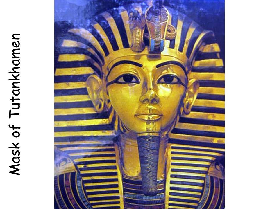
Mask of Tutankhamen
Unknown Ancient Egyptian Artist
(Additional information can be found in Rotation #1, Packet 2. Masks of Many Cultures)
During the time Tutankhamen lived, the pyramids and the Great Sphinx were already ancient monuments, built during the period of the Old Kingdom, around 3000 BC.
King Tutankhamen reigned during the Eighteenth Dynasty of the New Kingdom of ancient Egypt. His reign was short and historically insignificant. However, the incredible treasures found in his burial tomb have elevated his name to worldwide prominence.
Tut’s funerary mask, pictured here in its actual size, is probably the most famous of all the treasures found in his tomb. The mask was placed directly over the head of the mummified pharaoh, and was found in that position when the sarcophagus was opened. The solid gold mask weighs 220 pounds!
The mask is made of beaten and polished gold. The eyelids and eyebrows are made of lapis lazuli, a deep blue semi-precious gemstone. The eyes themselves are of obsidian and quartz. The stripes on both the royal headdress and the inlay of the plaited false beard are blue glass. The broad collar extending from shoulder to shoulder is segments of deep blue lapis lazuli, green feldspar and brown quartz with a lotus bud border of green colored-glass cloisonné work. The vulture beside the cobra on the forehead, symbolize the king’s sovereignty over the kingdoms of both Upper and Lower Egypt.
Suggested Dialogue
This is a Portrait mask. Scientists now know that the mask is a reasonably accurate representation of Tutankhamen himself, who died when he was only 19 or 20.
What is a Portrait? An artistic image of a person or an animal
What type of LINE does the mask have and where do you see line? ALL FIVE LINE TYPES—
Horizontal (blue glass stripes on side of the royal headdress, outside edge of eyeliner, band of headdress across forehead)
Vertical (Inner golden edge of royal headdress on either side of neck and resting on chest) Diagonal (blue glass stripes of false beard, stripes on top of headdress)
Curved (collar, brows, mouth, snake body on forehead)
Zig Zag (gold center LINE decoration of false beard)
Does the mask have RHTHM? Yes, the lines of the headdress are spaced in an evenly measured repeated rhythm. The alternating lines of colors in the collar create alternating rhythm.
Does the mask have MOVEMENT? REPITITION of the same type of LINE in the headdress causes our eyes to move along the sides and across the top of the mask. REPITITION of curved and alternating LINE in the collar moves our eyes from side to side and upward.
Does this mask have SHAPE or does it have FORM? Form, it is three-dimensional—height, width and depth (shape has only two dimensions—height and width)
What type of BALANCE does the mask have? SYMMETRICAL BALANCE, same on both sides
Project Ideas
• (K – 1) Create SYMMETRICAL portrait masks from cardboard, poster board, or paper plates.
• (Grades 4-5) Create SYMMETRICAL portrait masks by covering poster board with aluminum foil. Design some decorative LINES (make them wide) and SHAPES for your mask on paper. Lay the mask on top of a padding of newspaper and tape your paper design to the foil with masking tape. Use a pen (preferably) to trace over the shapes and lines of your decoration. Remove the paper and use acrylic metallic colors to paint in your “sculptured” decorative details, leaving most of your mask silver.
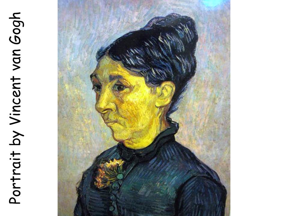
Vincent van Gogh Portrait
(Additional information can be found in Rotation #3 Packet 14. Vincent van Gogh)
About the Artist
Vincent van Gogh painted this portrait. He was born March 30, 1853. Vincent was a Dutch painter but did most of his painting while he lived in France. Vincent was very poor and only sold one painting during his lifetime. Now Vincent’s paintings sell for millions of dollars!
Suggested Dialogue
Look at the person sitting next to you. When you look at a person from the front, their face is roughly the same on both sides if you divided their face in half. If a person has a small mole or a scar on one side of their face, the face would still have SYMMETRICAL (or formal) BALANCE.
How can a portrait have ASYMMETRICAL BALANCE? One way this happens is when the face is slightly turned sideways, like in this picture
We can see still see almost all of the woman’s entire face in this Portrait. Yet, because she is not looking directly at us, the BALANCE changes from SYMMETRICAL (same on each side) to ASYMMETRICAL (different but visually equal on each side).
Another type of ASYMMETRICAL BALANCE in Portraiture happens when the person is turned all the way to the side and we can’t see the other half of the face at all. This additional type of Portraiture is called a “PROFILE”.
When painting portraiture, artists usually turn the face slightly to make the picture more interesting. ASYMMETRICAL BALANCE is the most common type of BALANCE used in Art. This is because ASYMMETRICAL BALANCE
How would you describe the TEXTURE of the BACKGROUND?
Can you see any CURVED LINES? Are there any DIAGONAL LINES? Hairline, nose
Which area of the picture has the LIGHTEST COLOR VALUE? The woman’s face, a typical technique used by artists to create EMPHASIS or DOMINANCE in a portrait painting
Which area of the picture has the DARKEST COLOR VALUE? Woman’s hair and eyes
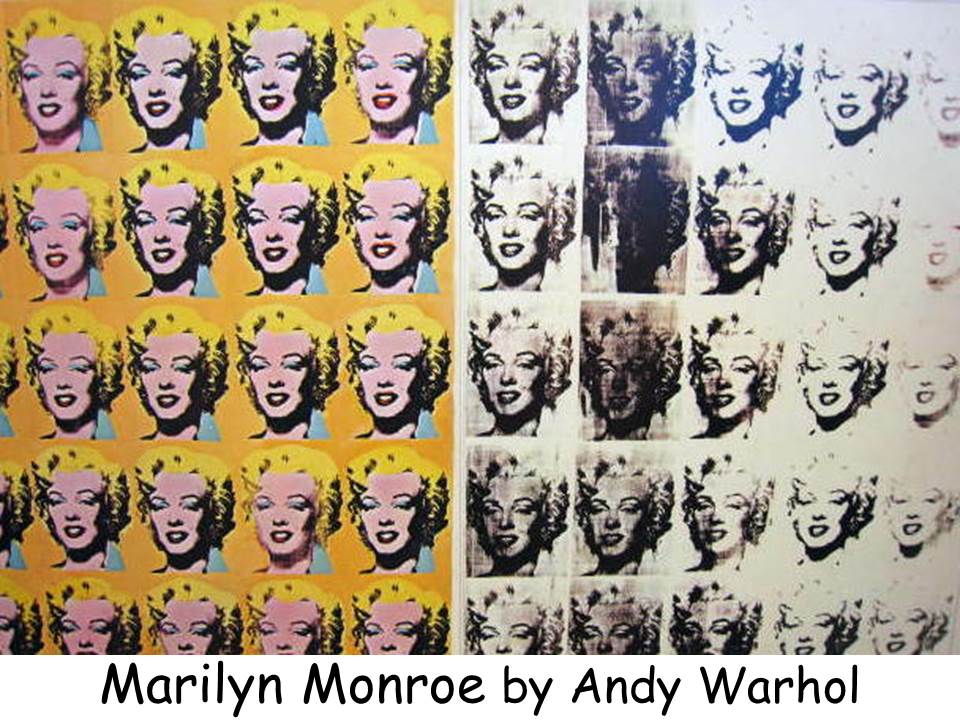
Marilyn Monroe
Andy Warhol
1962
(Additional information can be found in Rotation #1 Packet 20. Andy Warhol)
About the Artist
As a young boy, Andrew Warhola was sick a lot and spent much of his time in bed drawing, cutting and pasting pictures to pass the time. His mother encouraged him with his art by having him attend Jr. Art classes. She was artistic and sold painted and decorated eggs, during the Depression, to help earn money to feed her family. Andy lived with his mother almost his whole life and was very close to her. Young, shy Andy Warhola attended Carnegie Tech to learn commercial techniques of reproduction. He said he wanted to “be an Art business man”. During studies at Carnegie Tech he lived at home and as soon as he got an apartment in New York, his mother came to stay with him.
In his later years of college, Andy taught art and during his senior year, he worked for a department store creating window displays. Besides attending classes, he studied dance and was the editor of an art student literary magazine. Few people knew that Andy Warhol was a church-goer and even helped with holiday dinners that were given to the poor by a local church. He was concerned about the homeless people that lived around him in the big city of New York and often left food where they could find it rather than giving them handouts directly.
About the Art
Andy Warhol is the leading artist of the Pop Art movement. His REPETITION of a single image (this image of Marilyn) expresses his feeling that our mass-media culture desensitizes the viewer by constant repetition. Magazines and advertising show famous people over and over again every day. We become used to seeing them and never think much about these as being “real”.
This portrait of the famous screen star, the 1960’s sex symbol of Hollywood, tells the story of a woman transformed into a commercial property. She has been manufactured, packaged and sold like a can of soup. Her painted mask is repeated endlessly, first in wild, unrealistic colors and then in black and white, until it is no longer possible to distinguish any individual characteristic. Warhol uses the REPETITION of images like a strip of film to create the effect of a person transformed by time. This work of art is more a statement about the way America packages famous people so they become unreal people. It is not really just a portrait, or rather many portraits, of a famous person. Her “mask” is a black and white publicity photo that the artist has reproduced over and over. In a publicity photo, a person looks their best and most glamorous. Not the way they would look while they are at home relaxing. Marilyn is a famous person so she is easily recognizable, although he has painted her photo in such a strange way.
Suggested Dialogue
If we could fold this Portrait painting in half, is it SYMMETRICAL (the same on both sides)? Although the picture shows repeated photos of Marilyn Monroe on both sides, it is not symmetrically balanced because one side is not exactly a mirror image of the other.
The COLOR on the left side of the painting changes the BALANCE and makes each side different. Notice how the photos are so much clearer and sharper on the left side of the painting. Some of the unpainted photos on the right side of the painting look smudged and dirty. Some of the photos are so light they almost disappear.
What type of BALANCE does the picture have? Asymmetrical
How does the picture show REPETITION? Does it show MOVEMENT? Yes, the REPETITION of the actress portraits naturally causes our eyes to move across the picture horizontally. Like read a book, we continue to move down to the bottom of the picture.
The picture states a feeling Andy Warhol had about “fame”. Marilyn Monroe was a beautiful and famous actress. From the outside she looked like she had everything a person could want to be happy. Yet, she was not very happy and tragically died at a young age.
The Marilyn on the left represents the Marilyn shown to the public. The one with the perfect clothes, hair and make-up—the always smiling Marilyn, who surely must have been happy (?). The beautiful, painted person she was supposed to be is represented on the left side of the painting—only a painted mask.
The Marilyn on the right represents the real life Marilyn; the one who woke up in the morning with bad breath and messy hair, the one who wasn’t always happy just like the rest of us. The one who faded away (died tragically) while still young and beautiful, just as her photo fades out on the far right side of the painting.
Now that you know some of the background about the painting, what kind of MOOD does it have as you look at it? How does it make you feel? Did you feel differently about the picture when you first looked at it?
Project Ideas
• Add color to the black and white photo of Marilyn in the same way Andy Warhol added color to his pictures. Find black and white photos of other famous people that copy well, and create colorful “masks” using them. Black and white newspaper photos would work well for this project. By using newspaper photos, kids could learn about someone famous from the media lately who might not be a Movie Star (President, local leader, World leader).
• If you have access to rubber stamps, have kids choose a single stamp (any design) and stamp it repeated times across a sheet of paper. Make sure the design of the stamps is stamped all the way across the paper, in several rows, an even amount of times. On one half of the stamped picture be sure to ink the stamp each time it is used. On the other half of the stamped picture, you might smear the ink the way Andy did and press the stamp more than once, after it is inked (to create a lighter, faded image). Have kids color half of the stamp designs and leave the other half uncolored, like this picture. This will create an ASSYMMETRICALLY balanced, stamped and colored picture. This project emphasizes the PATTERN of the stamps, not the individual pictures of them.
• Create a SYMMETRICALLY balanced, stamped picture by uniformly stamping and coloring across a colored page. Be sure to re-ink the stamp each time so every REPETITION of the stamp is strong. LIGHT VALUE backgrounds will create a different effect or MOOD than a DARK VALUE background.
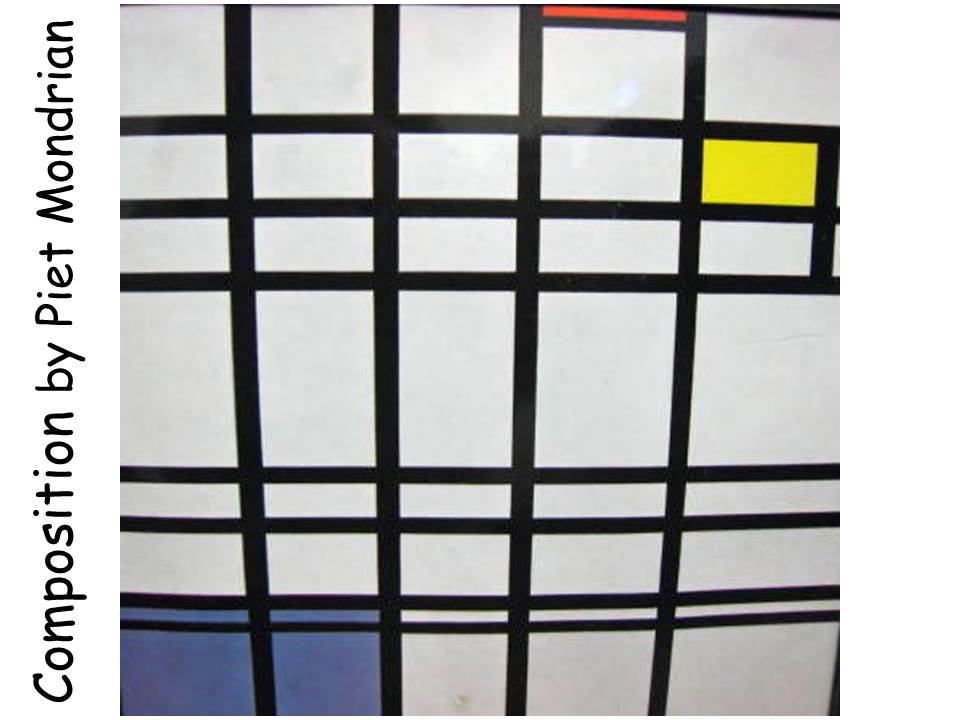
Composition
(1929-1944)
Piet Mondrian
About the Artist
Piet Mondrian was a pioneer and founder of abstract art. He was born in Ammersfoort, a small town in the Central Netherlands, as Pieter Cornellis Mondrian, on March 7, 1872.
His father was the headmaster of an elementary school and enjoyed painting as a hobby. After completing his elementary education, Piet declared his intention of becoming an artist, which was unsettling to the family because of the instability of an artist’s income. He compromised with his father by gaining his education to teach drawing in public schools. When he began his art career, Piet painted realistic Landscapes. Does anyone know what a Landscape is? A picture of the outdoors
Piet continued his own art education by attending the National Academy of Art in Amsterdam. In 1893, he began publicly exhibiting his work. He painted numerous self-portraits and during this time almost exclusively painted landscapes.
In 1912 he moved to Paris and was greatly influenced by the work of Picasso and Léger (lay ZHAY). Piet began reducing the number of details and focused more on the main elements (COLOR, LINE or SHAPE) in his work. Initially you could see the tree shape or the house, which had been the subject matter, but that gradually changed until it was purely abstract.
Mondrian developed a style that banished the conventions of three-dimensional space and the curved line. Mondrian was a leading member of the De Stijl artistic movement. The De Stijl movement was founded in 1917 and believed that art should strive towards complete harmony, order and clarity in a constant process of refinement. The work of De Stijl was simple, plain, and GEOMETRIC. De Stijl used mainly square SHAPES. Art was composed of the simplest artistic elements: straight LINES and pure PRIMARY COLORS. The movement’s aim was deeply philosophical and rooted in the idea that art should in some way reflect the mystery and order of the universe. They tried to create a precise, mechanical order that seemed lacking in nature (natural objects).
Piet wanted art to be as mathematical as possible, a kind of blueprint for life. He filled his canvases with black HORIZONTAL and VERTICAL LINES. The resulting boxes were painted with white, red, yellow and blue. To Mondrian, the VERTICAL LINES symbolized vitality and energy. The HORIZONTAL LINES represented tranquility and harmony. At first glance, his grid paintings may look alike but each one is different and has been precisely calibrated and measured.
As Mondrian progressed with his unique, non-representational format, he continued to eliminate emotion from art. Colors, lines and shapes were used for their own sake, without painting an actual scene or object. Piet even transformed his own studio into one of his paintings. The walls were covered with rectangles of primary colors or white, black and gray. All the furniture was painted white or black. He even painted his record player a bright red. One decoration in his studio stood out—a yellow, artificial tulip in a red vase. The leaves of the tulip were painted white because he only used PRIMARY COLOR and green was a SECONDARY COLOR!
About the Art
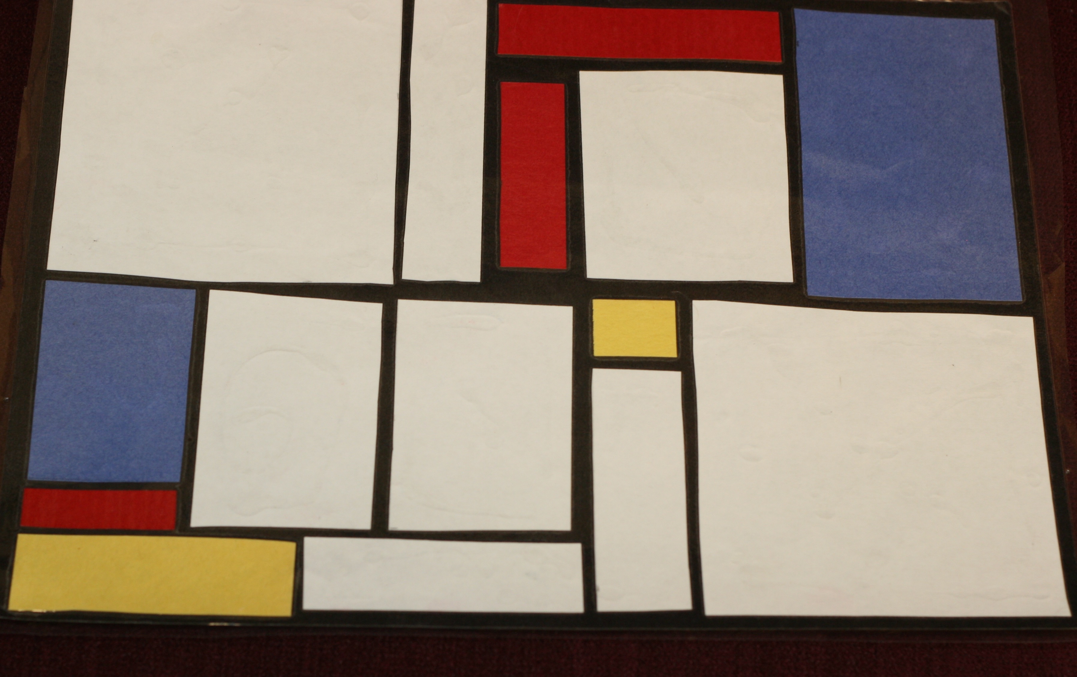
Extensive planning and careful proportioning were involved in creating this work of art. The painting is very basic and simple, using only the elements of LINE, SHAPE and COLOR. It’s a simple black grid pattern, with white rectangular SHAPES, and the PRIMARY COLORS—red, yellow and blue. Three rules guide Mondrian’s work:
1. Only HORIZONTAL or VERTICALLINES are used
2. Only PRIMARY COLORS plus black, white and/or gray
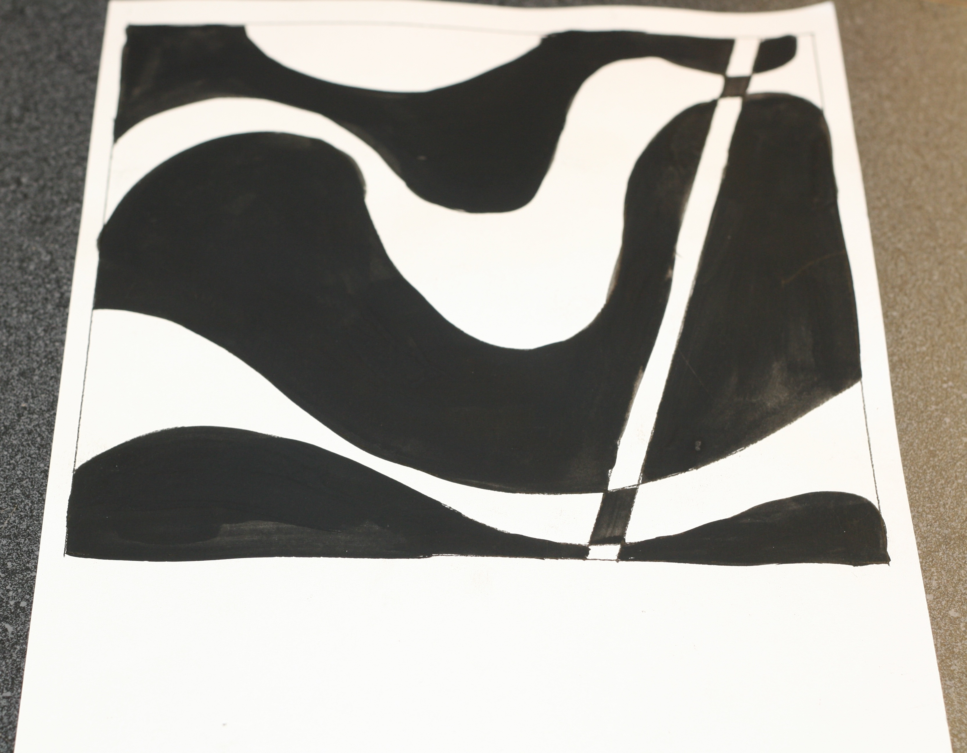
3. An ASYMETRICALLY BALANCED composition
The picture has ASYMMETRICAL BALANCE. The artist has carefully arranged BASIC ELEMENTS of art—LINE, COLOR (primary), and SHAPE, into a design. He has only concentrated on these three basics. This kind of picture often bothers people who need to SEE something they can identify (a person, place or thing). There are no recognizable SHAPES, except for GEOMETRIC SHAPES. This painting is an example of NONREPRESENTATIONAL or ABSTRACT Artwork. The picture is only basic COLOR, LINE and SHAPE—and nothing else! There isn’t anything hidden in the picture, it is just what we see, a PATTERN of LINE, COLOR and SHAPE.
Suggested Dialogue
If you were going to divide this painting in half, where would it be divided? Stress it is ASYMMETRICAL, unequal
Why do you think the color blue takes up such a LARGE amount of space compared to the colors yellow and red? So the picture will BALANCE. Red is the loudest color, the heaviest color. The blue is calmer, quieter and has less visual “weight”. There are also large areas of non-color. In ASYMMETRICAL art, each side is different but each side needs to attract the viewer’s eye equally. Large areas of non-color balance small areas of strong color. Large SHAPES on one side are BALANCED by several smaller shapes on the other.
How many HORIZONTAL LINES are in the painting? Five
How many VERTICAL LINES? Eight
How many DIAGONAL LINES? None, Mondrian only used vertical and horizontal lines. He was so fanatical about his artistic beliefs that when a fellow member of De Stijl introduced the DIAGONAL line into his paintings, Mondrian quit the society in disgust!
Study the painting for a few moments. Does the picture make you feel anything? What type of MOOD does it have? Do you get a warm cozy feeling or a cold one? Does it make you feel happy or sad? Is it calm or exciting?
Do you like this painting? Why or why not?
SUGGESTED COLOR ACTIVITY
Give the kids a small square (2” – 3”) of each of the PRIMARY and SECONDARY COLORS and a full sheet of white paper. Place one of the squares of colored paper in the center of the white paper. Stare at the colored square while you count to ten slowly. Remove the colored square without moving your eyes. Continue to stare at the same area on the white paper. The kids should be able to see a square of color that is the COMPLEMENTARY COLOR of the original square color.
Project Ideas
• Balanced composition
Supplies:
12”x12” square of black paper, scissors, glue, ruler or T-square, white, gray, yellow, blue and red paper
Create a composition using the rules that guided Mondrian’s work.
1. Only Horizontal or vertical lines
2. Only primary colors plus black, white and/or gray
3. An ASYMMETRICALLY BALANCED composition
Students should draw some quick sketches to decide what makes an ASYMMETRICALLY BALANCED composition. (i.e. small areas of strong color balancing a large area of non-color, a larger shape balanced by several smaller shapes on the opposite side) Compositions should be created on black background. Encourage kids to use their ruler, or a T-square, so their rectangles are square. The rectangles should be placed on the paper so there is a ribbon of black (about ¼” wide) separating each element. Use ASYMMETRICAL BALANCE. Use a large square or rectangle on one side of the artwork and BALANCE this with more than one smaller shape on the opposite side. Make sure your art cannot be equally divided down the center.
• In his trademark paintings, Mondrian limited his work to black lines that formed rectangles or squares. Experiment with triangular shapes instead. With a ruler and black line marker, draw many intersecting triangles of different sizes on a white background. Color some of the spaces with primary colors.
• Another trademark of Mondrian was PRIMARY COLOR. On a tag board or poster board background, use cut lengths black electrical tape to create a Grid like Mondrian. Color or paint some of the spaces with SECONDARY COLOR. Mondrian did not use SECONDARY COLOR. Examine your finished composition (artwork) as you think about the following: Which type of composition do you prefer—Mondrian’s, using only PRIMARY COLOR, or your own experiment based on Mondrian’s style, using only SECONDARY COLOR?
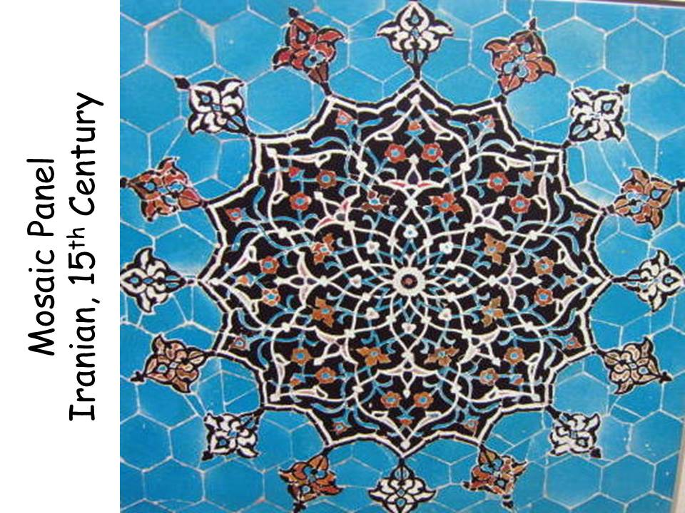
Mosaic Panel from Revetment
(Detail)
Iran, 15th Century
Faience Mosaic
About the Art
Mosaic is the ancient art of arranging small pieces of colored material, such as stone or glass, to make a decorative pattern or picture. The oldest mosaics were made by the ancient Greeks around 400 BC they made decorative floors by pushing colored pebbles into the ground. In fact, the Greek word for mosaic was Psephosis, after psephos meaning, “pebble.” Later, they began to use various materials, such as marble and terracotta (reddish-brown-colored unbaked clay), to produce beautifully detailed scenes from Classical mythology, often with elaborate geometric borders and designs.
The Romans adopted the Greek art of mosaic and took it to new heights of beauty. In particular they made opus tessellatum, fantastic mosaics created from thousands of small squares of colored marble called tesserae. Mosaics were the most common art form in ancient Rome. Marble mosaics were flat and hard wearing, which made them practical as decorative walkways and floors, both in the home and in public places like the public baths, forums or temples.
Many of the mosaics from the Byzantine era were made for churches and synagogues. Byzantine mosaic artists were among the first to use colored glass, which enabled them to create wonderfully bright images of saints and angels. The Byzantines were also famous for using gold tessarae to produce dazzling shimmers of light around the ceilings of the churches.
The Islamic people, of the 7th-10th centuries, hired Byzantine artists to decorate their mosques. Religious laws controlled Islamic art, so artists weren’t allowed to create images of people or animals in any of their religious works. Instead, the devout but creative Islamic artists used their imagination to make fantastically intricate geometric, abstract, and floral mosaic designs.
In Mexico during the 15th century, the Aztecs were making mosaics of a very different kind. They used precious stones to make ceremonial objects such as masks and knives. Aztec mosaics are defined by the use of the precious stone turquoise, which gives the objects their beautiful greenish-blue color.
Suggested Dialogue
What type of BALANCE is this Iranian mosaic artwork an example of? Radial Balance
Where does the design begin? In the center, moving out to the edges
It is easy to see the grout lines (where the tile has been put together) on the plain blue area. Notice that where the PATTERN is busier, the grout lines are hard to see.
What SHAPE can you find in this mosaic? GEOMETRIC SHAPE (six sided hexagons), and ORGANIC SHAPE (floral and plant)
What kind of LINE do you see? BASIC LINE TYPES—Vertical, diagonal, curved
LINE QUALITY descriptions might include straight, thin, white, blue, black, even tangled or “pointed”
Project Idea
• Create a RADIAL BALANCE mosaic design using hexagons with patterned and colored
paper. Be sure to leave some space between the shapes like the mosaic example.
Here are some assorted sized hexagon SHAPES to use for templates:
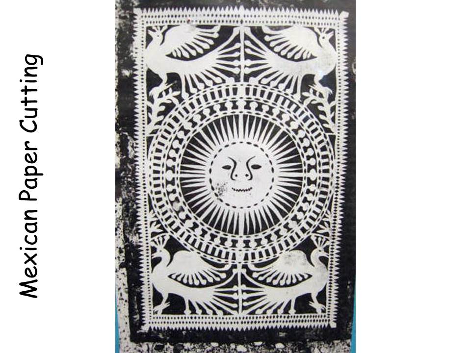
Mexican Paper Cutting
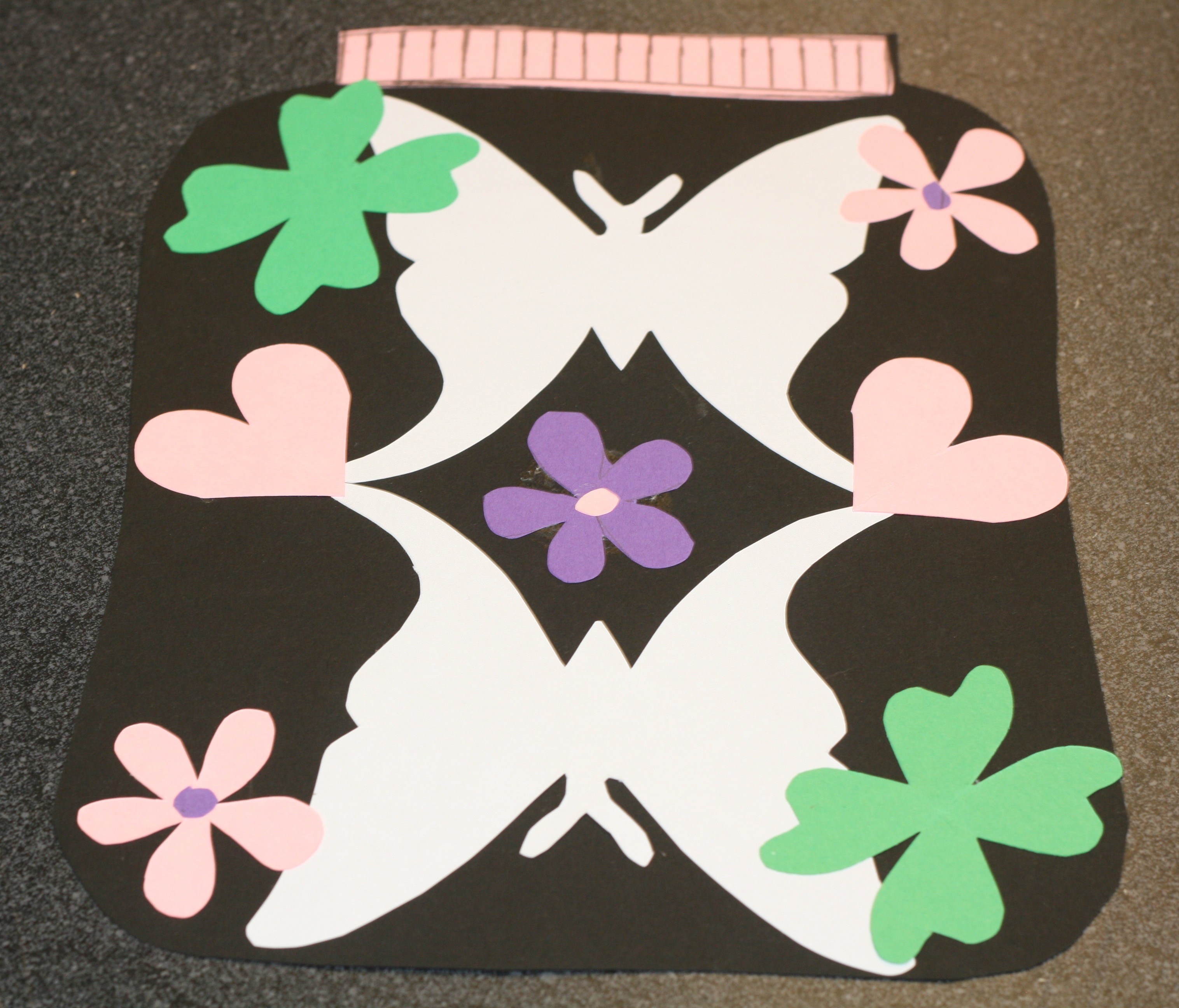
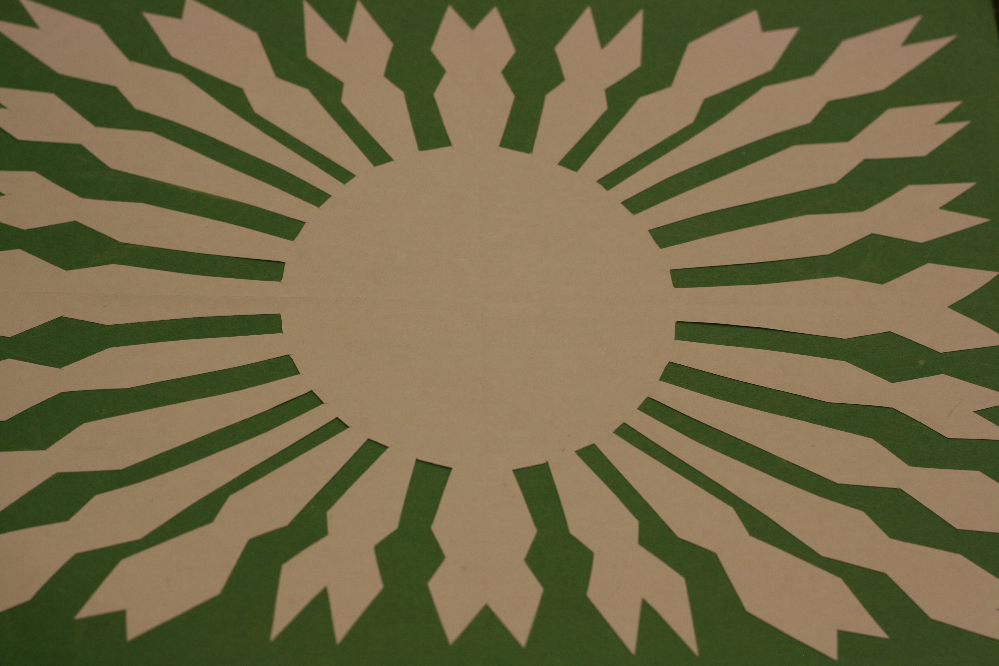
This Mexican paper cutting is an unusual example of two types of BALANCE contained in one work of art! RADIAL BALANCE (the sun design moving out from the center) and SYMMETRICAL BALANCE (the two birds at the top and bottom of each side of the paper are mirror images).
To create this design, the artist folded the paper into quarters before cutting. After the cutting was finished and the paper was unfolded, the bird design was repeated in each of the corners. To cut the SYMMETRICAL face in the center, the paper was then folded in half and cut a second time.
Project Idea
Used colored tissue paper to make cut paper designs. Fold a rectangle of tissue paper into quarters or in half. Lightly draw a design, using a pencil, which fills the space of the folded rectangle. Point out that it is important to remember that the design on the fold should not be completely cut away, or the design will become FOUR small rectangles instead of just one large one. Mount the finished design on black construction paper, using liquid starch or thinned white glue.
A design such as this, with TWO types of BALANCE, is hard for kids to create. Decide on the type of BALANCE (radial or symmetrical) you would like the kids to create with their paper cutting ahead of time. A sample would be helpful to help with instruction and give you an idea of hints that will aid kids in construction of the project.