


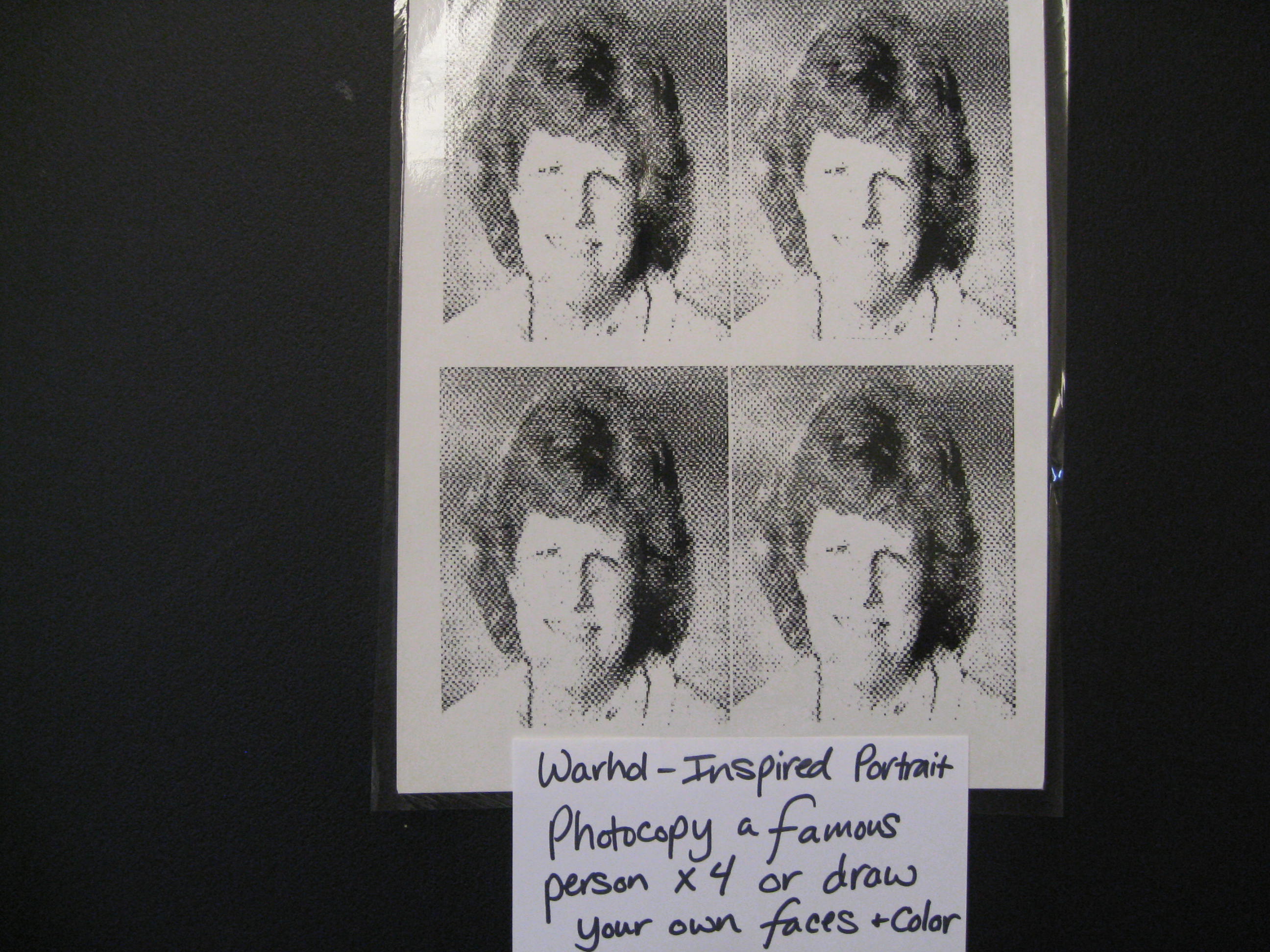
9. Brillo, Del Monte, Heinz Carton Sculpture
Sample Projects:


This is not a favorite packet for many Art Discovery volunteers but a lot of basic art information can be taught with this art and it is a very FUN type of art for kids! Once learning a little about the artist and the artwork, many volunteers discover they do not dislike this style of artwork (at least not as much).
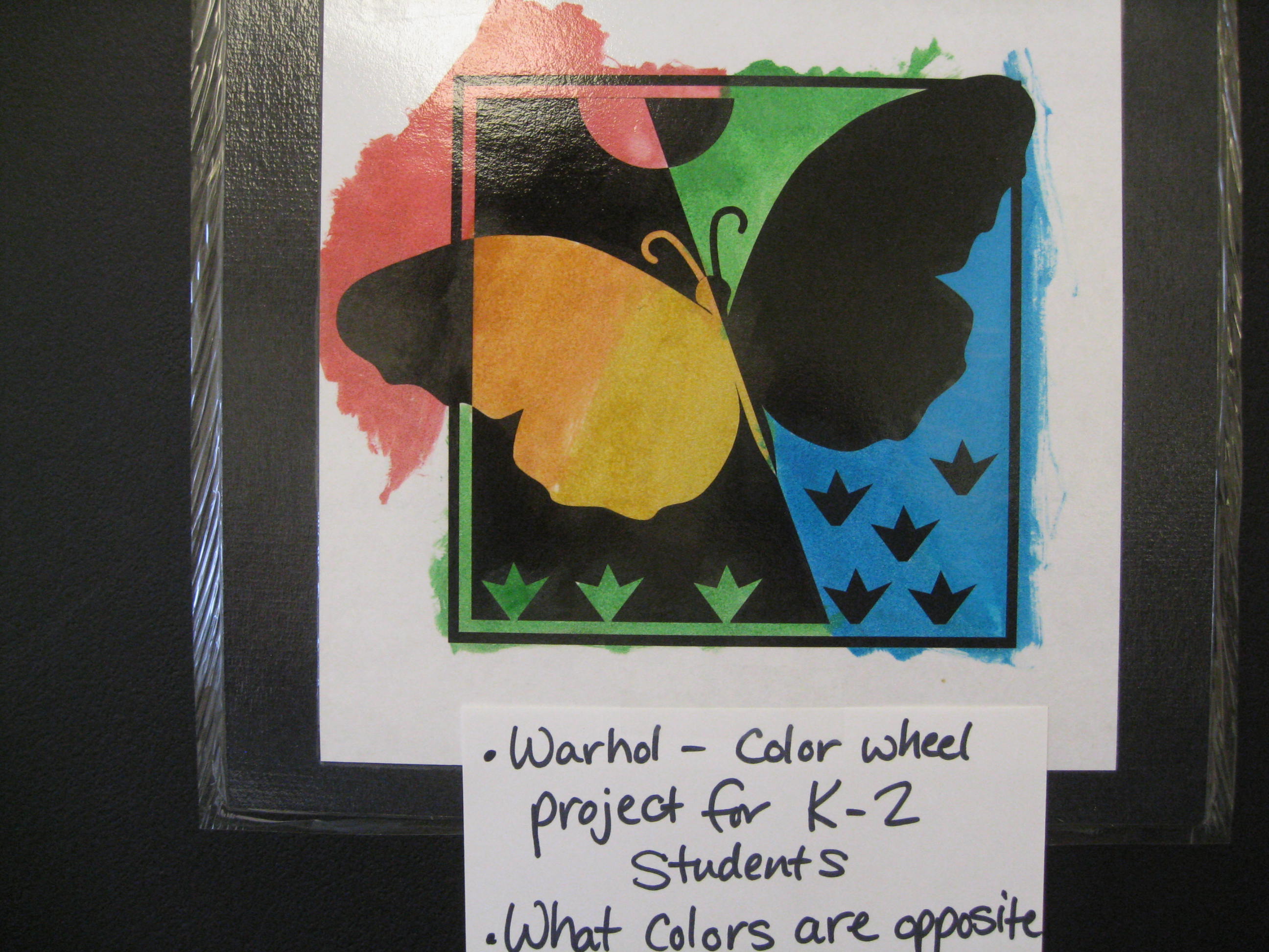
Because there is so much COLOR in this art, a Color Wheel project would be appropriate. Grade 1-2 can paint a Primary/Secondary Color Wheel and Grades 3-5 could create an Intermediate Color Wheel (See Art Discovery Coordinator about Templates for these.) If you volunteer in a Third Grade class and do not paint a Color Wheel for this packet, look ahead to find a future packet to do this project with. All Third Grade Classes need to create an Intermediate color wheel this year and it is a good 4-5 review!
The subjects for the artwork are unusual. Try to see the spirit of fun that such bizarre subjects can create and have some laughs with the kids. Do not try to take this art too seriously. Andy Warhol tried to create controversy with his art and make people think, talk and have fun with it. What better advertising medium could an artist use to promote his work than commodities already familiar to the American public? Andy Warhol’s $100 million estate proves that he may have been strange but he was also smart!
Many of the projects are a little difficult for K-1 classes. Best ideas for young kids are to use unusual colors to draw or paint cows, flowers, a favorite food, or shoes. The coloring picture is meant for kids (every age) to use as a visual aid when sharing with their parents and family members what they learned in Art Discovery. Challenge kids to go home and teach parents what the parents probably don’t know about. This can be fun and repeating information to others is a good listening and brain exercise! Print some general information on the back of the coloring page to make it more useful (will help Kindergarten parents discuss the picture with their kids, who very often forget what they are supposed to share). Kids may color the pictures if they choose, but DO NOT USE THE COLORING PAGE FOR AN ART DISCOVERY PROJECT, ESPECIALLY FOR GRADES K-2! One exception, as suggested in Project Ideas, is grade 3-5 “series” project.
Make sure ALL 10 pictures are returned to the Packet Carrier after your Presentation is finished!
Project Ideas
Andy Warhol—Pop Artist (Born Andrew Warhola)
“Once you ‘got’ Pop, you could never see a sign the same way again. And once you thought Pop, you could never see America the same way again.”
-Andy Warhol
Andrew Warhola was born sometime between 1928 and 1931. No one knows for sure because the artist liked to keep some things about himself mysterious or confusing for people, to gain more attention. His parents immigrated to America from Czechoslovakia. Andy’s father worked hard in a coal mine. He became ill and died in 1942, while Andy was still a boy. After his father’s death, the family was very poor and his mother found it hard to make ends meet.
Growing up in Pittsburgh, Pennsylvania, Andy was often sick as a child. While he was sick in bed, his mother gave him paper dolls to cut out, for strengthening his hands, and coloring books to color. He also read many comic books. Andy was not very athletic, and because he was sick so much, it was hard for him to play with the neighborhood kids. He found another way to make friends; Andy would draw pictures of the kids in his neighborhood. He also won many contests at school with his art. When Andy was older, he was able to get a scholarship to an art school. To help pay his way, he sold fruits and vegetables on the street corner.
After art school, Andy and his mother moved to New York, where he worked for a magazine illustrating shoes. The magazine misprinted his last name as Warhol so Andy decided to leave it that way. Andy also illustrated for Seventeen and Glamour fashion magazines. His style was unique and caught the attention of many people in the art world. He became known as the best shoe illustrator in New York.
Andy Warhol never married. He lived with his mother all of his life. Andy and his mother’s first apartments in New York were usually infested with roaches, had no hot water, and the bathtub was in the kitchen. This was because they lived where rent was the cheapest, until Andy established his art career. Andy and his mother kept between eight and twenty cats in their apartment at one time. The cat smell sometimes overpowered the scent of Andy’s paints.
After his mother died, Andy lived alone in his 5-story townhouse filled with valuable antiques, artwork and his amazing collections (such as 175 cookie jars). Every room in his house was a storeroom—even the bedroom had hundreds of boxes of wigs. Andy had 400 wigs in all!
Early in his career, Warhol decided that a bizarre personal image would promote sales of his artwork. People couldn’t forget him because of the way he tried to look. Andy’s trademark look became sunglasses (which got bigger as he aged), blonde wigs (which got bushier), black leather jackets and high-heeled boots. The only people who ever saw him without his wigs were his young nephews. The dramatic Andy also emphasized his pale complexion with makeup. It made him look even more frail and unearthly—yet he was able to do 100 push-ups and 50 pull-ups every single morning! He was an artist who became a famous celebrity, not just for his unusual art, but also because he looked so bizarre and had very strange ways.
Andy’s crazy life-style and odd eating habits would worry almost any mother! He worked 12 hours a day at his studio (known as The Factory) then went out to parties until 3:00 or 4:00 in the morning! Andy often attended up to 20 parties a night. Sometimes he lived on just candy and junk food. For a treat, Andy would sometimes buy himself a whole birthday cake and eat it all by himself in one sitting! At other times he became more health conscious and ate only bean sandwiches and raw garlic. What would your mother say about all of that? Do you agree that Andy’s strange life-style and eating habits made him the type of son who would worry his mother?
Andy Warhol’s ideas about art were different from those of many artists before his time. He was one of the first “Pop” artists. Pop artists take their images from advertising, television, movies, cartoons, comics, music, commercial products and other POPular items.
Andy Warhol was famous for doing portraits of famous people he had never met. Up until his time, artists had done self-portraits or worked on commissioned portraits people hired them to paint. Andy discovered that he could convert just about any black and white newspaper or magazine illustration into a photographic silkscreen. The silk-screen process also made it possible to repeat the same portrait hundreds of times if he wanted. Andy created portraits of movie stars, rock stars, and famous world leaders.
Warhol thought of dying as “the most embarrassing thing that can ever happen to you”. Andy almost died after being shot in the stomach by a crazy fanatic, but lived another 18 years. Andy died at the age of 58 (?) after routine gall bladder surgery. Two Thousand people attended his memorial service; 6,000 came to the later auction of his many collections. Andy’s final will left most of his $100 million-dollar estate to charity. Much of the money went to a foundation to be set up “for the advancement of the visual arts”. To advance the visual arts, The Andy Warhol Museum opened in Pittsburgh, Andy’s hometown, in 1994. It is the largest museum in the United States that is devoted to a single artist.
On the website for the museum you can find presentations that may be appropriate to use in your lesson.
Talk with the classroom teacher ahead of time about projecting things from this site for your Presentation. These are simple written narratives with many good visuals. Recommended Presentations for elementary kids include:
- Warhol Biography (All grades)—Excellent way to tell the artist’s life story! Includes photographs of Andy as a boy, his family, and Pittsburgh, where he grew up. Written very simply, volunteers could easily add in any interesting additional details they wish as the slides and story progress. Short and complete, with many of his artworks included.
- Introduction to Pop Art (All grades)—Includes a simple explanation of the Pop Art Style and examples of the artists who helped create it. Short, with lots of visual examples that assist in the points of the explanations.
- Color Theory (3-5)—Excellent short lesson includes many “Art Basics”. Covers and defines COLOR: monochromatic, neutral, analogous, complementary, warm/cool, and tints/shades, using visual examples. Includes geometric and organic SHAPE, and positive/negative SPACE and a chance to “Test Your Knowledge”.
- Aesthetics of Brillo—(Coming Summer 2007) Judging and Criticizing. Presentation summary explains it will explore aesthetic questions and various points of view. Suggested for adult volunteer viewing. This should be an especially valuable lesson for volunteers and sounds like A MUST VIEW for all those volunteers who dislike Warhol’s work and feel it has no true artistic value. Kids will probably not grasp many of the concepts but there should be things learned here that volunteers might share with the kids during the Presentation.
1. “Shoes (With Diamond Dust)”
Andy’s first summer in New York City, after he finished art school in 1949, was a time without much money. Andy had to look for work as a commercial artist in order to make a living. This was a major challenge for the extremely shy artist. While other potential commercial artists presented themselves for their interviews in suits and ties, Andy didn’t own a tie and wore sneakers, his only shoes. Artists take examples of their best artwork with them for interviews. They store these art samples carefully in a portfolio, a professional protective folder similar to an oversized briefcase. Andy Warhol’s portfolio was a brown paper grocery sack because he was so poor.
Warhol was first hired by Glamour Magazine to create a one page advertising spread showing women’s shoes. These early shoe drawings had a humble elegance, advertising a line of sensible-looking shoes with low heals. The drawing and the quiet colors used were totally different in style to his later artwork, which is loud and bright like this painting.
That summer Andy also interviewed with Carmel Snow, the Art Director for Harper’s Bazaar, a major, high fashion, New York magazine. When he opened his paper sack portfolio in the offices of Harper’s Bazaar, a cockroach crawled out. Fortunately, Carmel was not the type of woman to judge only on appearance and took the time to examine the art Andy brought in. She had an immediate appreciation for his artwork and hired him.
The Art Director soon learned that Andy was also a hardworking and dependable artist. He always met his deadlines and turned out quality advertising work. Major fashion magazines began to hire him regularly for their adverting illustrations. One company, I. Miller Shoes, came to count on him almost exclusively for its ad campaigns. Seven years later his artwork had made such an impact that the Art Directors Club gave him a Distinctive Merit Award for one of his I. Miller Shoe advertisements. The next year he received the same award for some additional I. Miller Shoe ads, as well as the Art Directors Club Medal, it’s highest Award given. Andy Warhol had become a successful advertising artist but the world did not yet consider him a serious artist and that was what he still wanted more than anything.
About the Art
Awhile after Warhol become famous, in 1980, he created this shoe painting. The painting began as a photograph of dark shoes arranged on a white background. Andy then silk-screened a photographic negative of this black and white picture onto a canvas. In other words, the original white background (negative space) turned black and the dark shoes (positive space images) became white. Andy painted assorted bright colors in the white shoe shapes. When the shoe shapes turned white, they became negative space. By adding color, Andy made the shoe shapes positive again. The final step of this painting was when Andy added a layer of real “diamond dust”—a powder produced in the manufacture of industrial diamonds. The original canvases of the Diamond Dust Shoe series actually sparkle and send light over the picture in a rough, glowing texture. Because this is only a copy of the original painting, we can only see very tiny white dots instead of the sparkly reflections.
Project Ideas
- Bring in several pairs of women’s high–heeled shoes. Trace the shapes of shoes with chalk, on to large black construction paper. Turn high-heels sideways or trace toe only to add variation in your shapes and fill the space. After tracing several shoe shapes, paint with assorted tempera colors, to create positive space shoes. Add clear glitter when paint is dry, for the look of diamond dust.
- Design a crazy and modern pair of elf shoes. Draw a creative new shoe shape on colored paper folded in half. Cut two shoes and glue on decorative detail—various colors, shapes and patterns. Design and cut out a fancy pair of patterned socks to cover the elf’s lower legs when he wears the shoes. Glue shoes, with the crazy socks, to a black sheet of paper for strong contrast. Challenge kids to create the most unique pairs of socks and shoes in the class!
- Design a poster for a shoe advertisement. Draw pictures of shoe(s) and include written information. Remember that you need to make the shoes appealing and exciting, so the customer will buy them.
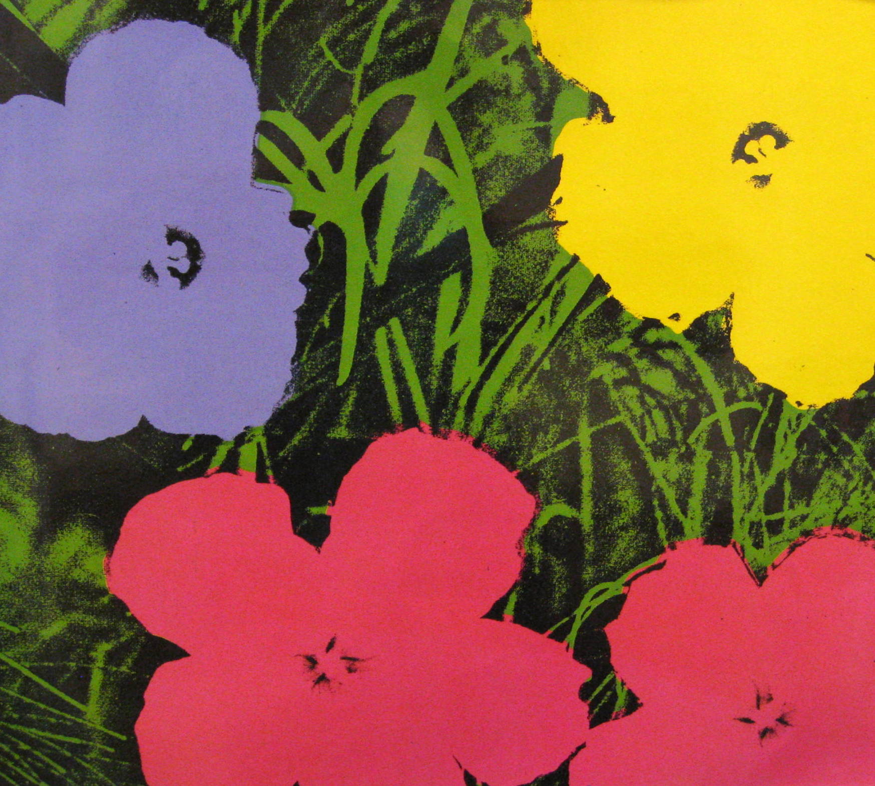
2. “Flowers” (Several versions created in series from 1964 to around 1970), silk-screen print.
This is one of Andy Warhol’s more decorative series of paintings. What exactly is a “series” of paintings by a particular artist? A group of several paintings on the same subject with slight variations
The flowers seem as if they have been plucked off their stems and arranged on top of the grass. Warhol seemed more interested in emphasizing the patterns of the flowers and the texture of the grass.
Warhol created this picture by silk-screening. This process uses paint but no brushes. Shapes of images are cut from a sheet of plastic to create several stencils or templates. A different shape template is cut for each color used. To create the picture, the first template is attached to a screen made of silk fabric. A sheet of paper or canvas is then laid under the screen and coated with the first color of paint. As the paint is pushed through the screen, the cut out areas of the template print on the paper or canvas underneath and the rest of the plastic template blocks out the paint. This creates both positive shapes of color and negative shapes without color. When the first color dries, the paper or canvas is placed back beneath the screen, and a different template is used for the second color. This process continues until all of the colors have been used to paint in the different areas.
The Flowers paintings were first created in 1964. To create the silk-screen painting, Warhol used a photograph of poppies that he found in a plant catalogue. He created stencils of the black and white photographic negative, which he first printed on the canvas. In one early version of his Flowersseries paintings, Andy left the flowers white. He also painted each flower a different color, or colored each flower the same, in other versions. In some versions of this series, Warhol even painted pink or orange grass in the background, instead of green.
Silk-screening was a good choice for an artist who got his ideas from the commercial world. Silk-screen is used to make many popular commercial items, such as the designs that appear on most T-shirts. (Point out kids in the room wearing silk-screened T-shirts.)
Warhol often used silk-screens because it allowed him to repeatedly make the same painting. He wanted to be like the machines that mass-produce the same commercial products many times. This was one of his very unusual ideas about art.
There used to be a Television comedy show, in the 1980’s, named “Murphy Brown”, which starred the actress Candice Bergman. On the wall of Murphy Brown’s living room was a large Andy Warhol Flowers print. Maybe you have seen re-runs of this series. If you have a chance to see a “Murphy Brown” episode, look for one of Andy Warhol’s Flowers pictures hanging on the living room wall!
Project Ideas
- (3-5) Use tempera paint on two of the coloring pages to create your own series of Flowers pictures. Color each version differently. Thin paint with water when painting background. What colors could you use for at least one of the backgrounds, other than green? You decide, then trim and mount the two different finished series pictures on a piece of large black construction paper, once they dry.
- Create a large flower shape with a foam meat tray or a piece of craft foam. Mount your shape on a small piece of wood (2”x4”) to create a large stamp. Make a second stamp using thin lines to create the look of grass. Stamp the grass on a piece of black construction paper using tempera paint. After the grass is dry, stamp several colored flowers on top of this background.
- Cut three flower shapes from a sheet of heavy paper. Arrange these on a sheet of white construction paper. Hold a piece of screening over the top of the paper. Dip a toothbrush into thin green tempera paint. Rub the brush over the paper to create a “splashed” green background. Add some yellow to the paint to create a lighter shade of green. Rub this color over the background with toothbrush through screen. Cover entire paper with both shades of green. DO NOT MOVE THE FLOWER SHAPES. After the background is dry, remove the flower shapes and paint the textured negative space that is left with regular tempera paint in any flower color you would like.
3. “Cow” Screen printed wallpaper, 1965.
About the Art
A man named Ivan Karp once told Andy Warhol that he should…”paint some cows” … The result was his cow wallpaper, which he spread across a Paris art gallery for an exhibit there, in 1965. Over this pattern of cow faces, Andy hung more of his “Flower” paintings for the exhibit.
The cow design was originally created using a black and white photograph of a cow. The color was then added over the top and around the printed cow design.
Suggested Dialogue
Today we might find cows decorating towels, rugs, ceramics, cookie jars, picture frames and many other things. Do you have any “cow” prints or decorations in your home?
What do you think of the background color and the cow color on this wallpaper print?
How do the colors that Andy Warhol chose make you feel?
Is the color Realistic or Expressionistic? The colors are meant to grab your attention. Andy always wanted to create fun with his art. His painting is expressionistic because it creates a MOOD.
What different colors might you have chosen for this wallpaper?
The cow on this wallpaper was created in a very large scale for a wallpaper design. Bring in a few scraps of various wallpapers, to compare the scale of the patterns and the types of designs found on most wallpaper.
Do you like the cow this size or would you want to change its scale, make it smaller? The size of this cow would require a very large room, with high ceilings, to show the wallpaper at its best. The cows were spaced far enough apart to be able to hang pictures on the wall.
Would you like to hang wallpaper like this in your bedroom? Would this wallpaper look better in a different room of your house? Would it look good in your kitchen?
How would you change this design to fit better inside a room at your house? Would you change the color, add a checkered border, flowers, or polka dots?
Would you consider this “serious” art? Much of Andy Warhol’s art was meant to make people laugh but many art critics today consider Warhol to have been a serious and very original artist. He came up with new ideas for art that nobody had ever thought of before. Andy never intended people to want this wallpaper in their homes. He just wanted people to think about the definition of art.
Project Ideas
- Use 24” strips of butcher paper to create a large scale, unusual Pop Art design for wallpaper, using only two colors (one for subject/one for background). Pretend that the butcher paper strip is a wallpaper sample for customers to take home and hold up on their walls to see the effect. You may add details to your subject with a black pen after paint is dry. Completely cover background and subject with color and/or pattern.
- (K-1) Add unusual and unexpected colors, patterns or designs with paint or crayons to create a Pop Art “Expressionistic” cow.
4. “100 Cans” (1962).
About the Art
At some point in 1960, Andy Warhol began painting display advertising art. His very large, hand-painted pictures simulated the original appearance of advertising art, with very few artistic changes.
Near the end of the 1970’s, Warhol produced advertising paintings for the Campbell’s Soup Company, Perrier water, and Mercedes-Benz automobiles. On his own, Andy also turned out a series of paintings and silkscreen prints for Paramount Pictures, LifeSavers candy, Chanel No. 5 perfume and Volkswagen cars. Andy Warhol’s art depicted many of the faces, products and events that were popular and easily recognized by Americans in his lifetime.
Warhol’s daily lunches in his studio consisted of Coca-Cola and Campbell’s soup. The accumulating empty cans on his desk inspired him to paint these cans on canvas.
Many critics hated the soup pictures and refused to take Warhol’s work seriously. The critics felt that if Warhol were a true artist, he would invent an original image of his own. They thought it was ridicules that anyone who just “copied” soup can labels would call himself an artist.
Warhol’s 100 Cans began as a painting of a single soup can. He then replicated the original image 100 times, to create a sense of monotony. Notice that the painting consists of ten rows and ten columns of Campbell’s Beef Noodle soup cans.
Suggested Dialogue
What is the focal point or center of interest in this painting? Where does the artist want your eyes to go? By repeatedly using exactly the same image on the canvas, Warhol has completely eliminated a focal point. The picture is monotonous and boring. Our eyes do not want to focus on anything specific because there isn’t anything interesting or different to focus on. The individual cans even tend to blur together.
Can you find any patterns in this painting? Can you find a repeating pattern? Can you find an alternating pattern? The shape of the cans creates a repeating pattern. The gold circle on the center of the can creates a repeating pattern. The words even create repeated pattern. The color of the cans creates an alternating red and white scalloped shape pattern up and down the canvas.
Andy Warhol liked Campbell’s soup and associated it with memories of the lunches his mother often made for him as a boy. Think about the types of foods that your mother often fixes you to eat. Does any food remind you of your mother? Does any food remind you of your father? Do you have any special memories of extended family (grandparents, aunts, cousins, etc.) when it comes to a certain food? What type of food and who does it remind you of? Why?
Project Ideas
- (K-2) Draw and paint a picture of your favorite food. It can be in a container (can, bottle or jar) or a picture of it after it has been served on a plate.
- (3-5) Divide graph paper into equal columns and rows, then lightly use a pencil to create 12 small rectangles that fill the page (4 down, 3 across). Choose the same simple object, with very few details, to draw in each rectangle. Draw the objects very carefully to look as if they are repeated in exactly the same way. Brightly color each of the objects and make them look the same. Title your picture like Warhol did, using the number and name of the object chosen: “100 (12) cats, dogs, cars, tulips,turtles, birds, trees, houses” etc. Trim the picture and mount on a colored paper frame. A great project to exercise math skills and spatial relationships.
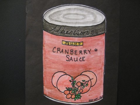
5. “Campbell’s Soup 1” 35” x 23” Screen print, 1968.
About the Art
Andy Warhol created ten different types of soup prints in his series of Campbell’s Soup cans. This print shows Tomato Soup. Other prints in the series included Black Bean, Chicken Noodle, and Vegetable made with Beef Stock. Andy’s soup cans were his most popular works of art.
Suggested Dialogue
What is a “series” in painting? A series is a group of several paintings on the same subject, such as portraits of the same person, Victorian Houses, or Seascapes. Andy’s “series” of large soup cans all looked like a Campbell’s soup can but each was labeled with a different soup name.
Project Ideas
- The class may need a short demonstration on the techniques of drawing a foreshortened circle and a cylinder before beginning this project. Bring in several assorted cans of Campbell’s Soups or various “Brands” of soup (cans do not need to be empty). Divide the class into groups of two or three and give each group a can. Lightly sketch the can and the label design on paper. Color or paint the can with the same label colors. It would be much more dramatic to boldly outline the details of your can with a fine tipped black marker. Outline after you have added all of the color. Mount on colored paper. (Grades 3-5)
- Create the above project using cans of assorted fruits and/or vegetables. Mount on black paper to create a border with more dramatic contrast. (Grades 3-5)
- An additional variation of the two above projects is to divide the paper into quarters and sketch four different cans. Center each can into each quarter. Rotate cans within the groups and set a time limit for drawing each can. This project will probably take two class times to finish—the first to draw the cans and the second to color them. (Grades 4-5)
- Bring in several assorted cans of Campbell’s Soup. Group and stack these together into a “Still Life” model at the front of the room. Add a spoon, folded napkin, crackers or a small bowl to the arrangement if you would like to make the still life a bit more interesting. Don’t add more than a couple of things so that the soup cans fill most of the arrangement. Sketch this arrangement on paper. Use markers or crayons to color the sketch. (5th)
- Save empty cans of the same size and remove the labels. Cut paper in the correct size to wrap around each can. Kids will design their own original soup can labels and attach them to their can. Challenge the class to come up with unusual types of soup, such as “Briny Barnacle”, “Cream of Possum” or “Cockroach Roast”. Give the kids a list of things to include on their labels—brand name and/or logo, type of soup, optional picture of the product, NET WT, ingredients, and Nutrition facts (serving size, servings per container, amount of calories per serving, total fat, cholesterol, sodium, total carbohydrate, protein, vitamins, etc.) Bring in several brands of soup cans so kids can see and compare the details found on the separate labels. You might create a sample template that indicates areas for each item of info. If all of the cans are the same size, stack them to create an interesting and unusual display. Try arranging the class cans into a stacked triangle, which may look like an Andy Warhol sculpture. (Grades 2-5)
- Save empty aluminum soda cans. Cut paper in the correct size to tape around each can. Display examples of several canned drink logos at the front of the room. Challenge the class to create an original, unique drink with the most unusual logo and label they can.
- Draw a cylinder, and create your own soup can painting, just like the Pop Artist Andy Warhol. Your cylinder should be large one, to fill most of the page. Sketch your can lightly with a pencil before you paint. Use a real soup, vegetable, or fruit can as a model for your painting.
Drawing a two-dimensional cylinder SHAPE creates an illusion of a three-dimensional FORM.
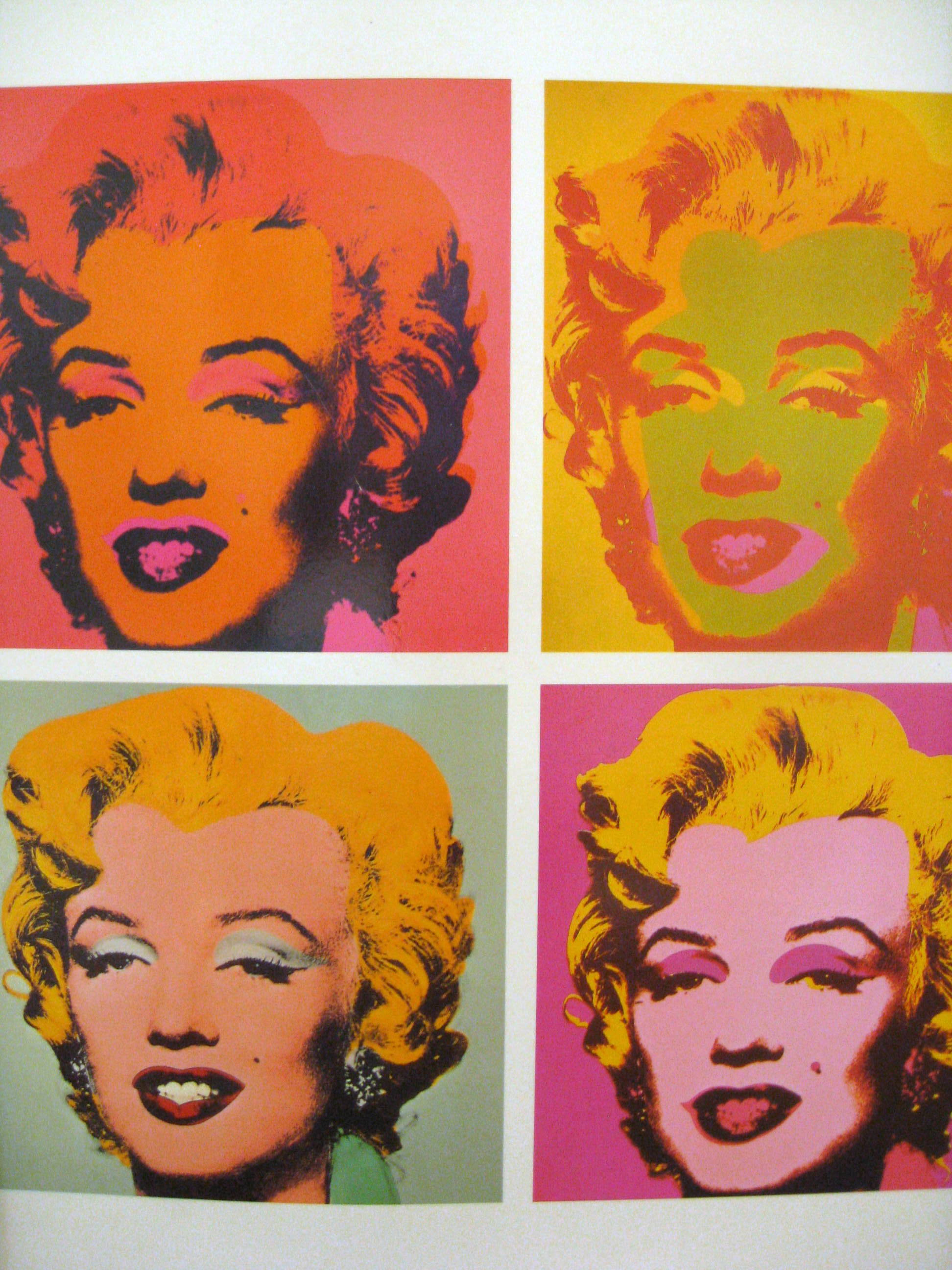
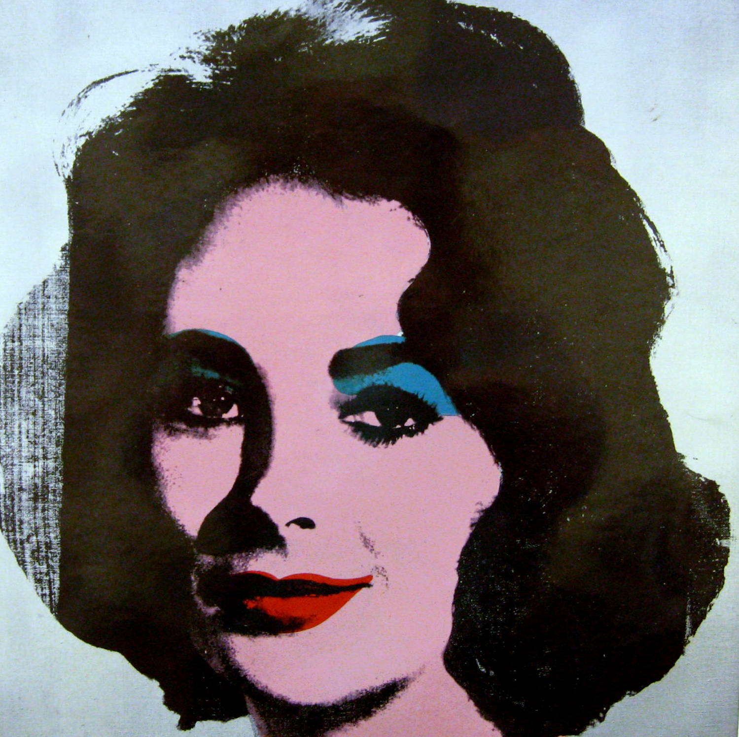
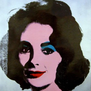
6. “Marilyn” Silkscreen, 1964, 1967
Suggested Dialogue
What type of painting is this? It is a picture of a person, so it is a “Portrait”
Has anyone ever heard the term “idol”? “American Idol” TV show? What is an idol? What does the word “idol” actually mean? A person or thing that is looked up to and admired
Can anyone give an example of an idol? Movie stars, music stars, athletes, fashion models
Elvis Presley, Elizabeth Taylor, and Marilyn Monroe were idols of the 1960’s. Andy Warhol captured their portraits in art with many paintings and picture series. For all their differences, these three stars have one major thing in common—they are the representation of the American success story—the American dream. These three song and movie idols symbolized the ideal of beauty and success in American society in the 1950’s and ‘60’s.
Elvis Presley rose from a singing truck driver to become the celebrated idol of a whole generation. Elizabeth Taylor, who started her career as a child film actress, grew up to become one of Hollywood’s most highly paid superstars. Norma Jean Baker, alias Marilyn Monroe, was a legendary movie star of the 1950’s and 60’s. Each of these idols shared something else—their not-so-perfect lives were surrounded by tragedy. Elvis, the 1950’s and ‘60’s Rock and Roll star, frequently had troubles with serious depression. Elizabeth Taylor constantly struggled with health problems. Marilyn Monroe died from a tragic overdose when she was only in her thirties.
To create this type of painting, Andy Warhol discovered that he could convert just about any black and white newspaper or magazine illustration into a photographic silkscreen painting. The silkscreen process enabled him to repeat the same portrait hundreds of times, in various colors. Warhol emphasized the most important features of Marilyn—her eyelids and lips.
What did the artist do to emphasize Marilyn’s most important features? He added light blue color to the top of her eyelids and bright red color to her lips. He also made Marilyn’s teeth extremely white, to sharply contrast the red color of her lips.
This is another painting that Warhol did for his Marilyn series. It was painted three years after the Marilyn portrait with the blue background.
These paintings of Marilyn do not reflect reality—they are not painted in REALISTIC colors. Warhol did this on purpose. The pictures are EXPRESSIONISTIC in style. The use of different colors might create a different feeling or MOOD. Discuss the MOOD each Marilyn creates. Which colors create a feeling of calm? Which colors create a feeling of excitement?
Warhol wasn’t painting the private Marilyn, only the Marilyn seen by the American public. The picture represents the mask famous people wear in public. A critic described Warhol’s Marilyn pictures as “a woman carefully manufactured, packaged, and sold like a can of soup”. When Warhol was asked why he painted her with such loud colors he said, “all that matters is beauty and she was beautiful; and if something is beautiful, then the colors are beautiful too”.
Do you think Marilyn Monroe was a beautiful woman? Are these two paintings of her beautiful?
(Grades 2-5) Is this Marilyn picture painted with mostly cool or mostly warm colors? Red, yellow, orange are warm colors—blue, green, violet are cool colors.
Kids should know warm/cool COLORS after second grade but many times Art Discovery volunteers may not have covered it well. It is recommended that volunteers review ALL grade’s previous basic EALR information to be sure students have not missed something. Remember that some classes may not have been lucky enough to have a regular or reliable Art Discovery volunteer. By reviewing each year, kids will learn and retain the information better, which will make the State Classroom Assessment in 5th grade easier and MUCH more fun!
(Grades 2-5) Is the other Marilyn picture painted with mostly cool or mostly warm colors? Mostly cool
Which are the most important features in these portraits? Their eyelids and lips
Compare the eyes and lips of this portrait with the portraits of “Liz Taylor” and “Jane Fonda”. The artist featured the young Liz Taylor with blue-green eyelids and bright red lips; Jane Fonda has highlighted purple eyelids and bright blue eyes, along with her red, shiny lips.
Can you list two striking differences about this Marilyn portrait? Marilyn’s teeth show here, Jane’s and Liz’s teeth don’t show; Marilyn’s hair is colored an unnatural bright yellow
The second Marilyn portrait has the same hair, but don’t show the warm colored version yet.
The artist chose a popular publicity photo of Marilyn Monroe as the subject for this painting. He went on to create many different versions of this Marilyn portrait painting, (Show second, warm colored version of Marilyn) using the same black and white photograph, with various colors and techniques to change the look.
Project Idea
Copy a black and white version of a black and white Elvis Presley photograph onto a piece of white paper. Give kids two copies of the picture. Paint each copy of the picture with different bright watercolors to create two Elvis “series” paintings. Bright colored marking pens will also work nicely. Mount the pictures side by side on a large sheet of construction paper (similar to Flowers project idea) to display your “series” pictures. Do kids understand “series”?
7. “Jane Fonda” Screenprint, 39 ½ “ x 39 ½”, 1982.
This picture was painted eight years after the “Marilyn” painting. It is a portrait of another famous American actress, Jane Fonda.
“When a person is the beauty of their day, and their looks are really in style, and then the times change and tastes change, and ten years go by, if they keep exactly their same look and don’t change anything, and if they take care of themselves, they’ll still be a beauty.”
ANDY WARHOL
This actress had a father, Henry Fonda, who was a very famous actor. Jane’s brother was also a well-known actor. Jane starred in many movies throughout the 1970’s – 1990’s. She made several popular exercise videos in the 1980’s. “Monster in Law” and “Georgia Rule” are more recent movies this actress has starred in. Although Jane Fonda is much older than in this painting, she still looks very much the same today.
(Find a more recent picture of Jane Fonda to show the class.) Jane Fonda was a real American beauty in the 1970’s. Compare the recent photo with the painting. Do you think Andy Warhol’s theory about beauty (stated above) is true in Jane Fonda’s case?
Warhol also made this painting very large (39 ½” x 39 ½”). Does the size of a painting say anything about the subject? Sometimes it does. Sometimes celebrities are seen as people very much larger than life. A very large portrait might reflect this idea.
What does “larger than life” mean?
(At one time Jane was a very controversial celebrity. She was extremely outspoken against America’s involvement in the Vietnam War. Although she traveled to Vietnam to visit the soldiers during the war, many soldiers were offended by her outspoken and negative views. For awhile this made the actress unpopular.)
Project Ideas
- Copy some of today’s famous celebrity’s portrait photos into black and white prints. Use marking pens, highlighters or paint to add color “Andy Warhol style” to one of these celebrity photos. Mount on colored paper to form a vibrant border.
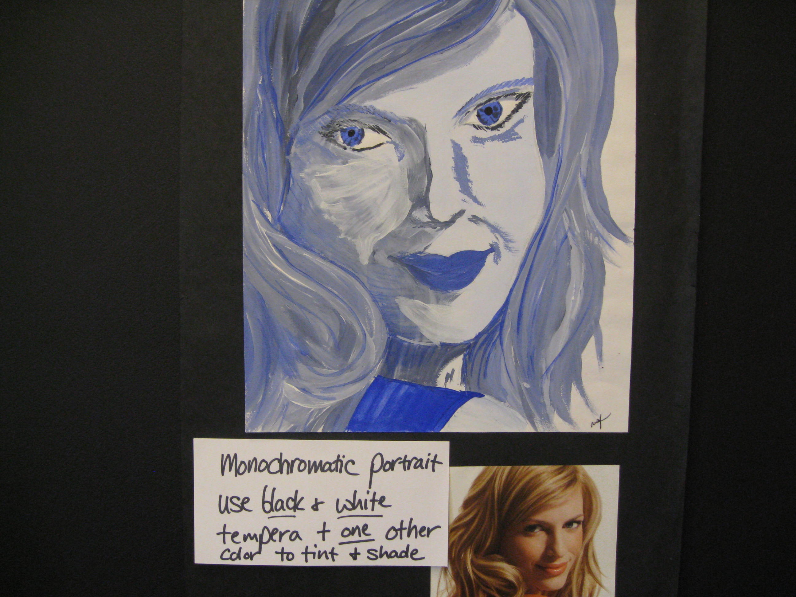
- If you have a digital camera, visit the classroom a few days before your presentation to take individual black and white photographs of each student. Print a plain paper copy of each student’s photograph, reproduced four times on the page. Kids color the four photographs (“Warhol style” as above), using different color combinations for each, to create a Pop Art self-portrait “series”.
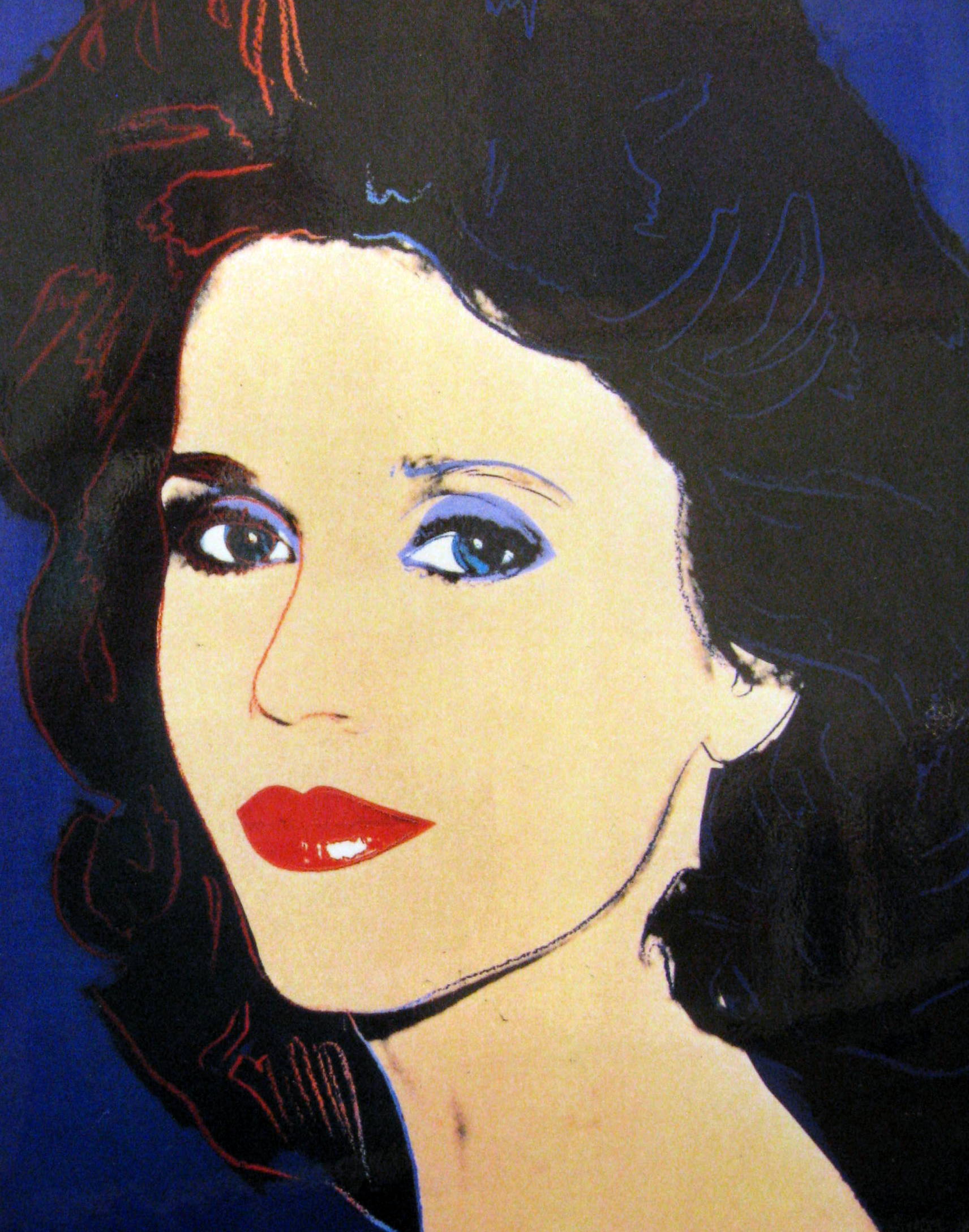
8. Liz Taylor
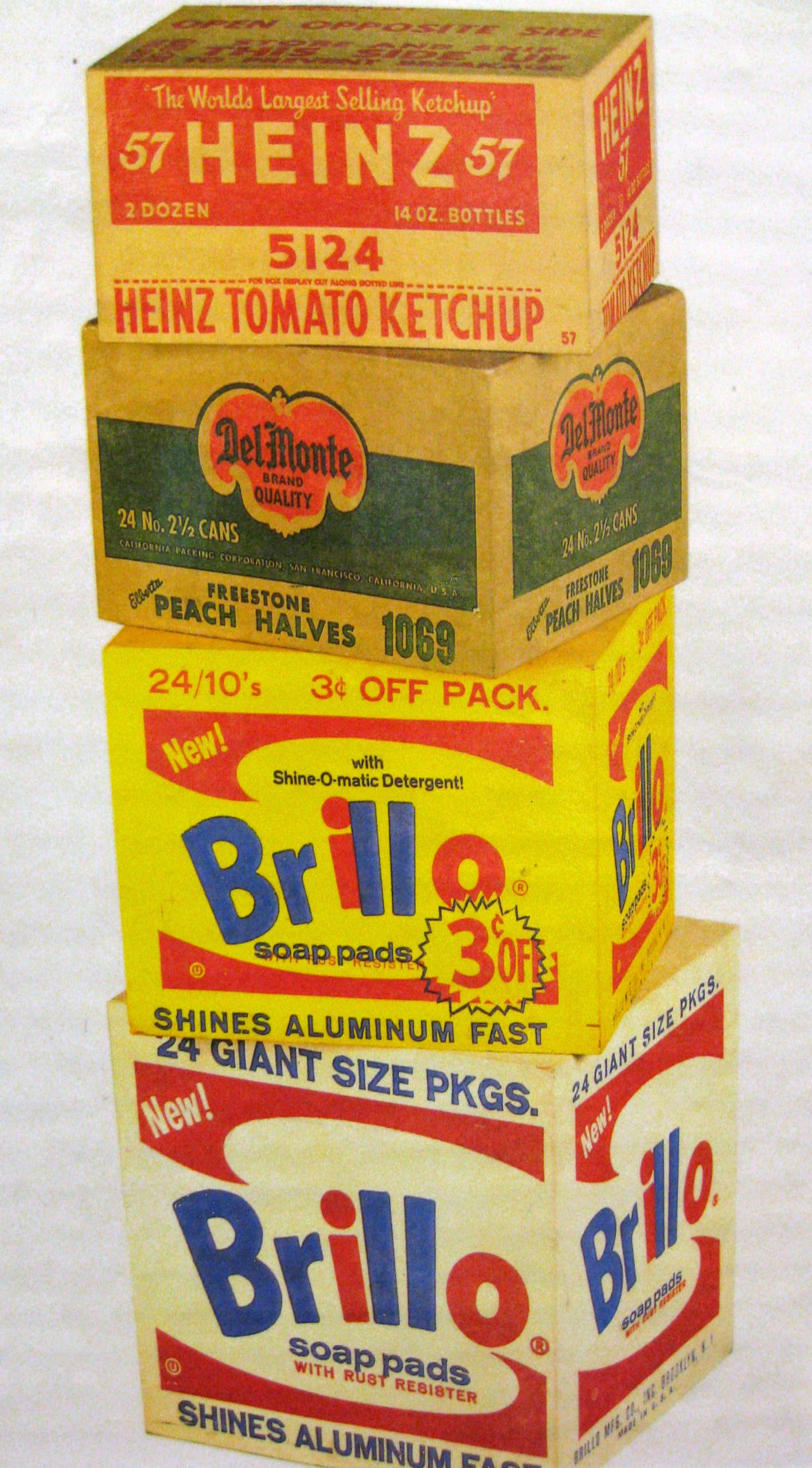
9. “Brillo, Del Monte, Heinz Carton Sculpture” 1964.
From the early 1960’s, Andy Warhol selected his art subjects in the supermarkets of Queens, the Bronx, Brooklyn and other American suburbs of New York. He chose items that ordinary, working class Americans would see and easily recognize rather than what the rich and elite might have. Items from the supermarket are the mass-market articles of American consumers. These items represent the American way of life. Because Andy Warhol chose to do this, some art critics saw him as a “true” artist with a unique vision. Many other critics thought it was just silly and did not classify him as a “real” artist at all.
In an exhibit in 1964, Warhol displayed a variety of boxes stacked around the gallery in a very casual way. On raw plywood forms, the size and shape of cardboard grocery cartons, Warhol silk-screened copies of real supermarket brand logos. The boxes stood in stacks, and Warhol’s paintings suddenly went from flat, two-dimensional shapes into three-dimensional sculptural forms. The variety of his silk-screened boxes included examples of Kellogg’s Corn Flakes, Mott’s Apple Juice, Heinz Ketchup and Del Monte Vegetables.
Suggested Dialogue
What is the difference between a SHAPE and a FORM? Shapes are two-dimensional; they can be measured top to bottom and side to side. Forms are three-dimensional; they can be measured from top to bottom, side to side AND they have measurable thickness.
What is the difference between a painting and a sculpture? Paintings SHAPE, sculptures FORM.
Are these actual cardboard boxes? No, Warhol built wooden boxes and painted them to LOOK like cardboard boxes. They are even stacked in a similar way you might find cardboard boxes stacked in a grocery store, just before the contents were emptied on the shelf.
Do you think your mother would pay money to own and display this sculpture in her living room or kitchen? Why or why not? Most people don’t consider things that resemble common items that we normally throw away, to be art.
Bring in several cardboard cartons that have logo designs from the grocery store. Stack these at the front of the room before your presentation begins. Don’t explain anything about them until you get to this picture. Is this a work of art like Andy Warhol’s sculpture? No, because they are the original cardboard cartons. Andy made his own cartons out of wood and painted them to “look” like the cardboard cartons. How could we turn this stack of cartons into a work of art? Make wooden cartons and paint them to look like the cardboard ones OR sketch and paint them. Use the cartons for your project. Kids draw and paint the boxes like a Still Life arrangement. You might demonstrate how to draw a cube on the board, at the front of the room, before beginning the project. Be sure you display each of the cartons at slightly different angles, just as the picture shows. Draw different angled versions of a cube for the class to refer to as they make their sketches or give the class copies of “The Shape of a Cube” handout. (If class is creating a cardboard box sculpture, explain wooden boxes cost too much.)
Project Ideas
- Send out a flyer to have kids bring in empty “brand name” food container boxes (such as cold cereals, oatmeal, Kraft macaroni, Velveeta cheese, pudding, Jell-O, crackers, etc.) and/or empty “brand name” toothpaste, soap, detergent, juice, or “Twinkie” boxes. Do this a couple of months ahead so you can send out a second flyer, in case you don’t get enough boxes back. Specify the boxes must be in good shape (not squashed or torn). Give everyone 8-10 boxes (depending on size) to glue together and create a stacked sculpture on a cardboard or poster board base. Assign kids to create either an Asymmetrically Balanced sculpture or a Symmetrically Balanced one. You might create a “fast food” sculpture with cups, fry and burger boxes, chili containers, chicken buckets, etc., with logos of major fast food chains in same way. Ask local chains for donations.
- Sketch and color a “Still Life” arrangement of three or four popular “brand name” food boxes or fast food containers from the major chains.