Understanding Basic ELEMENTS and PRINCIPLES of Art
Art Discovery volunteers need to understand some very basic Elements and Principles of art! ELEMENTS of design are the building blocks of art. These are the basic parts that are put together to create a work of art. Elements include: LINE, COLOR, SHAPE or FORM, TEXTURE and SPACE. PRINCIPLES of design are the plans that make the elements of art come together. Some basic principles volunteers should cover are BALANCE, EMPHASIS/DOMINANCE (focal point or center of interest), MOVEMENT/RHYTHM, REPETITION/PATTERN and PERSPECTIVE or SPACE.
The following pages are simplified and detailed definitions (with examples) to help volunteers understand and teach the ART BASICS, found on the Washington State EALRS (Essential Academic Learning Requirements) list. Some additional activity ideas are also included.
Art Discovery Volunteers should REVIEW the basics regularly in classroom presentations. Volunteers are not expected to teach ALL of these basics in ONE presentation, or even in just one year. Some basics need to be simplified for younger grades and expanded as kids get older.
Be sure to USE THE CORRECT WORDS as you describe and discuss these elements and principles. This will expand the student’s vocabulary and they will understand other Art Discovery volunteers correctly, as they each progress to other classrooms.
Line is an extension of a point (a dot). It moves in a direction. Paul Klee (pronounced “clay”) was an artist who created pictures filled with line. Paul liked to say he was “taking a line for a walk” as he drew or painted these pictures. Point out how lines MOVE through a picture. Line is the visual representation of an experience of movement—a path of action.
THERE ARE FIVE DIFFERENT LINE TYPES:
- HORIZONTAL: These lines are restful, like the horizon of a quiet seascape.
- VERTICLE: These lines are strong and stable, like tall skyscrapers in a cityscape.
- DIAGONAL: These lines are unstable and may cause dynamic movement in or through a work of art.
- CURVED: These lines twirl, curl, roll, and show movement and action.
- ZIG ZAG: These triangular lines may create rhythm as they move the viewer’s eye up, down and across an area.
LINE QUALITY DESCRIBES THE APPEARANCE OF A LINE.
Some examples of LINE QUALITY, or descriptions of lines, could include thick, thin, dark, light, bold, strong, weak, stiff, soft, sharp, blurry, straight, jagged, dotted, or broken. LINE COLOR is a LINE QUALITY.
The artist can also apply LINE to the surface in many ways to complement the MOOD of the painting. This might be a conscious or unconscious effort on the artist’s part. If the artist feels angry while he is painting, the LINES might show this. To show an angry MOOD in a picture, the artist might intentionally use LINE. LINES can show emotion or expression. LINES can describe an idea (such as speed or heat) or an emotion, (MOOD, such as anger) without even depicting a person or an object (Abstract). Expressive LINES can be—wavering, delicate, nervous, gentle, tense, or restful.
- The HORIZON LINE is the imaginary line created where the sky meets the earth in an outdoor scene such as a Landscape, Cityscape, or Seascape.
- Implied lines are created where two different colors meet along a straight, jagged, zig zag, or curved edge.
- Line may create a 3-dimensional illusion of a FORM on a 2-dimensional surface (SHAPE). SPHERE, CYLINDER, CUBE, CONE, or PYRAMID SHAPES, when drawn with line and shadow give the illusion of their actual three-dimensional FORM but on two-dimensional paper are still shapes. A Three-dimensional clay version of a SPHERE, CYLINDER, CUBE, CONE, or PYRAMID is an example of actual FORM.
(Recommended technique to use with Grade 3 students as a simple FORM and SHAPE relationship comparison teaching activity.)
Shape has two dimensions. It can be measured two different ways—up and down and side to side (height and width). SHAPES are FLAT because they DO NOT HAVE THICKNESS.
Some SHAPES can be identified by name (square, heart). Others are simply designs which can only be identified by describing them (round at the top, flat at the bottom, angled at the sides). Types of SHAPES include:
- GEOMETRIC SHAPES are like squares, rectangles, diamonds, octagons, circles and triangles. These shapes are easy to identify and are mathematical.
- ORGANIC SHAPES resemble those natural shapes such as leaves, twigs, shells and rocks.
- FREEFORM SHAPES are abstract, combining geometric and organic shape.
SHAPE Represents FORM when used in two-dimensional drawings or paintings.
Form has three dimensions. It can be measured three different ways—up and down (height), side to side (width) and includes an object’s THICKNESS.
SHAPE and FORM are the 2- and 3-DIMENSIONAL aspects of each other.
A square is a two-dimensional SHAPE but a cube is the three-dimensional equivalent or the FORM. A Full Round sculpture (a statue) has FORM but a photograph of that statue has SHAPE (although for Art Discovery discussion a photograph of sculpture is used and described as FORM because actual sculpture can’t actually be brought into classrooms. Discussion of this detail is important for grade 3 and up). Sculpture attached to a background (Sunken, Low, or High RELIEF) has FORM. Drawings and paintings have SHAPE. Masks have FORM.
Color is a Basic Element of design. HUE is another word for color.
PRIMARY COLORS: (red, yellow and blue) the three basic colors from which all other colors are made. They are the true or pure colors. These are the only colors that CAN’T be created by mixing other colors. Primary colors are the most intense of all the colors. By mixing various amount combinations of the Primary colors, all the colors found on the *color wheel can be produced.
SECONDARY COLORS: (orange, violet and green) These colors are made by mixing equal amounts of two primary colors—Red and Yellow produce Orange, Red and Blue produce Violet, Blue and Yellow produce Green.
INTERMEDIATE COLORS: (yellow-orange, red-orange, blue-violet, red-violet, yellow-green and blue-green) These colors are also called TERTIARY colors and they are made by mixing a primary color (red, yellow or blue) and the secondary color that is next to it on the color wheel (orange, violet or green).
ANALOGOUS COLORS are colors that are next to each other, seen in a series on the *Intermediate Color Wheel (blue, blue-violet, and violet or yellow, yellow-orange, orange). These closely related colors make a harmonious color scheme.
COMPLIMENTARY COLORS are opposite each other on a color wheel. Orange is the compliment of Blue, Green is the compliment of Red, Violet is the compliment of Yellow. These colors pleasantly contrast each other. Complimentary colors can sometimes seem to create vibration when used next to each other. As complimentary colors are mixed together, they make each other less bright or less intense, and can even produce the neutral colors of brown or gray, depending on the proportions.
NEUTRAL COLORS are not part of the color wheel. Black, white, gray, and brown are NEUTRAL or “non-colorful” colors that are not found in the rainbow. Neutral colors are harmonious with almost any color. White is the absence of color. Mixing different proportions of Primary colors creates some of the other neutral colors:
- Mixing equal amounts of red, yellow and blue creates black.
- Adding more red than yellow or blue produces the neutral color brown.
- Adding more blue than red or yellow makes a bluish-gray.
- Complimentary colors equally mixed together create neutral tones of gray.
WARM / COOL Colors can be grouped as WARM (red, yellow, orange) or COOL (blue, green, violet). WARM colors give the illusion of warmth—sunshine, mellow feelings, or heat, fire and brightness. COOL colors can be soothing, cold, lush or sad. They give the illusion of coolness, as in water, mountains and ice. COOL colors appear to recede or go towards the background of a painting, like the sky. WARM colors tend to pull the viewer’s eye forward.
VALUE is the LIGHTNESS or DARKNESS of a color. Colors have different values—YELLOW has a light value, VIOLET has a dark value. When colors are used at full value, they appear strong and bright. Adding any color that is either lighter or darker than the original color can change value. Adding neutral white or black also changes value. By making color change through mixing, the color possibilities are almost limitless. It is estimated that humans can distinguish about 10 MILLION COLORS!
INTENSITY is the BRIGHTNESS or DULLNESS of a color. The full intensity of a color (brightest) can be dulled (given less intensity) by adding gray or some of the COMPLIMENT of the color. The more of the compliment that is added to a color, the less intense it becomes.
MONOCHROMATIC COLORS: These colors are different *VALUES and *INTENSITIES (see definitions above) of a single color. Monochromatic colors are closely related colors that make a harmonious color scheme (much like analogous colors). The different VALUES and INTENSITIES of a monochromatic color scheme are created with:
- TINTS are colors that have had their VALUE lightened with white.
- SHADES are colors that have their VALUE darkened with black.
- TONES are colors that are dulled by either mixing amounts of two complimentary colors or adding gray.
TONES of gray exist between black and white. In a black and white photograph, the LIGHTEST VALUE is white, the MEDIUM VALUES are the various grays and the DARKEST VALUE is black. A black and white *VALUE SCALE, is a good way to teach kids tints, shades, and VALUE but this project does not truly cover INTENSITY or TONE (3-4 grades). Painting a color *VALUE SCALE, using tints, shades, and tones of a single color, is the best way to teach MONOCHROMATIC color VALUE and color INTENSITY concepts to 4th and 5th grade. A primary or secondary color are used to paint a *COLOR INTENSITY SCALE. An *ANALOGOUS COLOR SCALE, which uses PRIMARY and SECONDARY COLORS to create INTERMEDIATE (or Tertiary) COLOR can teach or reinforce several color concepts. (*Check for several additional pages created to help with this.)
COLOR WHEEL: This is a way of showing relationships among colors in the form of a circle. The basic Primary Color Wheel displays the primary and secondary colors in a series. An Intermediate (Tertiary) Color Wheel includes the intermediate colors found between the primaries and secondaries, in series such as violet, blue-violet, blue, blue-green, green, yellow-green, yellow, yellow-orange, orange, red-orange, red, red-violet. A Color Wheel is sometimes divided into WARM and COOL colors.
The artist can apply color to a painting in many ways (TINTS, SHADES, TONES, VALUE, INTENSITY, and WARM, COOL) to create a MOOD for the painting. Color can show emotion or expression without even depicting a person or object. If the artist wants to create an angry or happy mood, he might use WARM COLORS, which give the illusion of heat and fire or warmth and sunshine. The artist might use light color VALUES or light TINTS of color to create a happy mood. The artist might also use dark VALUES, SHADES, and INTENSITIES to create a sad or gloomy mood. COOL COLORS can create either a sad, cold, or a relaxed mood.
LIGHT AND SHADOW—Colors are affected by how much light is reflected on them or how much shadow. White can be added to a color (TINT) where light is reflected. Areas of shadow can be created in a color by adding various amounts of black (SHADE). Sources of light in a painting might come from a window or door, the sun or moon, a candle, a lamp or a fire. The eye often focuses on the lightest point in a painting, moving from the lighter areas to the dark. Light and shadow also create movement through a painting. Light or shadow might also affect the mood or emotion of a painting. Point out, or ask the kids to point out, the direction that the light comes from in a picture:
- When light comes from behind, it creates shadow in front.
- If there is a shadow on one side, the light source is from the opposite side.
- When light is in front, the shadow falls behind.
SUGGESTED COLOR ACTIVITY:
Bring in pieces of cellophane in PRIMARY COLORS. Let kids hold these up to the window and overlap primary colors to produce the SECONDARY COLORS.
*Two Color Wheel and various Value and Intensity Scale Templates are included with Art Basics materials and can be printed on cardstock for kids to paint. Consult your Art Discovery Coordinator for copies of these Templates.
Texture refers to an object’s surface. This is a tactile description—the way something feels. Texture in a painting is usually the result of a visual illusion of how an object actually feels. These illusions can be created using LINE, PATTERN, COLOR, SHAPE, or REPETITION. The artist can represent a variety of textures in a single artwork, even if the surface of the canvas doesn’t change. This is called VISUAL TEXTURE. For example, the shiny metal container hanging on the wall of The Kitchen Maid (3. The Golden Age of Dutch Art—Vermeer) and the rough bread crust appear to have very different textures, but if you could rub your hand across the actual canvas, these objects would actually feel the same because the texture is a visual illusion.
Some works of art have ACTUAL TEXTURE. For example, an artist can apply the paint thickly, with a palette knife, and leave the rough surface to dry. Look closely at the reproductions, to get a sense of the actual texture of the real canvas. Sometimes this can be seen but often it is hard or impossible to make out the actual texture in a poster print. Actual texture can be seen and felt in sculpture, since this is three-dimensional. Compare the smooth texture of the Pietà with the patterned texture found on the boots of Donatello’s David (22. Renaissance Art). The texture of each of these sculptures could be felt if you were able to touch them so they have actual texture.
SUGGESTED TEXTURE ACTIVITIES:
- Help kids list words to describe TEXTURE. Write them on the board. Here are some suggestions to get started, but be sure to let the kids create the list first: Smooth, rough, bumpy, slick, gritty, sticky, slippery, lumpy, prickly, choppy, glossy, furry
- Let kids choose one visible object in the classroom (you might bring some objects with you to help). Have kids identify the object’s TEXTURE. Go around the room and let several kids choose an object to identify to the class. (Suggested objects—sandpaper, cactus, velvet cushion, washcloth, satin pillow, metal bowl, polished rock, waxed paper, etc.) Challenge older kids to write their descriptions.
- Fifth grade students need to know how to create several types of TEXTURE using only the basic element of LINE. They must also be able to identify and label their drawn texture. Pass out half sheets of paper and have kids fold this into quarters. Give 5-10 minutes for quickly drawing four different types of Texture (one in each quarter), using only LINE, and labeling each one. This is now a vitally important activity which should be covered in third and fourth grade classes, in preparation for the new 5th grade State WASL Visual Arts Classroom Assessments (beginning 2008 – 2009 school year). If class seems to have trouble understanding this activity, take time to draw a few of your own examples on the board up front. Repeat the activity again the next month, challenging kids to draw completely different types of texture, making sure everyone understands how to do the activity. This same type of activity is included in State Visual Arts Classroom Assessments.
Space in an artwork is either POSITIVE or NEGATIVE.
Negative Space in an artwork is empty space. In a two-dimensional painting or photograph, negative space is the sky, a wall or the background surrounding SHAPES, objects, or images. Negative space in a Landscape can be the grass in a park, where people are walking and sitting, as well as the sky above; negative space can be the sky and water in a Seascape.
Positive Space is the area of a picture that is filled with something—LINES, DESIGNS, COLORS, objects, people, animals or SHAPES. Positive space holds the focal point, or the center of interest, in a picture, which is partly defined by the negative space surrounding it.
In a three-dimensional sculpture, POSITIVE SPACE is the solid FORM of a statue, carving or assemblage. The NEGATIVE SPACE of a sculpture is represented in the openings formed by taking away material or leaving areas that might look like “holes” in a sculpture.
Perspective is the illusion of 3-dimensional space on a 2-dimensional surface. Perspective creates DEPTH on a 2-dimensional surface such as paper, a canvas, or a photograph. Classical painting (art of the ancient Greeks and Romans) used perspective but the technique was lost, considered unnecessary, or forgotten for many years after the Roman Empire fell. The rules for creating the illusion of perspective (depth) were carefully calculated and recorded, using mathematical formulas, by artists living during the time of the Renaissance (another word for the “rebirth” of classical art). There have been several formal systems of perspective developed for artists for creating realistic paintings and drawings.
All ages can discuss and begin learning to identify the spatial concepts of BACKGROUND (objects farthest away), MIDDLE GROUND (those objects a little closer) and FOREGROUND (closest). This is the simplest way to create DEPTH in a painting and it is very easy to demonstrate and review. Almost every two-dimensional painting and photograph has Foreground, Middle Ground and Background. Reviewing this principle could be as simple as asking several questions—What is happening in the Background of this picture? Who can list some of the objects the artist painted in the Middle Ground? Is the (certain object) in the Foreground, Middle Ground or Background of the scene? In which area of the painting does the main action of the painting occur? In which area(s) of the painting do you see movement?
COLOR, SIZE and LOCATION are each simple spatial devices used to create the illusion of DEPTH.
- COLOR in the distance (background) is pale or dull when compared to colors of things closer to the viewer (foreground).
- Objects of smaller SIZE appear to recede into the background of the picture. Larger objects move closer to the viewer.
- LOCATION of an object also fools the eyes to create DEPTH. Things up close are lower in the picture, things farther
away appear higher in the picture. Objects also become less detailed and fuzzy as they move farther into distance.
Grades 4 – 5 can begin to understand ONE-POINT PERSPECTIVE using a VANISHING POINT. This technique is best illustrated in Landscapes, for creating roads, rivers, or railroad tracks. The principle of one-point perspective is a form of LINEAR PERSPECTIVE, in which all lines appear to meet at a single point on the HORIZON LINE (the vanishing point).
OVERLAP means extending over or resting on top of something and partially covering it up. Overlapping happens when parts of a picture lie on top of other parts, like hills, mountains or houses lined down a street. Overlapping gives an illusion of DEPTH because the parts on top look closer than the parts underneath.
FORESHORTENING is a way to apply perspective to a single object. For example, an arm pointing directly at the viewer is foreshortened to become little more than the hand of the arm. A round tabletop would be “squished”, or foreshortened, into an oval in order to have the viewer believe they are seeing it from farther away. If the table top were left round, the shape it actually is, it would seem that the viewer was directly above the table, instead of a distance away. In the eighteenth and nineteenth centuries, when a critic praised an artist’s “drawing”, he generally meant the artist’s skill in handling the difficult problems of foreshortening.

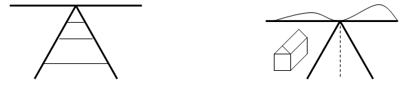
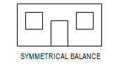
Balance refers to the way an artwork is laid out. There are three basic types of balance to discuss: SYMMETRICAL (Formal), ASYMMETRICAL (Informal) and RADIAL.
When the same basic elements are mirrored evenly on both sides of a picture or sculpture, it has SYMMETRICAL (or FORMAL) BALANCE. In this type of balance, there is an equal distribution of visual weight (created with COLOR, LINE, SHAPE, or FORM) on both sides of a composition (another word of a work of art). Most Symmetrically Balanced art is not perfectly balanced only roughly balanced. Large Decoration with Masks (5.Henri Matisse) and Minoan House Plaques (6. Minoan Art of Crete) have Symmetrical Balance.
A portrait is usually an example of Symmetrical Balance when a person is facing the viewer. Each side of the face is a mirror image of the other. If you fold a portrait in half vertically, each side has the same elements, or parts (eye, cheek, shoulder, arm, leg, etc.). Packet 2. Masks of Many Cultures, contains several good examples for teaching portrait symmetry. Madame Matisse (The Green Stripe) (5. Henri Matisse) is a roughly balanced portrait.
SYMMETRICAL (or FORMAL) BALANCE is not the most common type of balance found in Art.
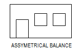
ASSYMETRICAL (or INFORMAL) BALANCE happens when the elements are not perfectly matched, but the parts of the picture still catch and hold your eye equally. In this type of balance, there is no way to divide a picture into exact equal parts down the center. A large shape on one side may be balanced with several smaller shapes on the other. Each side of the picture is somewhat different. If a person were turned slightly, they might become ASYMMETRICALLY (or INFORMALLY) balanced because a face turned sideways looks a little different on each side of an imaginary, vertical, center line. Informal balance is usually more exciting and interesting than more formally balanced compositions.
ASSYMMETRICAL or INFORMAL BALANCE is the most common type of Balance in Art.
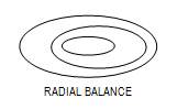
RADIAL BALANCE or RADIAL SYMMETRY happens when the elements of a design radiate, or move out, from a center point. A wheel with spokes is a good example of RADIAL SYMMETRY. The Snail (5. Henri Matisse), Spider Web (12. Mira Atkeson-Color Photography), The Dance of Youth (9. Picasso) and Zebegen (18. Illusions in Art) are examples of RADIAL BALANCE.
RADIAL BALANCE is the least common type of Balance.
Emphasis/Dominance –Sometimes, the artist wants to direct attention to a specific part of a painting first. This is called EMPHASIS. A certain color in a painting might be DOMINANT or in other words, it might stand out against all the other colors. Additionally, an object, LINE, SHAPE or TEXTURE in the picture might also be a dominant FOCAL POINT. But if your eyes stayed on the dominant focal point too long, the rest of the painting would not be noticed. An artist needs to keep a visual balance of the elements in the work, so the viewer’s eyes will move through the picture.
Artists can also create EMPHASIS or DOMINANCE by using COLOR VALUE. Areas that the artist wants to direct the viewer’s attention to first have either a lighter or darker color value. In Portrait Art, the face has the lightest value so that the eye travels here first.
Movement/Rhythm are often created using LINE. Line is the path of action and the visual representation of an experience of MOVEMENT. Repetition of LINE, COLOR or SHAPE can create RHYTHM and MOVEMENT. The illusion of MOVEMENT can also be created with curved, diagonal, or angled LINE. Movement usually illustrates the action in a picture (a horse running, wind blowing). Visual Movement causes our eyes to travel across or through a picture (along railroad tracks or across a fence line).
The best examples of MOVEMENT (and in some cases rhythm) from Rotation #1 include: Group of Deer and Yellow Horse (1. Prehistoric Cave Art), White Birds Flying in the Snow, Autumn and Tiger [Kyosai] (4. Japanese Art), Large Decoration with Masks, The Horse, the Rider, and the Clown, The Snail, Sadness of the King (5. Henri Matisse), Bull Leaping Fresco, Ivory Figure of an Acrobat, Pair of Gold Repoussé Cups, Octopus Pottery (6. Minoan Art of Ancient Crete), (8. American Carousel Art), The Dance of Youth (9. Picasso), Winter Light, East River (10. Cityscapes), Revolution of the Viaducts (11. Art of Fantasy, Dreams and Make Believe), Oregon Coastline, Ecola State Park, Ecola State Park, Crescent Beach, (12. Color Photography), Dismounted: 4th Troopers Moving, Bareback Riders, Train du Soir (13. Adventures in Art), Monet Painting in his Garden at Argenteuil (14. Renoir—Impressionism), Swinging, Massive Structure, Blue Poles II (16. Abstract Art—Kandinsky & Pollock), The Episode of the Buffalo Hunt, Bronco Buster, The Stampede (17. Frederic Remington), Troupe de Mlle Eglantine, Job Papier a Cigarette, Eugenie Buffet, (19. Poster Art of the 19th Century)
Pattern is the REPETITION of a similar SHAPE, or set of shapes. SHAPES in a PATTERN are often called a MOTIF. SHAPES can be precisely or irregularly repeated. PATTERN can be random—like freckles, frost on a window or raindrops on dry pavement. PATTERN can be geometric—like a chain-link fence, lined notebook paper, bathtub tiles and bricks. Arranging several SHAPES, LINES, TEXTURES and/or COLORS creates PATTERN.
Patterns generally have a basic underlying network such as: alternating, checkerboard, overlapping, directional change, or scale.
Examples to illustrate PATTERN and rhythm include: Large Decoration with Masks (5. Henri Matisse), Minoan House Plaques (6. Minoan Art of Ancient Crete), Winter Light, East River (10. Cityscapes), Train du Soir (13. Adventures in Art), Monet Painting in his Garden at Argenteuil (14. Renoir—Impressionism), Blue Poles II (16. Abstract Art—Kandinsky & Pollock), 100 Cans (20. Pop Art—Andy Warhol)
Repetition is repeating something of the same element two or more times. Most design is unified through the repetition of some element. RHYTHM is created in a design or picture by REPETITION of an IDEA, SHAPE, LINE, COLOR or TEXTURE. Again, the same Packets listed above, under PATTERN, are great Packets to illustrate REPETITION.
And Finally…
Refer to Essential Academic Learning Requirements in the Arts (EALRS spread sheets) to understand which BASIC ELEMENTS or PRINCIPLES of Art you will need to discuss with the class in the grade level(s) you volunteer. This two-page guide will be extremely helpful as you plan your presentations. Each school also has a copy of Evergreen Public Schools Elementary Art Resource Guide. Check with your school Art Discovery Coordinator and ask to take a look at this resource notebook. It is filled with project ideas, organized according to each basic ELEMENT or PRINCIPLE you may wish to teach.
Students will find it interesting to analyze and discuss the way these ELEMENTS and PRINCIPLES are organized to create the desired effect in a finished artwork. You may not think so at first, but watch how involved kids become as you DEFINE, DISCUSS, and REVIEW Basic Art Elements and Principles each month. Searching for the vertical and horizontal lines in a scene, or comparing the differences between two paintings is a way to exercise higher level thinking skills (“brain push-ups”). While organizational techniques such as BALANCE and EMPHASIS are initially more difficult to recognize than SHAPE, they become easier to see as they are repeatedly emphasized and reviewed. Understanding how these parts of the painting work together is a valuable piece of the learning process. The concept requires a higher level of understanding than merely remembering facts.
As kids understand and use the art vocabulary with you, they begin to take a deeper look at the art you show them and they discover more art in the world around them. This also enhances self-esteem, as kids become familiar with definitions of art vocabulary and are able to share what they have learned at home. In just ten to twenty minutes a month, with a five minute revue of facts from the previous and current month, a class can learn to identify and define the Basic Elements and Principles of Art up to grade level expectations and even beyond. You do not need to be an Art expert, just keep these pages handy and read the packet information each month.
- Read ahead in the workbook, to get an idea which Art Basics would work best with each of the Packets your school will receive this year. This helps with planning how to cover and review the learning goals for the grade(s) you visit.
- Refer to the EARLS lists of learning goals (available from your School Art Discovery Coordinator) for the grade(s) you visit when planning your presentation. Ask questions of your Coordinator if you are unclear about anything that is listed.
- Look for questions in the packet information under Suggested Dialogue that will appropriately cover these learning goals each month.
- Make it a priority for kids to learn, understand, and remember each of the Art Basics listed for their grade level (see EALRS list) by the end of the year. If a class does not grasp everything you have attempted, ask other volunteers, the classroom teacher, or your School Coordinator for additional suggestions. Remember that many classes are also capable of challenging goals for the next grade level. (Stickers or a classroom treat are sometimes helpful incentives for learning—ask teacher or Coordinator.)
- Try to focus on at least 4-6 Basic Art Elements and/or Art Principles to teach and/or review with each Presentation.
- REVIEW what you taught last month with a few quick, simple questions before introducing the new month’s topic.
- Before you finish, REVIEW with the class the information that was discussed during your Presentation.
- REPEATEDLY REVIEW (and review again) Basic Art Elements and Principles (EALRS) throughout the year.
- ASK QUESTIONS! Kids learn better with questions than by simply listening to a 10 – 15 minute list of facts.
- DO THE BEST YOU CAN, which is all that Art Discovery asks! We are very aware that this is a volunteer program. There are many helpful Art Discovery handouts available, designed to assist volunteers in learning “Art Basics” themselves so that they can more effectively share this information with the kids. The Art Discovery goal for the class(es) you visit this year is for the kids to gain more Art and Art Basics knowledge by the end of the year than they knew when you began. Thank you for your efforts!